I've seen it a thousand times. A company pours a fortune into Google Ads, nails the keywords, writes brilliant ad copy, and then sends all that high-intent traffic to a generic, slow, and utterly useless landing page. It’s like building a rocket and then trying to land it on a trampoline. A complete waste of time and money.
As someone building tech in Europe, I see this disconnect constantly. We're obsessed with scaling, with efficiency, with data, yet we tolerate design that actively works against our goals. Your website isn’t just a digital brochure; it's a machine for converting interest into revenue. For PPC campaigns, the landing page is the most critical part of that machine. A high Quality Score isn't some vanity metric; it directly lowers your CPC and multiplies your ROAS. It's pure leverage.
The problem is that most advice on design is vague, artsy nonsense. We're not talking about making things pretty. We're talking about strategic engineering. It's about psychology, clarity, and speed. It’s about removing every possible point of friction between a user’s click and the conversion you need. To lay the groundwork for a truly effective online presence, understanding the 10 essential design elements for website success is paramount.
So, let’s cut the crap. Here are 12 specific, non-negotiable design elements for websites that you need to get right if you're serious about performance marketing. I’m not going to sugarcoat this. Some of these are obvious, yet most people still get them wrong. For each one, I’ll tell you what it is, why it matters for your bottom line, and how to implement it without a three-month redesign project. Let's get to work. 🚀
1. Call-to-action (CTA) buttons
Your call-to-action button is the single most important conversion point on a landing page. It’s the final gateway between a user’s interest and your business goal, whether that’s a lead, a sale, or a signup. Think of it as the big, red launch button for your customer's journey. Among all the design elements for websites, the CTA has the most direct impact on your conversion rate and, consequently, your PPC campaign's Quality Score. A weak CTA makes your ad spend work much harder than it needs to.

It’s not just about making a button; it’s about making a button that people want to click. It needs to stand out visually and communicate value instantly. Platforms like Unbounce and Leadpages have built entire businesses around this principle, proving that strategic CTA placement and compelling copy are non-negotiable for high-performing pages. For PPC managers, a strong CTA directly improves your landing page experience score, which is a key component of Google's Quality Score. Better Quality Score means lower cost-per-click and better ad positions. It’s a direct line from design to profit.
Quick implementation tips
To make your CTAs effective, start here:
- Color and contrast: Your button color should pop against the background. Don't just stick to your brand palette if it blends in. A high-contrast color will always draw more attention.
- Action-oriented copy: Ditch generic words like Submit or Click Here. That’s just lazy. Use first-person, benefit-driven language. Get My Free Audit feels personal and valuable, while Submit feels like a chore.
- Size and placement: The button must be large enough to be easily tapped on mobile (at least 44x44 pixels). Place your primary CTA above the fold and consider repeating it further down the page for longer content.
- Micro-interactions: Add a subtle hover effect or a slight shadow change. These small details provide visual feedback and make the button feel more interactive and important, guiding the user's eye without being annoying.
2. Form fields and input components
Your form fields are the handshake of your lead generation process. These are the interactive input elements—text fields, dropdowns, checkboxes—that gather user data. If the CTA is the door, the form is the room they enter. A clunky, demanding form is like a stuffy room with no air; people will leave immediately. As one of the most critical design elements for websites, your form directly impacts lead quality and conversion volume, which in turn influences your landing page experience score in Google Ads. A poor form experience makes a user feel like you’re wasting their time, and that friction costs you money.
It’s not about how much data you can get; it’s about getting the right data with the least amount of effort from the user. Platforms like Typeform have made an art of this with single-question flows, while HubSpot uses smart fields to avoid asking returning users for the same information twice. For PPC managers, every field you add is a potential drop-off point. Reducing form friction directly improves your conversion rate. A higher conversion rate signals a better user experience to Google, boosting your Quality Score and lowering your cost-per-acquisition. It’s a simple equation: better form design equals more efficient ad spend.
Quick implementation tips
To make your forms convert, focus on removing friction:
- Keep it minimal: Stick to the essentials. Do you really need a phone number right now? Or a company name? Capture only what you need for the initial follow-up, like a name and email.
- Use smart defaults and placeholders: Place labels inside the input fields as placeholder text for a cleaner look. Better yet, pre-fill information you already know, like the email from a user who clicked your ad.
- Implement inline validation: Don't wait until the user hits Submit to tell them they made a mistake. Provide real-time feedback with a green checkmark for correct entries or a red 'x' for errors. This is less frustrating.
- Use progress indicators: For multi-step forms, show a progress bar. It manages expectations and reduces abandonment by letting users know how close they are to the finish line. People are more likely to complete a task if they can see the end.
3. Hero section / hero image
Your hero section is the first thing a visitor sees. It’s the digital handshake, the initial pitch, and the emotional anchor for your entire landing page. This above-the-fold content, with its large background image, headline, and CTA, sets the tone and either grabs attention or loses the user in seconds. Among all design elements for websites, the hero section has the most immediate impact on bounce rate. If your hero messaging doesn't perfectly match the promise from your ad, you’ve just wasted a click and damaged your Quality Score.
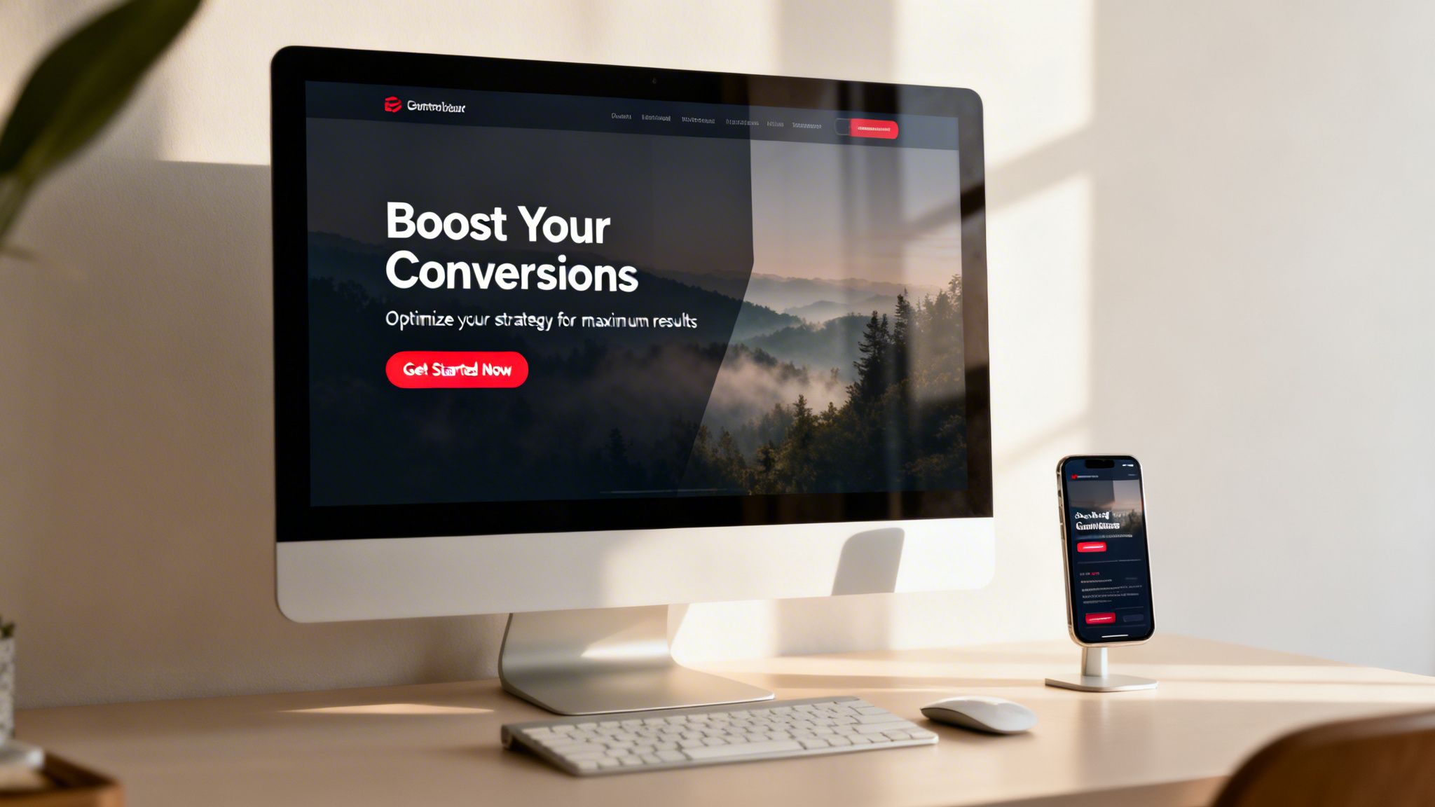
This isn’t just about a pretty picture; it’s about instant relevance. A powerful hero section creates a seamless journey from ad to page, reassuring the user they’re in the right place. Look at how Airbnb uses stunning photography to sell a dream, or how Slack uses minimalist visuals and a sharp value proposition to communicate purpose. This immediate connection is crucial for your landing page experience score. A relevant, engaging hero tells Google your page delivers on the ad’s promise, which helps lower your cost-per-click and improve ad positioning.
Quick implementation tips
To make your hero section work for you, not against you:
- Message matching: Ensure your headline and subheadline directly reflect the ad copy and keyword intent that brought the user to the page. Consistency is key to building trust.
- High-quality imagery: Use professional, authentic images or videos that resonate with your audience. Avoid generic stock photos at all costs; they scream you didn't try. Compress all images to under 300KB to keep your page speed fast.
- Clear value proposition: Your headline should answer What's in it for me? in 8-10 words. Don't just state your company name; communicate a direct benefit.
- Text readability: Place text overlays on your image with enough contrast to be easily read on any device. Test this on a mobile screen to be sure. A dark overlay or a subtle drop shadow on the text can make a huge difference.
4. Social proof and trust signals
People don’t trust marketers; they trust other people. Social proof and trust signals are visual elements that borrow credibility from existing customers to reduce anxiety for new visitors. Think testimonials, client logos, star ratings, or certifications. These design elements for websites work by showing that others have already taken the leap and had a positive outcome. It’s a powerful psychological shortcut that says, it’s safe and smart to do business with us. For a PPC manager, this is a direct lever for improving conversion rates, as trust is the foundation of any transaction.
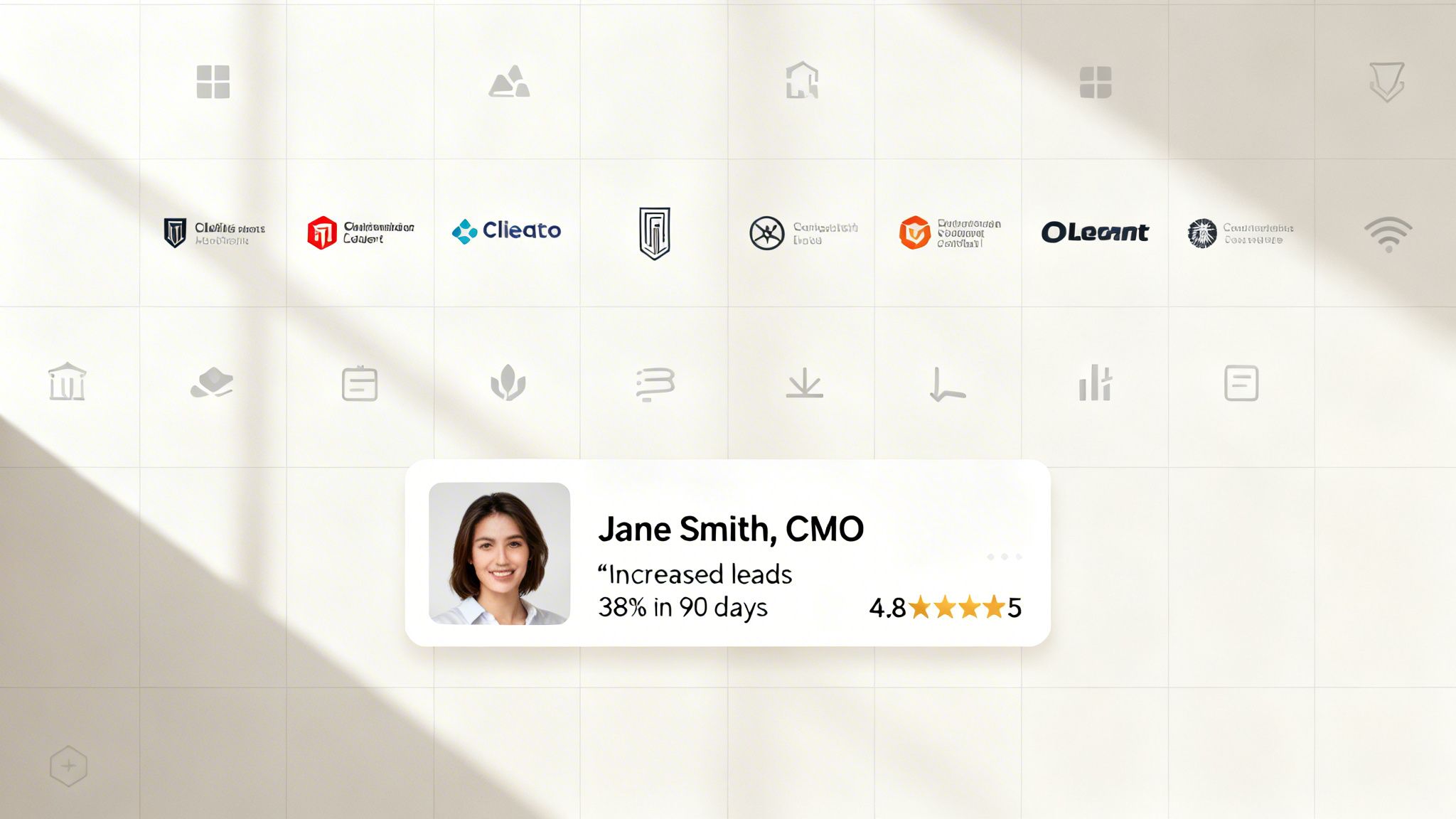
This isn’t just a nice-to-have; it’s a core conversion asset. SaaS companies like Calendly and Notion master this by showcasing impressive usage metrics and logos from major companies. They’re not just selling a product, they're selling confidence. When a potential customer lands on your page from an ad, they are skeptical. Seeing logos they recognize or reviews from real people immediately lowers their guard. This improved landing page experience helps your Google Ads Quality Score, rewarding you with a lower cost-per-click. Better trust signals mean more efficient ad spend, simple as that.
5. Navigation menu / header
Your website's header is its digital handshake. It’s the first thing a user sees and the primary tool for wayfinding, setting the brand tone from the very first second. On a standard website, it's packed with links. But on a landing page built for PPC, a bloated header is a conversion killer. It’s like inviting someone over for a specific purpose and then showing them a hundred different doors to leave through. Among all the design elements for websites, the header requires the most discipline, as you must consciously strip it down to its essentials.
The goal of a PPC landing page header is not to offer a sitemap; it's to maintain brand presence and funnel users toward one single action. You’re paying for every click, so every element must support that investment. Companies like ConvertKit often remove navigation entirely on their landing pages to eliminate choice paralysis. This minimalist approach directly improves your landing page experience by removing exit points, keeping users focused on the CTA, and thus boosting your Quality Score. A clean header means a clearer path to conversion.
6. Feature cards / benefits grid
Your users don't have time to read a novel about what your product does. They need to understand its value in seconds, and that’s where feature cards come in. These organized visual blocks break down complex product features or service highlights into easily scannable, bite-sized pieces. Think of them as the executive summary of your value proposition, presented visually. For PPC campaigns, this is gold. A visitor from a specific ad needs to see that your solution directly addresses their pain point, and a well-organized benefits grid does exactly that, improving your landing page experience score.
This isn’t just about listing functions; it’s about communicating outcomes. Companies like Slack and HubSpot master this by translating technical capabilities into tangible user benefits. A benefits grid organizes value propositions to align with specific keyword intents, making your page instantly relevant to the search query that brought the user there. This immediate relevance confirms the user is in the right place, reduces bounce rates, and signals to Google that your landing page is a high-quality match for your ads. These are some of the most crucial design elements for websites focused on conversions.
7. Countdown timers and urgency elements
Procrastination is the enemy of conversions. Countdown timers and urgency cues are your direct counterattack. They tap into the powerful psychological trigger of FOMO (fear of missing out), pushing users to act now instead of “later.” This isn’t just about creating fake scarcity; it’s about framing a genuine offer within a limited timeframe to encourage a decision. Among the design elements for websites, timers have a stark, immediate effect on action rates. For PPC managers, this means converting user intent into action before the visitor clicks away, maximizing the value of every paid click.
The goal is to create just enough pressure to close the deal. Think of Booking.com showing Only 2 rooms left! or Amazon’s lightning deals. This isn't manipulation; it's motivation. When a user lands on your page, a timer visualizes the closing window of opportunity, making the value proposition feel more exclusive and immediate. This directly impacts the landing page experience, as it encourages goal completion—a positive signal for Google Ads. Better engagement and conversion rates signal to Google that your page is highly relevant, boosting your Quality Score and lowering your ad costs.
8. Pricing tables and comparison elements
Your pricing table isn't just a list of numbers; it's a critical sales tool that helps prospects make a decision. It’s where a user self-selects, matching their needs and budget to your offerings. A poorly designed pricing page causes confusion, friction, and ultimately, abandoned carts. Among all the design elements for websites, a clear pricing table has a massive impact on your conversion funnel's health, directly influencing lead quality and your PPC campaign's return on investment.
This is about turning ambiguity into clarity. SaaS leaders like HubSpot and Stripe have mastered this by using well-defined tiers to anchor value and guide users toward a choice. It’s not just about listing features; it's about framing value to prevent decision fatigue. For a PPC manager, a page that effectively converts visitors into paying customers signals a fantastic landing page experience to Google. This improves your Quality Score, which means you get better ad placements for less money. It’s a direct link from smart design to a healthier ad spend.
9. Video embeds and media elements
Text is great, but let's be honest, video can tell a story faster and with more punch. Embedded video is your chance to show, not just tell. It’s perfect for product demos, client testimonials, or explaining a complex service. A well-placed video grabs attention, increases time-on-page, and builds an emotional connection that words alone often can't. This isn't just a vanity metric; higher engagement signals a better user experience to Google, directly helping your landing page Quality Score.
Think about how companies like Slack and HubSpot use short, crisp videos to demonstrate their product's value in seconds. They don't just describe collaboration; they show it. This approach is one of the most effective design elements for websites because it answers a user’s questions visually and builds trust. For a PPC manager, this means the user understands your offer more deeply before clicking the CTA, leading to better-qualified clicks and a higher conversion rate. More engagement and clearer value translate to a stronger Quality Score and a more efficient ad spend.
10. Testimonial sections and customer quotes
Social proof isn't just a marketing buzzword; it's the trust battery for your landing page. Testimonials and customer quotes are direct endorsements that tell prospects, someone just like you succeeded with this, and you can too. They cut through the noise of your own marketing claims with authentic, third-party validation. These dedicated sections are one of the most powerful design elements for websites because they address a user's primary fear: Will this actually work for me?
For a PPC manager, this is about building credibility fast. When a user clicks your ad, they're skeptical. Showing them specific, results-driven praise from real people helps lower that guard. Platforms like G2 and Capterra have built empires on this concept. When a landing page features quotes from recognizable companies or displays hard numbers, it dramatically improves the user experience. This translates to a better Quality Score because Google sees that your page is genuinely helpful and trustworthy, reducing your cost-per-click and making your ad budget more efficient.
11. Footer with links and contact information
The footer is the last thing your user sees, but don't make the mistake of treating it as an afterthought. It’s the digital equivalent of a building’s foundation: it provides stability, legal footing, and essential access points. For users who scroll all the way down, the footer is their last chance to find what they need before they bounce. It’s a crucial tool for building trust, providing secondary navigation, and ensuring legal compliance. Among all the design elements for websites, a well-structured footer signals professionalism and completeness.
Think of the footer as your website's safety net. It catches users who didn't convert above the fold and gives them another path. For a PPC landing page, this is a delicate balance. A stripped-down footer with just a copyright notice and a privacy policy link can keep focus on the main CTA. However, on a homepage or blog post, a richer footer with links to a help center, your About Us page, and social profiles builds credibility. This small section directly impacts user experience, and for Google Ads, a positive page experience contributes to a better Quality Score. It shows Google your site is legitimate, transparent, and user-friendly.
12. Loading states and micro-interactions
Nobody likes waiting. A blank screen after a click is a conversion killer. It creates uncertainty and frustration, often leading users to abandon the page entirely. This is where loading states and micro-interactions come in. These small, purposeful animations provide visual feedback, reassuring users that the system is working. Think of skeleton screens, progress bars, or subtle button hover effects. These are not just decorative fluff; among the many design elements for websites, these are critical for managing user perception and improving the overall experience.
Polished micro-interactions signal a high-quality, professional product, which builds trust. For a PPC manager, this perceived performance directly impacts user patience and engagement. A user who sees a loading indicator is less likely to bounce, which sends a positive signal to Google Ads about your landing page quality. This can improve your Quality Score and lower your cost-per-acquisition. Big players like Stripe and Medium have mastered this, using tiny animations to make form submissions feel slick and content loading feel faster than it actually is. It's about bridging the gap between a user's action and the system's response.
12 website design elements comparison
| Component | Implementation Complexity | Resource Requirements | Expected Outcomes | Ideal Use Cases | Key Advantages |
|---|---|---|---|---|---|
| Call-to-Action (CTA) Buttons | 🔄 Low — simple HTML/CSS + optional JS for states | ⚡ Low — small assets, quick A/B tests | 📊 ↑ Conversion rate; ⭐ High impact when optimized | Lead capture, landing-page primary actions | ⭐ Direct conversion lift; 💡 Test copy, color, placement |
| Form Fields and Input Components | 🔄 Medium — validation, conditional logic, integrations | ⚡ Medium — dev work, privacy & data hookups | 📊 Better completion & lead quality; ⭐ High for qualification | Multi-step lead capture, qualification flows | ⭐ Improves data quality; 💡 Capture essentials only |
| Hero Section / Hero Image | 🔄 Medium — responsive media, overlays, copywriting | ⚡ Medium — high-quality imagery/video + optimization | 📊 Strong first impression & engagement; ⭐ High credibility | Above-the-fold messaging, ad match landing pages | ⭐ Communicates value quickly; 💡 Match ad copy and optimize images |
| Social Proof and Trust Signals | 🔄 Low — content blocks, logo/testimonial integration | ⚡ Low — collect assets, occasional updates | 📊 Increases trust & reduces objections; ⭐ High when verified | B2B SaaS, conversion pages needing credibility | ⭐ Reduces anxiety; 💡 Use specific metrics and photos |
| Navigation Menu / Header | 🔄 Low — markup + optional sticky behavior | ⚡ Low — consistent styling; minimal links preferred | 📊 Better wayfinding; ⭐ Moderate effect on conversions (if simplified) | Brand pages, product pages; minimize on conversion landing pages | ⭐ Keeps brand visible; 💡 Remove excess links on CTAs |
| Feature Cards / Benefits Grid | 🔄 Low — responsive grid + icons/text | ⚡ Low — copy and visual assets | 📊 Improves scannability and value clarity; ⭐ Moderate-high | Explaining benefits, feature overviews on landing pages | ⭐ Scannable value propositions; 💡 Limit to 3–6 cards |
| Countdown Timers and Urgency Elements | 🔄 Medium — timer logic, evergreen/session rules | ⚡ Low–Medium — JS plugins and offer coordination | 📊 Increases conversion velocity; ⭐ High short-term lift (if genuine) | Time-limited offers, webinars, limited-capacity events | ⭐ Drives faster actions; 💡 Use only for real scarcity |
| Pricing Tables and Comparison Elements | 🔄 Medium — columns, toggles, responsive layout | ⚡ Medium — pricing strategy, content planning | 📊 Enables self-selection; ⭐ High for purchase decisions | SaaS pricing pages, subscription tiers, plan comparison | ⭐ Reduces sales friction; 💡 Highlight recommended tier |
| Video Embeds and Media Elements | 🔄 Low–Medium — embedding, captions, lazy loading | ⚡ Medium — production and hosting resources | 📊 Increases engagement/time-on-page; ⭐ Moderate-high when high quality | Product demos, testimonials, walkthroughs | ⭐ Explains complex features quickly; 💡 Keep short + captioned |
| Testimonial Sections and Customer Quotes | 🔄 Low — carousel/grid or static blocks | ⚡ Low — collecting and updating testimonials | 📊 Builds credibility; ⭐ High when metrics and identities shown | Case studies, B2B trust-building near CTAs | ⭐ Authentic social proof; 💡 Feature strongest testimonials near hero |
| Footer with Links and Contact Information | 🔄 Low — structured links and legal text | ⚡ Low — legal copy, support links maintenance | 📊 Supports trust & navigation; ⭐ Low–moderate conversion impact | Resource hubs, full site pages, legal compliance | ⭐ Provides contact/legal info; 💡 Keep minimal on conversion pages |
| Loading States and Micro-interactions | 🔄 Medium — animations, accessibility considerations | ⚡ Low–Medium — front-end work and performance testing | 📊 Improves perceived performance & confidence; ⭐ Moderate UX impact | Forms, multi-step flows, interactive elements | ⭐ Reduces friction & duplicate actions; 💡 Keep animations short and accessible |
Stop talking and start building
There you have it. Twelve fundamental design elements that separate high-performing websites from digital paperweights. This isn't rocket science, but it does demand discipline and a ruthless focus on the user. We've walked through everything from your hero section to your footer, not as abstract art projects, but as functional tools engineered for a single purpose: conversion.
The real takeaway isn't just a checklist of items. It’s a shift in mindset. A great PPC campaign doesn’t end when someone clicks your ad; it begins. The landing page is where the promise you made in your ad copy is either fulfilled or broken. Every single element, from the clarity of your CTA button to the reassuring presence of social proof, contributes to that moment of truth. Getting these design elements for websites right is the difference between a profitable campaign and a money pit.
Synthesizing the core principles
Let's cut through the noise. If you forget everything else, remember these three pillars that underpin every successful design element we discussed:
- Clarity over cleverness: Is your offer immediately understood? Is the next step obvious? Stop trying to be witty with your button copy and just say Get Your Free Quote. Stop using vague icons and use clear text labels. Your user is busy and distracted; don't make them think.
- Trust through transparency: Every testimonial, every security badge, every clearly written privacy policy link builds a small deposit of trust. Conversely, every hard-to-find contact detail, every confusing pricing tier, and every form asking for unnecessary information erodes it. Build trust, and the conversions will follow.
- Speed as a feature: This applies to page load times, but also to cognitive load. How fast can a user understand what you do? How quickly can they fill out your form? A clean layout, efficient navigation, and fast-loading media aren't just nice-to-haves. They are direct contributors to your Quality Score and your conversion rate.
The most expensive part of your marketing funnel is the friction you create for your own customers. Your job is to find it and destroy it.
Your immediate action plan
Don’t just read this list and nod along. That’s a waste of your time and mine. Real growth comes from execution, not consumption. Here’s a simple, pragmatic plan to start right now.
- Pick one weak link: Open your highest-traffic landing page. Cross-reference it with the twelve points in this article. I guarantee you’ll find at least one element that is mediocre or broken. Maybe it's a generic Submit button, or perhaps your testimonials are from 2018. Just pick one.
- Fix it this week: Don't schedule a meeting about it. Don't add it to a Q4 roadmap. Just fix it. Change the button copy. Remove two form fields. Add a new, relevant customer quote. Make one, small, tangible improvement.
- Measure the impact: Watch your analytics. Did the conversion rate on that page tick up? Did your Quality Score improve for the associated ad group? Don’t guess. Use the data to validate your change.
- Repeat relentlessly: Once you have a win, no matter how small, you build momentum. Pick the next weakest element and repeat the process. This is how you build something that lasts. Incremental improvements, applied with relentless consistency, are far more powerful than waiting for a perfect redesign that may never come.
The future of performance marketing isn't about having one perfect landing page. It's about having thousands of good ones, each perfectly tailored to a specific user's intent. The technology is here. The opportunity is massive. Now it's on you to execute.
Building and testing thousands of landing pages by hand is not a scalable plan. That's why we built dynares. It automates the creation of high-intent, campaign-specific landing pages, ensuring every one of your design elements is optimized from the start. See how it works at dynares and stop leaving money on the table.


