Let's be direct. Too many of us are guilty of spending a fortune on Google Ads, driving traffic to generic homepages or landing pages that just don't work. It’s like inviting guests to a party but forgetting to tell them where the food is. Your ad promises one thing, your page delivers another. The result? A high bounce rate, a low Quality Score, and a CPC that makes your eyes water. It’s a dumb way to burn money, and we can do better.
As someone deep in the trenches of building and scaling tech, I’ve seen this pattern over and over. A brilliant product or service held back by a disconnected marketing funnel. To ensure your Google Ads campaigns don't waste budget, it's essential to understand how to optimize landing pages for higher conversions and ROI. The good news is that fixing this isn't black magic. It’s about message match, clarity, and giving the user exactly what they searched for, instantly.
We need to stop thinking about landing pages as an afterthought and start treating them as the most critical part of the conversion journey. A great page isn't just about pretty design; it’s a strategic tool.
This article isn’t fluffy theory. I’m going to show you real-world google ads landing page examples from companies like HubSpot, Unbounce, and others. We’ll dissect what makes them work with screenshots and direct links, what you can steal for your own campaigns, and how to think more strategically about that crucial click-to-conversion gap. Let’s get to it. 🚀
1. dynares
Let's be direct. Manually creating dozens of landing pages to match every ad group in a Google Ads campaign is a colossal waste of time. It's tedious, error-prone, and frankly, a task that machines should have been doing for us years ago. That’s why dynares is my featured choice; it tackles this exact problem with a level of automation that actually works, moving you from keyword research to a fully tracked, personalized landing page without the usual spreadsheet hell.
This isn't just another page builder. It’s an AI-first platform designed to automate the entire pre-click to post-conversion workflow for Google Ads. You feed it your brand guidelines and a list of keywords, and its system gets to work, generating thousands of coordinated ads and landing pages. Each page is tuned to the searcher's intent, injecting specific keywords and messaging to create a truly one-to-one experience. This level of message match is precisely what Google rewards with higher Quality Scores.
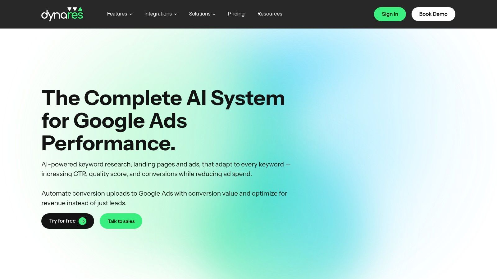
Why it stands out
The core strength of dynares is its end-to-end automation, but two features in particular make it a standout example for anyone serious about Google Ads performance.
First, personalization at scale. Most teams either create a few generic landing pages or spend countless hours manually cloning and tweaking pages for their top ad groups. dynares automates this, building a unique, keyword-specific landing page for every single ad. This granular approach directly improves ad relevance and Quality Score, which in turn lowers your CPC. It’s a simple concept, but the execution is what makes it powerful.
Second, revenue-first optimization. This is a big one. Most PPC managers optimize for lead volume because tracking actual revenue is a pain. dynares simplifies this by automatically uploading conversion values back into Google Ads. This means you can finally optimize your campaigns for Return On Ad Spend (ROAS), not just lead counts. You're no longer flying blind, guessing which leads turned into customers; you're making decisions based on real money. For a deeper dive into the mechanics, their team has a solid post on building a high-converting landing page that’s worth reading.
Practical application
So, how do you use this effectively? The modular template and form builder is a great starting point. Create a few core layouts that reflect your brand, and then let the AI populate them with intent-driven copy for your different keyword clusters.
Don't just set it and forget it, though. Use the Auto A/B Testing feature to let the platform find winning combinations of headlines, copy, and CTAs. The system automatically promotes the winner based on real-time performance, so you’re constantly iterating without the manual overhead. For agencies or teams managing multiple accounts, the native integrations with Google Ads, Tag Manager, and HubSpot are essential for a clean workflow.
The fine print
dynares offers a tiered pricing model, which I appreciate. There’s a free plan to get your feet wet, and paid plans start at around €29/month for the Starter tier. This gives you about 30 landing pages and 5,000 pageviews, which is perfect for freelancers or small businesses. Larger advertisers will need the Pro or Business plans to handle higher volumes.
The main thing to keep in mind is that while the AI is good, it isn't a replacement for human oversight. You'll still need to review the automated copy and layouts, especially if you're in a regulated industry or have very strict brand guidelines. Think of it as a massive force multiplier, not a fully autonomous employee.
- Pros: Creates keyword-specific landing pages and ads at scale, boosting Quality Score. Uploads conversion values to Google Ads for true ROAS optimization. Automates keyword research, A/B testing, and analytics in one place.
- Cons: Starter plans have limits on pages and traffic, requiring higher tiers for large-scale campaigns. AI-generated content requires human review to ensure brand compliance and accuracy.
Website: dynares.ai
2. Unbounce
Let's get straight to the point: theory is fine, but seeing what actually works in the wild is better. Unbounce’s landing page example gallery is where I go when I need a shot of pure, unadulterated inspiration from real campaigns. This isn't a collection of sterile mockups; it’s a curated showcase of live landing pages built by their customers, giving you a direct look at what others are using to convert traffic.
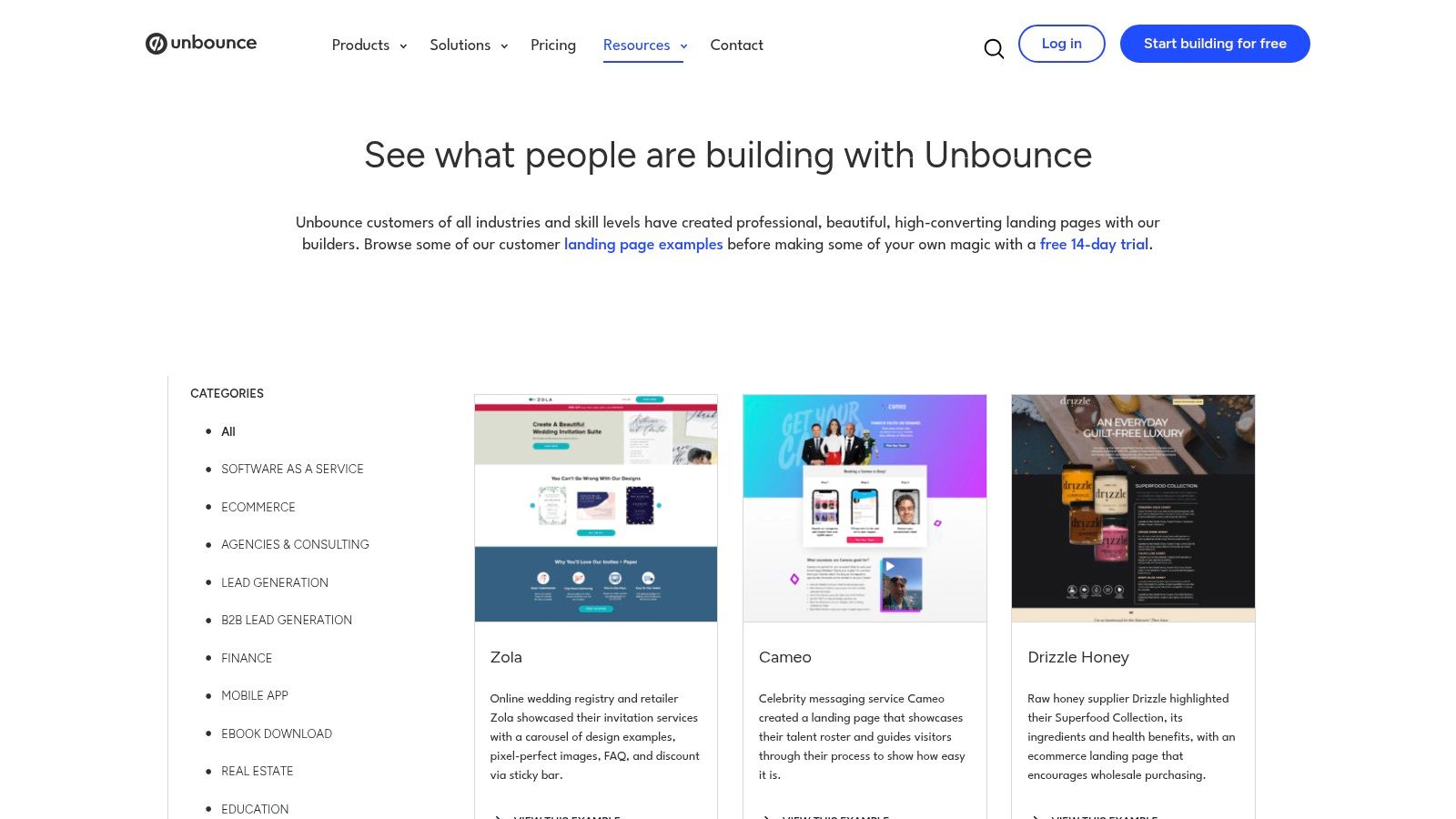
The real value here is the direct link between a visual example and its strategic purpose. Each example includes a short, punchy explainer on the page’s conversion-focused choices. You can see how a B2B SaaS company structures its demo request form versus how a local home services business captures a lead for a quote. It’s an excellent way to reverse-engineer successful layouts and understand the why behind the design, which is crucial for building your own high-performing google ads landing page examples.
Strategic breakdown
What makes this resource stand out is its focus on conversion rate optimization (CRO). The pages are categorized by goal, like lead generation or event signups, so you can filter for what’s relevant to you. Browsing is completely free, and you can click through to see the full, live landing pages. This is a game-changer because you can analyze the entire user journey, not just a static image. The only catch is that these are all built with Unbounce, so if you want to replicate a design, they gently nudge you toward their 14-day free trial. It's a smart, non-aggressive upsell.
A minor downside is that the gallery isn't exclusively for Google Ads pages, so you need to use your own judgment to identify which ones are built for a high-intent PPC audience. Look for pages with extreme message match, a single call-to-action, and minimal distractions. The platform’s design patterns can also feel a bit repetitive after a while, but that’s a small price for access to dozens of battle-tested layouts. For a deeper dive into the technical side, you can find more guidance on effective Google Ads landing page optimization to complement the visual ideas you get here.
Actionable takeaways for PPC managers
Use these examples to form hypotheses for your own A/B tests by paying attention to form placement. Don't copy headlines word-for-word but instead identify the formula. Is it a question? A benefit statement? A direct command? Adapt these structures to your own offers. Lastly, open the live examples on your phone. See how they handle responsive design, sticky headers, and thumb-friendly CTAs. It’s a free masterclass in mobile-first conversion design.
3. HubSpot
If Unbounce is the surgical tool for PPC landing pages, HubSpot’s blog is the comprehensive medical library. Their team consistently publishes broad, regularly refreshed roundups of high-performing landing page examples. It’s less of a focused gallery and more of an editorialized collection, which is a different, but equally valuable, source of inspiration.
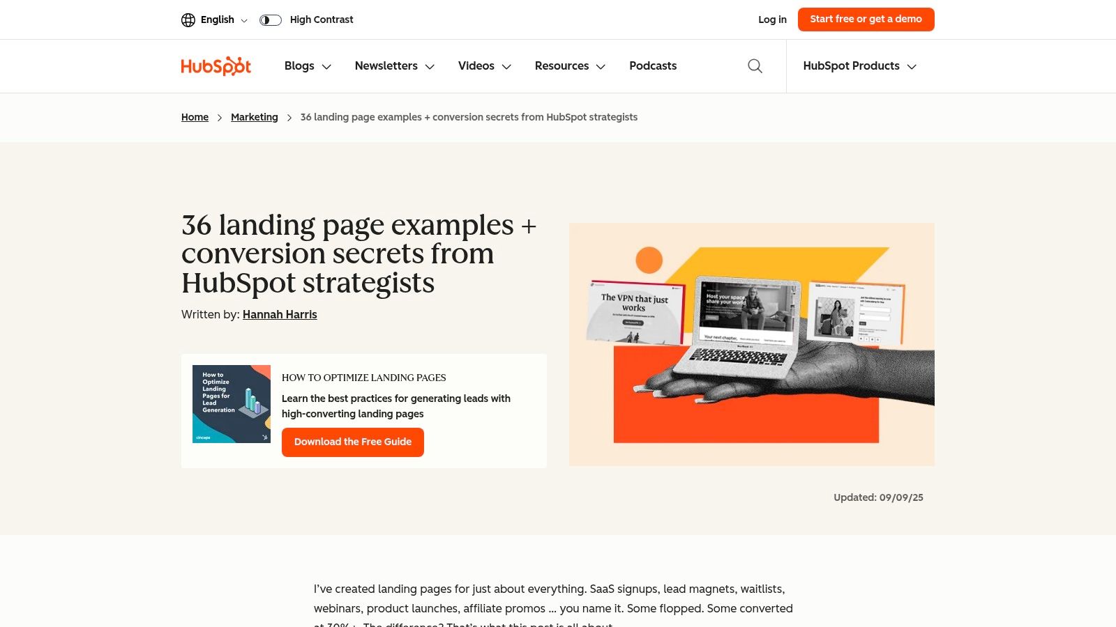
The strength here is the commentary. HubSpot’s marketing teams break down why each example works, from SaaS and lead magnets to e-commerce and events. This is gold for training your strategic eye. You learn to see pages not just as designs, but as conversion machines built with specific intent. It helps you connect the dots between an ad's promise and the page's execution, a critical skill for building effective google ads landing page examples that truly convert.
Strategic breakdown
What makes this a go-to resource is the mix of variety and actionable analysis. The posts are completely free to access and offer a wide range of B2B and B2C pages, from simple lead capture forms to long-form educational pages. The editorial commentary often highlights specific copywriting techniques, visual hierarchy choices, and calls-to-action that you can directly apply to your own campaigns. It’s an excellent way to get ideas for swipe files or to educate stakeholders on what a good landing page looks like.
The main drawback is that it’s not a PPC-exclusive list. You have to apply your own filter and think, would this work for a high-intent, paid search visitor? Some examples are more suited for organic or email traffic. Occasionally, a link might point to a company’s homepage instead of a dedicated ad lander, which is a bit of a miss. Still, the sheer volume and quality of the analysis from their CRO and strategy teams make it a must-visit. You can get even more out of these ideas by learning more about the fundamentals of split testing landing pages to validate your assumptions.
Actionable takeaways for PPC managers
Use HubSpot’s commentary as inspiration to rewrite your own headlines and body copy. Look at how different brands use social proof like customer logos or testimonials with headshots and map these methods to your own available assets. Finally, categorize the examples you find by funnel stage (top, middle, bottom) to build a library of page structures tailored to different levels of audience awareness.
4. WordStream
If Unbounce is the visual gallery, then WordStream is the university lecture for PPC practitioners. Their content isn't just about showing pretty pictures; it's about dissecting landing pages through the critical lens of a paid search manager. They publish roundups and critiques that connect the dots between ad copy, landing page experience, and, most importantly, Google's Quality Score.
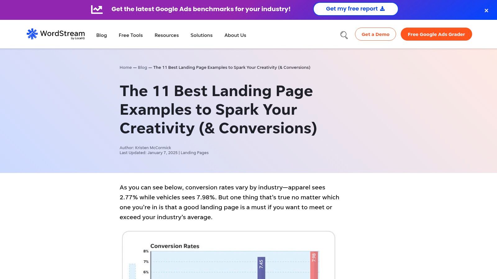
What makes WordStream's approach so useful is its relentless focus on the mechanics of conversion for a PPC audience. They explicitly discuss ad-to-page message match, the role of trust signals in reducing bounce rates, and how a form’s design can influence lead quality. This isn't just design inspiration; it's a practical, educational resource for anyone who needs to build high-performing google ads landing page examples that don't just look good, but actually work to lower your cost-per-acquisition.
Strategic breakdown
The real strength here is the PPC-aware commentary. The authors clearly live and breathe Google Ads, so their analysis of headlines, form fields, and CTAs is always tied back to the intent of a user clicking a paid ad. The content is completely free, existing as blog posts that are incredibly valuable for brainstorming. They feature examples across a wide range of industries like education, e-commerce, and local services, which is perfect for agencies managing diverse client portfolios.
On the downside, some of the examples are dated, and many are static screenshots rather than links to live pages. This means you can't interact with the page or check its mobile responsiveness yourself. The depth of the critique can also vary from one post to another, but the overall quality remains high. It’s an excellent starting point for understanding strategy, especially when you consider how new technologies are changing the game; it's worth exploring the current thinking on AI-powered landing pages and their real-world impact to supplement these fundamental lessons.
Actionable takeaways for PPC managers
- Audit for Trust Signals: Use their examples as a checklist. Do your pages have testimonials, security badges, partner logos, and clear contact information? WordStream is great at highlighting what’s missing.
- Strengthen Message Match: For each example, WordStream often discusses the ad that likely led to it. Apply this thinking. Write down your ad headline and then look at your landing page headline. If they don't feel like part of the same conversation, fix it.
- Evaluate Form Friction: Look at the forms they critique. Are they asking for too much information upfront? Could a multi-step form work better? This is a great source of ideas for reducing user friction and increasing lead volume.
5. ConvertFlow
When speed-to-test is your top priority, you need a tool that’s built for it. ConvertFlow is where I turn when I want to move from an idea to a live PPC experiment in minutes, not days. It’s less of a passive gallery and more of an active workshop, with a hub of examples, templates, and a builder all tightly focused on personalization and A/B testing for paid traffic. It's designed for marketers who need to deploy and validate quickly.
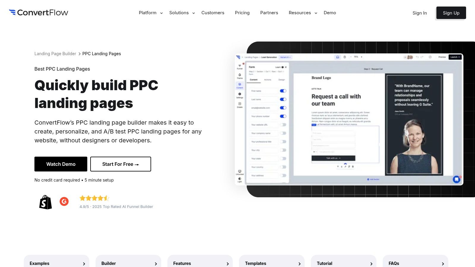
The platform’s strength is its dedicated Best PPC Landing Pages section. This isn't just a random collection; it’s a set of templates and examples framed specifically for paid search. This focus is a huge help for ensuring strong message match from your ad copy to the page itself. You can find layouts designed for specific goals, like lead magnets or demo requests, which makes it an excellent resource for sourcing strong google ads landing page examples that you can actually implement right away.
Strategic breakdown
What makes ConvertFlow different is how it closes the loop between inspiration and execution. You see an example you like, and with a few clicks, you can have a similar template live and ready for traffic. The platform includes built-in A/B testing and on-site personalization tools, allowing you to run experiments without needing a developer. You can connect calls-to-action to multi-step forms and funnels directly within their ecosystem. The biggest advantage here is the low friction to get started; their free tier lets you test ideas without a credit card.
Of course, this comes with a trade-off. Because the examples are all part of the ConvertFlow ecosystem, you don't get the broad design variety you might see on an editorial blog. The critiques are also more functional than strategic, focusing on the how rather than the deep why. But for a small team or a solo operator who needs to get a high-quality page live for a new Google Ads campaign by end-of-day, this is an incredibly practical tool. You can find the main gallery and templates at https://www.convertflow.com/landing-pages/ppc.
Actionable takeaways for PPC managers
Many ConvertFlow templates use multi-step forms. Try one for your high-intent campaigns by asking for easy info first (like name) and higher-friction info (like phone number) on step two. Use the free tier to launch a landing page for a small, experimental campaign as a low-risk way to test a new offer. Also explore their personalization features, you can set rules to dynamically change a headline based on the UTM parameters in your Google Ads URL, creating perfect message match.
6. Landingfolio
If Unbounce is for surgical precision, Landingfolio is for building your entire visual arsenal. It's a massive, curated library of real-world landing pages spanning countless industries. While it’s not exclusively focused on PPC, its sheer volume makes it an incredible resource for spotting design patterns and component ideas you can adapt for your paid traffic campaigns. It’s where I go to build swipe files for specific verticals, like SaaS or home services.
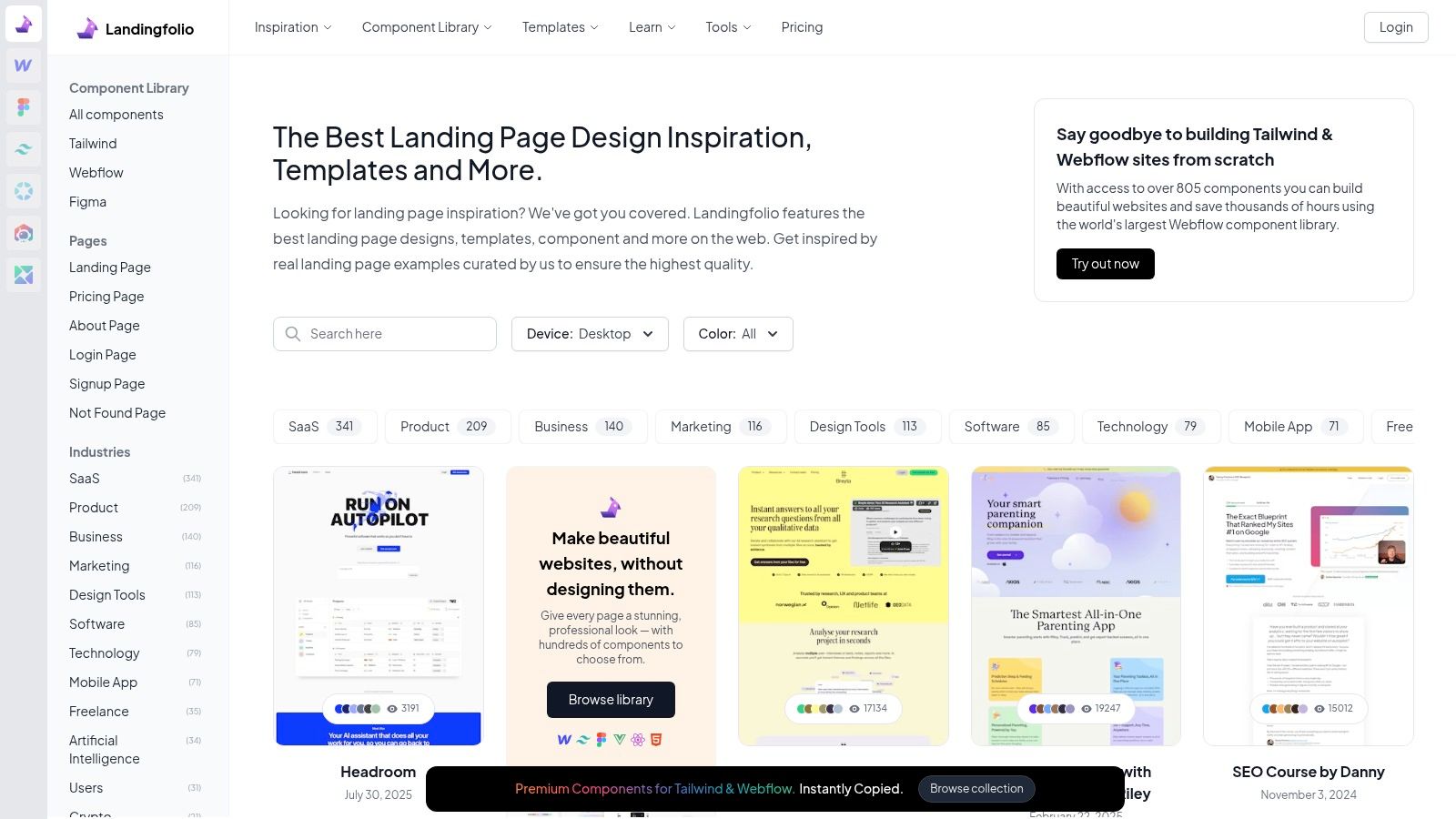
The value here is modular. Instead of looking at a page as a single unit, Landingfolio helps you deconstruct it into its core components. You can see hundreds of hero sections, pricing tables, social proof blocks, and FAQ layouts. This is perfect for building your own google ads landing page examples because you can mix and match proven elements to fit your specific keyword intent and offer. It's less about finding one perfect page and more about collecting the best building blocks.
Strategic breakdown
What makes Landingfolio so practical is its organization. You can filter by category (SaaS, Agency, etc.) and by specific page elements, which is a huge time-saver. The library is constantly updated, so you’re always looking at fresh, relevant designs. Browsing the main gallery is free, which gives you more than enough to work with. However, some of the more advanced features, like component libraries for Webflow, Figma, and Tailwind, are part of a paid subscription. Think of it as a free inspiration gallery with a paid path to accelerate production.
The main drawback is that you have to do the mental work of translating these designs for a PPC context. A homepage hero section designed for organic traffic won't work as-is for a high-intent ad click. You need to apply your own CRO knowledge to adapt these patterns, focusing on message match and a single, clear call-to-action. It's a resource for builders and thinkers, not a plug-and-play solution. For a great external perspective on this, check out the analysis on building trust on landing pages, which pairs well with the visual ideas from Landingfolio.
Actionable takeaways for PPC managers
Don't just save full pages. Screenshot specific sections you like—a pricing table from one, a testimonial block from another, a hero from a third to build a Lego kit of components. Filter for your industry and study the first screen to see the most common headline/sub-headline/CTA combinations. Lastly, deconstruct social proof to find new formats to test beyond a simple quote, like client logos, case study snippets, or 'as seen on' banners.
7. Leadpages
If you're looking for more than just visual inspiration and need to understand the psychology behind a high-converting page, the Leadpages blog is a fantastic resource. They don't just show you pretty pictures; they publish deep-dive roundups that dissect why a certain headline, form placement, or call-to-action works. It's like getting a free consultation on conversion strategy from people who live and breathe this stuff.
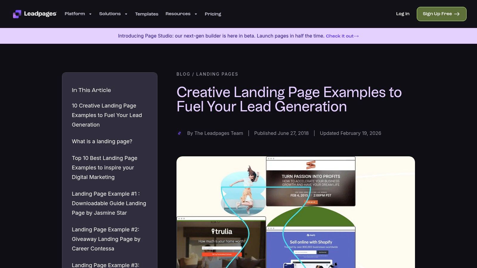
Their articles are packed with examples for lead magnets, webinar signups, and event registrations, all common goals for PPC campaigns. Each example comes with a 'why it works' analysis, breaking down elements like structure, social proof, and urgency. This is a goldmine for understanding the rationale behind design choices, which is exactly what you need to build your own effective google ads landing page examples and justify them to clients or stakeholders.
Strategic breakdown
What makes the Leadpages blog so useful is its direct applicability to the entire ad-to-landing page flow. The content is completely free to access, with no signup walls or forced demos. You can immediately see how a strong headline on a page should mirror the ad copy that brought the user there. The analysis often points out the importance of a single, focused CTA, a principle that is non-negotiable for paid traffic funnels. It's practical guidance that directly connects design to conversion.
Of course, it's not perfect. The examples are a mix from across the web, not just pages built with Leadpages, which is both a pro and a con. You get variety, but you lose the consistency of a single builder's ecosystem. Also, some of their roundup posts are a few years old, so you'll want to cross-reference the principles with more current designs. Still, the fundamental psychology they break down is timeless, making it a great starting point for educating your team or getting buy-in on a new page layout.
Actionable takeaways for PPC managers
Study how they analyze lead magnet offers (eBooks, checklists) to help you articulate the value of your own offers more clearly. Pay close attention to the specific callouts in their articles about form length, button copy, and use of proof, these are ready-made hypotheses for your next A/B test. You can also use these articles to explain best practices to clients or your boss.
7-tool comparison: Google Ads landing page examples
| Tool | Implementation complexity 🔄 |
Resource requirements ⚡ |
Expected outcomes ⭐📊 |
Ideal use cases 💡 |
Key advantages |
|---|---|---|---|---|---|
| dynares | Medium–High — setup, integrations & template tuning | Medium–High — paid tiers scale with volume; human review for brand/regulation | ⭐ High / 📊 Revenue-focused lifts: higher CTR & Quality Score, lower CPC, improved ROAS | PPC managers, agencies, SMB growth teams needing per-keyword pages at scale | End-to-end automation, per-keyword landing pages, Auto A/B testing, Google Ads/GTM/HubSpot integrations |
| Unbounce | Low — browse examples; builder optional for reproduction | Low — free examples; builder on 14-day trial / paid plans | ⭐ Moderate / 📊 Practical CRO patterns for headline, form & layout tests | Marketers wanting live examples and quick replication with a landing-builder | Live page examples, CRO-focused explainers, integrated template/builder |
| HubSpot | Low — consume editorial collections and takeaways | Low — free articles; implementation requires team effort | ⭐ Moderate / 📊 Actionable commentary to map examples to PPC intent and tests | Teams educating stakeholders or building diverse swipe files across B2B/B2C | Editorial insights, broad variety, regularly updated examples |
| WordStream | Low — read targeted critiques and examples | Low — free resources; occasional archived screenshots | ⭐ Moderate / 📊 PPC-aware critiques useful for Quality Score & conversion paths | Google Ads practitioners focused on ad-message alignment and QC | Pragmatic, PPC-specific analysis across verticals |
| ConvertFlow | Medium — builder, personalization & A/B testing setup | Medium — free starter tier; deeper features in paid plans | ⭐ Moderate–High / 📊 Fast tests and personalized experiences can improve conversion | Small teams needing rapid PPC experiments and on-site personalization | PPC-focused templates, built-in testing, personalization & funnels |
| Landingfolio | Low — browse and adapt large curated library | Low–Medium — many free examples; some paid components/templates | ⭐ Moderate / 📊 Wide pattern library accelerates design & modular builds | Designers and teams building industry-specific or componentized pages | Extensive real landing-page archive, component libraries (Webflow/Tailwind/Figma) |
| Leadpages | Low — read example roundups; use builder to implement | Low–Medium — free articles; builder is paid | ⭐ Moderate / 📊 Practical, psychology-driven guidance for lead-gen/ad pages | PPC lead-gen, webinars, offer pages and stakeholder education | Clear “why it works” breakdowns, form/CTA guidance, accessible examples |
Your turn to build something that converts
Alright, we've walked through a ton of examples, from slick SaaS pages built with Unbounce to the high-intent forms from HubSpot. If you've been paying attention, you'll realize the secret isn't a magical button color or some secret layout that converts every time. Frankly, anyone who tells you that is selling snake oil. The common thread is simpler and much harder to execute: a radical obsession with the user's intent.
The best google ads landing page examples aren’t just pretty web pages; they are the final, critical step in a conversation that started the moment someone typed a query into Google. They feel like a seamless continuation of the thought that led to the search. They provide immediate clarity, build trust in seconds, and make the next step painfully obvious. Your job isn't to just build a page, it's to build a bridge from your ad's promise to your product's value.
Your big takeaway shouldn't be to just copy the design of a Leadpages template or mimic a headline from a WordStream example. That’s missing the point. The goal is to adopt the mindset behind these high-performing pages. Look at your current setup. Are you creating a disconnected, jarring experience where your ad says one thing and your landing page says another? Or are you building a smooth, logical path from a user’s problem to your solution?
From theory to action: your next steps
It’s easy to get lost in theory. Let's make this practical. The difference between the examples we reviewed and the average landing page is execution. The teams behind these pages are relentless testers. They don’t guess, they measure. They use tools to accelerate their learning loops, not just to build static pages.
So, here’s your homework. Don't try to boil the ocean.
- Pick one high-traffic ad group in your Google Ads account. Just one. Preferably one with a decent budget but a mediocre Quality Score or conversion rate.
- Audit the experience with fresh eyes. Open the landing page it points to. Forget that you built it. Ask yourself, honestly, does this page directly answer the core intent of the keywords in this ad group? Is the value proposition immediate? Is the form intimidating? I’m willing to bet there’s room for improvement.
- Identify one major point of friction. Is it a vague headline? A form that asks for too much information? A lack of social proof? Maybe the page is just slow. Find the single biggest blocker.
- Formulate a simple hypothesis. For instance, by changing the headline to match the ad copy and adding three client logos above the fold, we can increase form submissions by 15%.
- Build and test the variation. Use a tool like Unbounce, Leadpages, or if you’re getting serious about personalization at scale, a dynamic system, to create and launch your test. Let it run until you have statistical significance.
This small, iterative process is how great performance is built. It’s not about one giant redesign; it’s about a commitment to continuous, incremental improvement. It's about building a system, not just a one-off campaign.
Choosing the right tool for the job
We looked at a few platforms, from all-in-one solutions like HubSpot to dedicated builders like Leadpages. There is no single 'best' tool. The right choice depends entirely on your team's needs, technical skill, and budget.
- For speed and simplicity: Unbounce and Leadpages are fantastic for getting dedicated, campaign-specific pages up fast without needing a developer. They are perfect for agencies and marketing teams that need to move quickly.
- For an integrated ecosystem: If your whole company runs on HubSpot, using their landing page builder makes sense. The deep integration with their CRM is the main selling point.
- For inspiration and ideas: Landingfolio is your digital swipe file. Don't go there to copy, go there to understand patterns and get inspired before you start your own design.
- For dynamic personalization at scale: This is the future. If you’re running complex Google Ads accounts with thousands of keywords, manually creating a unique landing page for each ad group is a nightmare. This is the problem we're obsessed with solving at dynares. You need a system that can generate and optimize pages programmatically.
When you're making your choice, think about scale. Will this tool help you launch five pages, or will it help you manage 500 personalized experiences? And don't forget the power of rich media. Once your page structure is solid, integrating a short, clear video can do wonders for engagement. If you need some ideas, check out these powerful landing page video tips to see what works.
The technology exists today to automate personalization and optimize conversions in ways that were impossible just a few years ago. There’s no longer an excuse for lazy marketing that points all ads to the homepage. Go build something that converts. 🙏
Tired of manually building a unique landing page for every ad group? We are too. That’s why we’re building dynares. It’s a platform designed to programmatically generate and optimize thousands of personalized landing pages from your Google Ads data, so you can finally achieve true message match at scale. See how it works at dynares.


