Look, if you’re burning money on Google Ads and sending traffic to a generic, slow, and uninspired landing page, you’re just lighting cash on fire. I’ve seen it a thousand times in the European tech scene. We build incredible products but then fail at the last hurdle, the page that’s supposed to convince someone to actually care.
It’s not about magic tricks or secret formulas. It’s about discipline and respecting the user’s intent. They clicked your ad for a reason. Your only job is to prove they made the right choice, fast. Most advice out there is either too academic or just plain obvious. Use a clear headline. No kidding. The real challenge is implementing effective landing pages best practices at scale, staying sane, and actually seeing your conversion rates climb without hiring a 20-person marketing team.
I’ve built and scaled tech products from the ground up. I’ve made all the mistakes so you don’t have to. This isn’t a theoretical guide. This is a practical, no-fluff list of the strategies that actually move the needle for paid search. We'll cover everything from single-value propositions and mobile-first design to outcome-focused forms and the A/B testing frameworks that separate the pros from the amateurs.
Let's get into what works, what's dumb, and how you can apply it tomorrow. 👇
1. Single-value proposition above the fold
Let’s be direct: if a visitor from a paid ad can't figure out why they should care within three seconds of landing on your page, you’ve already lost them. Your single-value proposition (SVP) is your one chance to make a first impression, and it absolutely must live above the fold—the area visible without scrolling. This isn't just about what your product does; it's about the immediate, tangible benefit it delivers to the user.
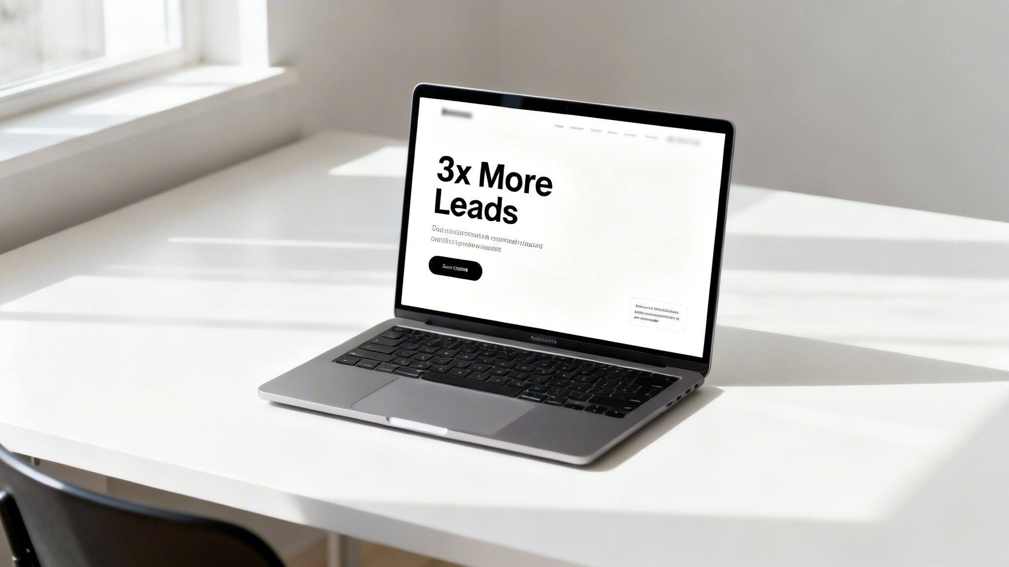
For PPC campaigns, this is non-negotiable. The headline and sub-headline must mirror the intent and language of the ad the user just clicked. If your ad promises Automated Reporting for Agencies, your landing page headline can't be The Future of Business Intelligence. This disconnect creates cognitive friction and kills conversion rates. The goal is a seamless, logical journey from ad to conversion.
How to implement it
Getting your SVP right is a core part of building high-performing landing pages. It’s the foundation upon which all other conversion elements rest.
- Align with ad intent: Your headline should be a direct continuation of your ad copy. If the ad targets the keyword "emergency plumber", the headline must say something like "24/7 Emergency Plumbing Services in [City]". It’s a simple concept, but so many get it wrong.
- Focus on outcomes: Don’t just state what your service is; state the outcome. Instead of Advanced Project Management Software, try Deliver Projects on Time, Every Time. The second version speaks directly to a pain point and a desired result.
- Test aggressively: Your first idea for a value prop is rarely the best one. Create 3-5 variations targeting different angles of the same core benefit and A/B test them. Companies have seen massive conversion lifts (over 30%) just from refining their value propositions.
2. Mobile-first responsive design with touch-optimized CTAs
Let's be blunt: if your landing page is a nightmare on a mobile phone, you’re just lighting your PPC budget on fire. With over 60% of paid search traffic coming from mobile devices, designing for a desktop monitor first is an obsolete strategy. Mobile-first design isn’t a nice-to-have; it's the only way to build landing pages that actually convert. It means designing with the smallest screen as your primary constraint, which forces clarity, focus, and ruthless prioritization.
A poor mobile user experience directly hits your bottom line. It tanks conversion rates and hurts your Google Ads Quality Score, making your ads more expensive and less visible. Salesforce reported a 35% higher conversion rate on their mobile-optimized pages versus their old, clunky versions. This is why mobile-first is one of the most critical landing pages best practices for any serious campaign. It's about designing for the user's actual context, not your own.
How to implement it
Building for mobile first isn't just about shrinking elements; it's a complete shift in mindset that prioritizes speed, simplicity, and thumb-friendly interaction.
- Design for thumbs: Place your main call-to-action (CTA) buttons within the natural sweep of a user's thumb, typically in the middle or lower half of the screen. Make them big, with plenty of white space so they are impossible to miss or mis-tap.
- Optimize your forms: Keep mobile forms brutally short. Use progressive fields to ask for essential information first and optional details later. Ensure mobile-native features like form auto-fill for emails and phone numbers work flawlessly to reduce friction. For some services, a click-to-call button is far more effective than a form on mobile.
- Prioritize performance: Mobile users are impatient. Compress image file sizes aggressively and use lazy loading so content below the fold only loads as the user scrolls. Your page needs to feel instant. Test on actual 4G connections, not just your office Wi-Fi, to see the real-world performance.
3. Message match: ad copy to landing page headline alignment
Let's cut the fluff. A user clicks your ad because it promises something specific. If your landing page headline says something completely different, you’ve just created a jarring experience. This disconnect, or cognitive friction, is a conversion killer. It makes the user think, wait, is this the right place? That split second of doubt is all it takes for them to hit the back button. Message match is the principle of making your landing page a direct, logical continuation of the ad.
This isn't just a nice-to-have; it's a fundamental requirement for a high-performing PPC funnel. It confirms the user’s decision and reassures them they've made a good click. Companies that nail this see massive lifts. Drift, for example, saw a 40%+ conversion lift by creating keyword-specific landing pages instead of using a generic one. This is a core landing page best practice because it directly impacts user trust and your bottom line.
How to implement it
Getting this right is less about creativity and more about disciplined execution. It’s about building a seamless bridge from ad to page, which is crucial for maximizing ROAS.
- Extract power words: You don't need to copy the ad headline verbatim, but the core promise must be there. Identify the 2-3 most important power words from your ad copy and ensure they feature prominently in your landing page headline. If the ad says Instant HR Compliance Reports, the page can't say Welcome to Our HR Platform. It needs to be Get Instant HR Compliance Reports.
- Use dynamic text replacement: For campaigns with thousands of keywords, manually creating a page for each is a nightmare. Use tools that offer dynamic keyword insertion for landing pages. This automatically populates the headline with the specific keyword the user searched for, guaranteeing a perfect message match at scale.
- Monitor bounce rates: Your analytics are your best friend here. If you see a specific landing page with an unusually high bounce rate, especially from a high-performing ad group, you almost certainly have a message match problem. Use UTM parameters to trace the user journey from the exact ad variant to the page, find the disconnect, and fix it. It's a simple, data-driven way to plug leaks in your funnel.
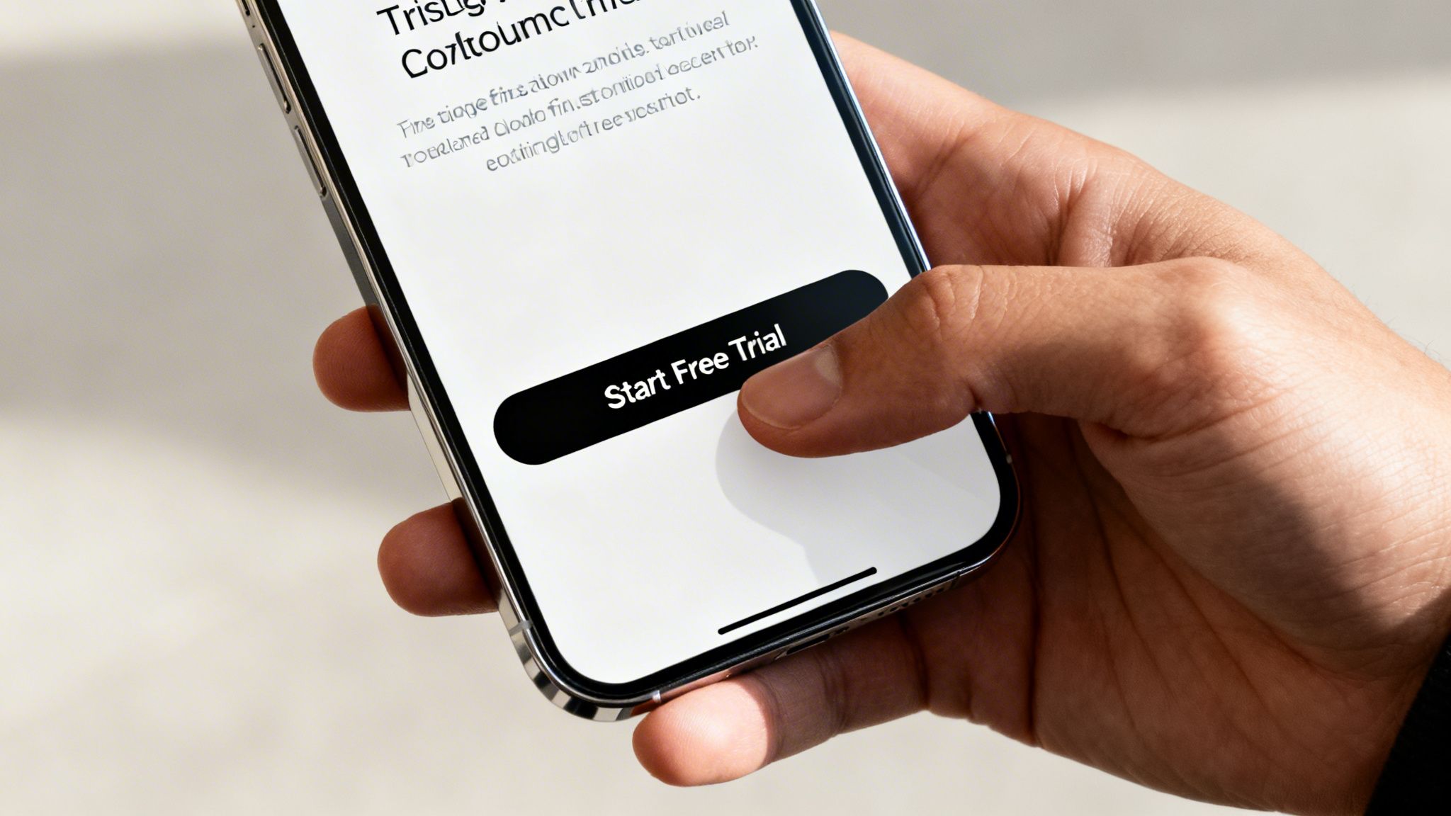
4. Strategic CTA placement and button design for maximum conversions
Your call-to-action (CTA) button isn't just a button; it's the final gateway between a visitor's interest and a tangible lead. It's the moment of truth. Mess this up, and everything else you’ve done on the page is worthless. The design, wording, and placement of your CTA must be a deliberate, psychologically-driven choice designed to eliminate friction and guide the user toward the one action you want them to take.
This is about creating a clear visual hierarchy. Your primary CTA should pop. Studies have shown massive conversion lifts from simple tweaks. HubSpot famously saw significant increases with their orange buttons on contrasting backgrounds, and Conversion Rate Experts documented a case where moving the button above the fold boosted conversions by over 300%. The goal is to make clicking the button feel like the most obvious, natural next step in the user’s journey. This is a crucial element of effective landing pages best practices because it directly impacts your bottom line.
How to implement it
Optimizing your CTA is one of the highest-leverage activities you can perform on a landing page. Small changes can produce disproportionately large results.
- Design for action: Use a color that contrasts sharply with your page's background. Warm colors like orange or red often signal urgency and action. Also, ensure your button is large enough to be an easy target on mobile—aim for a minimum touch target of 48x48 pixels. Nothing kills a mobile conversion faster than a button that’s impossible to tap.
- Use commanding microcopy: The text on your button should be an action-oriented command that communicates value. Get Your Free Quote is far more compelling than a generic Submit. Basecamp found that Try Free performed better than Sign Up because it lowered commitment. Focus on what the user gets, not what they have to do.
- Place it strategically: Your primary CTA must appear above the fold. No excuses. For longer pages, repeat the CTA after key benefit sections or at the end of the page. This catches users who need more information before committing but ensures they don't have to scroll back up to convert once they're convinced. Remove or de-emphasize any secondary CTAs that might distract from the main conversion goal.
5. Social proof and trust signals (reviews, testimonials, logos, credentials)
Let’s be honest, people don’t trust marketing copy. They trust other people. When a visitor lands on your page, especially from a paid ad where you’ve made a bold promise, their skepticism alarm is blaring. Social proof is how you turn it off. By showing that real people and legitimate companies already trust you, you reduce perceived risk and give visitors the confidence to convert. This isn't just a nice-to-have; it's a fundamental part of building trust with someone unfamiliar with your brand.
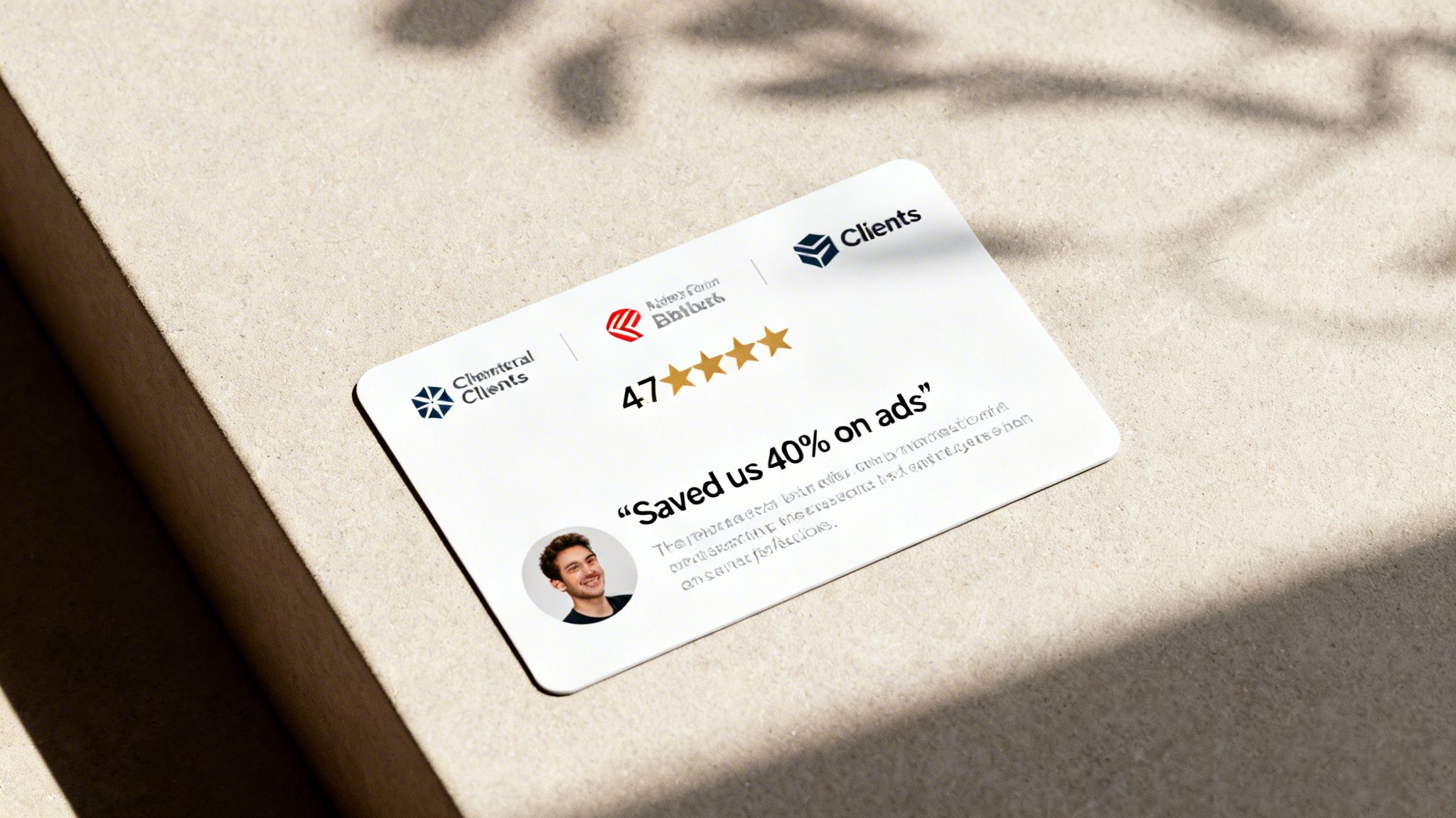
For high-intent traffic, this is where the decision is made. A visitor might be sold on your value prop, but they're still evaluating you against competitors. Seeing logos of well-known clients or testimonials with specific, powerful results can be the final push they need. Slack features Fortune 500 logos to signal enterprise-readiness, and Zendesk has seen conversion lifts over 35% by using customer videos with concrete ROI metrics. This is one of the most important landing pages best practices because it builds a bridge from interest to action.
How to implement it
Integrating social proof isn't about plastering your page with every nice thing anyone has ever said. It's about a strategic selection of validation that builds a powerful case for your offer.
- Prioritize quality over quantity: Don't throw 20 mediocre quotes on a page. Select 3-5 high-quality testimonials that are specific and impactful. Instead of a generic Great platform, feature a quote like "We increased qualified leads by 45% in the first quarter." Specific numbers are always more believable.
- Maximize credibility: A quote from "John S." is worthless. A real testimonial includes a full name, title, company, and a professional headshot. This adds a layer of authenticity that anonymous praise can never match. It shows you have real relationships with real clients.
- Use video for high-ticket offers: If you're selling a high-value service or product, a written testimonial won't cut it. Video testimonials can increase conversions by 50-80% because they are much harder to fake and create a genuine human connection. The investment in producing them pays for itself almost immediately.
6. Minimal, outcome-focused form design with progressive disclosure
Let's be blunt: your lead form is the final boss of your landing page. If it's a long, intimidating wall of fields, you're just asking for visitors to give up and leave. A minimal, outcome-focused form design respects the user's time and drastically reduces friction. It’s about asking for only what you absolutely need to start the conversation, not interrogating them for your CRM.
The core idea is simple: a shorter form feels less like work and boosts submission rates. The classic debate pits conversion rate against lead quality, but progressive disclosure offers a way to get both. This technique intelligently reveals additional form fields based on a user's previous answers. For instance, HubSpot’s smart forms might only ask for an email on the first visit, but on the second, they'll ask for a company name and job title, progressively building a richer profile without overwhelming the user on day one.
How to implement it
Optimizing your form isn't just about deleting fields; it's a strategic process. You are building a conversation, not a questionnaire. This is a critical part of landing pages best practices because the form is where the conversion actually happens.
- Start with the essentials: For a lead magnet or a free trial, what do you truly need? Often, it's just a name and an email. Asking for a phone number, company size, and budget on the first interaction is premature and kills conversions. Make the phone field optional, if you must include it at all.
- Use progressive logic: Don't ask for a job title before you know the company. A logical flow feels more natural. For example, once a user enters "Acme Corp," you can then ask for their role. Tools like Okta even use conditional logic to show different fields to enterprise vs. SMB users, tailoring the experience on the fly.
- Test your field order: The sequence of questions matters. Always start with the easiest, least-threatening fields first, like a first name. Place more demanding fields, like company website or phone number, toward the end. Enable browser auto-fill to make the process even faster for the user. It’s a small detail that shows you respect their time.
7. Benefit-driven copy over feature lists (outcome-focused narrative)
Let’s get real: nobody cares about your product’s features. They care about what your product will do for them. Your landing page copy needs to stop listing technical specifications and start promising tangible outcomes. Visitors are asking, "What’s in it for me?" and if your answer is "A13 Bionic chip," you've completely missed the point. High-converting copy focuses on benefits and emotional resonance, not a dry spec sheet.
Your prospects are drowning in problems, not a lack of features. They want a solution that makes their life better, easier, or more profitable. For paid search campaigns, this is critical. The user just clicked an ad that likely promised a solution to a problem. Your landing page must immediately prove you can deliver that solution by articulating the benefit in plain language. Focusing on the outcome is one of the most fundamental landing pages best practices, yet it's shocking how many pages get it wrong.
How to implement it
Shifting your copy from features to benefits isn't just a writing trick; it's a strategic decision that re-frames your entire value proposition around the customer's world.
- Lead with the primary benefit: Your headline must scream the main outcome. Don't say "10 ad variations per keyword." Instead, say "Generate 50% More Leads with Dynamic Ads." The first is a feature; the second is a result that gets a PPC manager's attention.
- Use the problem-agitation-solution framework: This is a classic for a reason. Start with their pain point: "Tired of wasted PPC budget?" Agitate it: "Watching money disappear with low conversion rates is frustrating." Then present your product as the clear solution: "Our platform fixes this with AI-optimized landing pages."
- Quantify benefits with specifics: Vague promises are useless. Be specific. Instead of "Save time," say "Get 10 hours back every week," a benefit that helped Calendly boost conversions by 30%. Specific numbers make the outcome feel real and achievable.
- Use “you” and “your” language: Make it personal. Talk directly to the visitor. "Our software does X" is cold and distant. "You will save 20 hours/week" puts the benefit directly in their hands and makes them the hero of the story.
8. Psychological triggers: scarcity, urgency, and social proof stacking
High-intent traffic from PPC ads is primed for action, but procrastination is a conversion killer. Your job is to give visitors a compelling reason to act now, not later. This is where psychological triggers like scarcity, urgency, and social proof come in. Used correctly, they create decision momentum without being manipulative. It’s about ethically communicating real constraints and benefits to help users overcome indecision.
This isn’t about inventing fake limitations, which is a fast way to kill brand trust. It’s about framing genuine limitations—like inventory, time-bound offers, or consultant availability—in a way that drives immediate action. For instance, Booking.com’s famous “Only 2 rooms left at this price” message has been shown to increase bookings by over 25%. Similarly, AppSumo’s deal pages often see a 50%+ conversion lift by using countdown timers for their limited-time software deals. The goal is to make the cost of inaction feel greater than the effort of converting.
How to implement it
Stacking these triggers is a key part of building effective landing pages best practices because it creates a powerful, multi-layered argument for converting immediately. When a visitor sees that an offer is limited, time-sensitive, and popular with others, the decision becomes much easier.
- Implement authentic scarcity and urgency: Don't lie. If you have limited seats for a webinar, say so. If a discount code expires on Friday, add a countdown timer. This must be grounded in reality. Test different messages like “Last 2 spots” versus “Ends Friday at 5pm” to see what resonates.
- Stack your social proof: One signal is good; multiple are better. Don’t just show a customer count. Combine it with a star rating, a powerful testimonial, and logos of well-known clients. ConvertKit does this masterfully by stating “Join 50,000+ creators” right next to testimonials and logos, a combination that helped them increase sign-ups by 35%.
- Combine triggers with a benefit: Connect the psychological nudge back to the value proposition. Instead of just "Only 5 spots left," try "Only 5 free audits remaining—claim yours to see what you're leaving on the table." This reinforces the benefit they’ll miss out on, making the urgency more potent.
9. Strategic use of video (hero videos, explainer videos, testimonial videos)
Let's be blunt: reading is work. In a world of infinite scrolling and short attention spans, making a visitor read paragraphs to understand your value is a losing bet. High-quality video is one of the most powerful tools in our arsenal to grab attention, communicate complex ideas instantly, and build a genuine connection. It’s not just a nice-to-have; for many products, it’s the difference between a bounce and a conversion.
The data doesn't lie. Wistia reports that landing pages with video see conversion increases of 50-80% on average. Loom saw an 80% conversion lift when they tested a hero video against a static page. These aren't small, incremental gains; they are game-changers. Video works because it conveys emotion, demonstrates value, and builds trust far more effectively than static text and images alone, which is a core component of effective landing pages best practices.
How to implement it
Dropping a random YouTube link on your page is a waste of time. Strategic video implementation requires thought about its purpose, placement, and performance.
- Autoplay hero videos on mute: A silent, looping hero video (under 15 seconds) can immediately show your product in action without being disruptive. The key is compelling visuals that tell a story even without sound. Crucially, always include overlaid captions, as around 80% of users will watch without audio.
- Test placement and thumbnails: The hero section is often the highest-impact placement, but don't assume. Test it further down the page, perhaps next to a specific feature explanation. Also, if you aren't autoplaying, your thumbnail image acts as a CTA. Make it compelling and avoid generic play buttons that look cheap.
- Prioritize performance: A huge video file that kills your page speed is self-defeating. Compress your video files and use a Content Delivery Network (CDN) to ensure fast load times. Your page must remain fast on both desktop and mobile.
- Focus on trust with testimonials: For B2B campaigns, a video testimonial from a recognizable client is pure gold. Hearing a peer endorse your solution directly is far more credible than a generic quote. Zendesk found customer testimonial videos boosted their conversions by over 35%.
10. Data-driven A/B testing and strategic visual hierarchy
Guesswork is the most expensive strategy in paid search. If you aren't systematically testing your landing page elements and guiding your visitor’s eye with a deliberate visual hierarchy, you are simply leaving money on the table. Combining statistical rigor with clean design isn't optional; it's how you iteratively build a conversion machine instead of just a pretty page. This is one of the most fundamental landing pages best practices for a reason.
The goal is to create a clear, logical path for the user’s attention: headline → problem validation → benefits → social proof → CTA. Generous whitespace, like that seen on Apple's product pages, isn't just an aesthetic choice; it’s a tool for focus. It reduces cognitive load and directs the eye exactly where you want it to go. Dropbox’s original minimalist landing page is a classic example of how a clear hierarchy drove its initial viral growth. It was simple, direct, and left no doubt about what to do next.
How to implement it
Marrying A/B testing with visual hierarchy turns your landing page from a static brochure into a dynamic conversion asset. It’s about building a repeatable process for improvement.
- Test with discipline: Don't throw everything at the wall to see what sticks. Test one major element at a time, like the headline or the entire hero section. Aim for at least 95% statistical confidence before declaring a winner, which typically requires a minimum of 100 conversions per variant.
- Prioritize high-impact tests: Forget testing 50 shades of blue on your CTA button, at least initially. The biggest wins almost always come from testing your headline, your core offer, or the structure of your form. These elements have the highest potential to impact a user's decision.
- Design for focus: Structure your page in 3-4 distinct vertical sections. Use consistent spacing (e.g., 40-60px between sections) to create a visual rhythm. Your CTA buttons must have high contrast to stand out. Most importantly, ruthlessly eliminate all distractions. That means no main navigation menu, no footer links leading away from the page, and no sidebars. The only way out should be through your form.
Top 10 landing page best practices comparison
| Item | Implementation Complexity 🔄 |
Resources / Speed ⚡ |
Expected Outcomes 📊⭐ |
Ideal Use Cases 💡 |
Key Advantages ⭐ |
|---|---|---|---|---|---|
| Single-Value Proposition Above the Fold | Low–Medium — simple layout, variation management for keywords | Low effort, fast to deploy | Clear relevance → lower bounce, higher conversions, improved Quality Score | PPC landing pages, high-intent keyword traffic | Immediate message match, reduces cognitive friction |
| Mobile-First Responsive Design with Touch-Optimized CTAs | Medium — device testing and responsive tweaks required | Moderate resources; needs optimization for <3s load | Large mobile conversion gains; reduced abandonment | Mobile-dominant campaigns, apps, B2C acquisition | Better mobile UX, higher mobile Quality Score |
| Message Match: Ad Copy → Headline Alignment | Medium–High — many variants per keyword/segment | Moderate; scales with automation (e.g., dynares) | Reduced bounce, higher conversion and ad relevance | Paid search, keyword-specific campaigns | Confirms user expectation, reduces wasted ad spend |
| Strategic CTA Placement & Button Design | Low–Medium — design + A/B testing | Low resources; quick A/B wins possible | Noticeable CTR/conversion uplift (often 15–35%) | Lead capture, pricing, trial sign-ups | Clear action focus, reduces friction and abandonment |
| Social Proof & Trust Signals | Low–Medium — sourcing/refreshing testimonials & logos | Low ongoing cost; moderate effort to verify permissions | Increased trust and conversions (20–40%) | New brands, high-ticket B2B, trust-sensitive offers | Reduces perceived risk, supports premium pricing |
| Minimal, Outcome-Focused Form Design (Progressive) | Medium — conditional logic and backend integration | Moderate dev effort; improves completion speed | Higher form completions; big drops in abandonment (50%+) | Lead magnets, trials, high-dropoff funnels | Low friction initial capture, preserves data via progressive fields |
| Benefit-Driven Copy Over Feature Lists | Low–Medium — requires audience research and testing | Low resources; quick to iterate | Stronger emotional connection → 25–40% conversion lifts | Non-technical audiences, hero sections, pricing pages | Communicates value clearly; supports higher pricing |
| Psychological Triggers: Scarcity, Urgency, Social Proof Stacking | Medium — must be authentic and legally compliant | Low–Moderate; quick to add but requires monitoring | Conversion uplifts when authentic (20–40%) | Limited offers, bookings, flash promotions | Accelerates decisions, combats procrastination |
| Strategic Use of Video (Hero/Explainer/Testimonial) | High — production, editing, placement decisions | High resource & optimization needs; can impact load time if unoptimized | Large engagement and conversion boosts (40–80%) | Complex products, storytelling, testimonial-led pages | Communicates complex value quickly; builds emotional trust |
| Data-Driven A/B Testing & Visual Hierarchy | High — statistical rigour, traffic, tooling | High time and data requirements; iterative process | Compounding improvements over time (sustained lift) | Mature campaigns with sufficient traffic, enterprise CRO | Removes guesswork, identifies scalable winners |
Stop talking and start building
So there you have it. Ten principles that aren’t just theory. They are battle-tested practices for building landing pages that actually convert. We’ve walked through everything from aligning your ad copy with your headline to the deep psychology of form design and the non-negotiable need for speed. If you’re a PPC manager juggling dozens of campaigns, you know the pain of trying to do this manually. It’s a nightmare.
The biggest takeaway here isn't about finding one perfect page. That’s a fool's errand. It's about building a system. A system for matching intent, for rapid testing, and for scaling what works without losing your sanity. The old way of having a developer build a new page for every ad group is dead. It’s slow, expensive, and frankly, a dumb way to operate in 2026. Your competitors are moving faster, and if you’re stuck in that old workflow, you’re already behind.
This is exactly why we're building tools like dynares. The manual grunt work of creating hundreds of message-matched pages is a problem that software should solve. It's a solved problem. Automating it lets us, the strategists and builders, focus on the real work: understanding the customer, crafting a better offer, and building better products. Technology should liberate us to be more human and more creative, not turn us into assembly-line workers.
Your immediate next steps
Don’t let this list just be another article you read and forget. That accomplishes nothing. The gap between knowing and doing is where most people fail. Let's make sure that's not you. Pick one, just one, of these practices and implement it this week. Seriously.
- Test your headline: Can you make it more specific to the ad that brought the visitor?
- Shorten your form: Are you asking for a phone number when you don’t actually call leads? Cut it.
- Add real social proof: Ditch the stock photos and add a real testimonial from a real customer, with their name and company.
The path to doubling or tripling your conversion rate isn't one giant leap. It's a series of small, smart, and consistent steps. It's the aggregation of marginal gains. Improving your page speed by 10%, your headline clarity by 15%, and your form completion by 20% doesn't just add up; it compounds. That’s how you win.
Mastering these landing pages best practices is not just about getting more leads. It’s about building a more efficient growth engine for your business or your clients. It means a lower cost-per-acquisition, a higher return on ad spend, and a more scalable way to acquire customers. It means you stop wasting money on clicks that go nowhere and start building a predictable pipeline.
The future is built by those who execute. Go build something. 💪
Tired of the manual grind of creating unique landing pages for every ad group? We built dynares to automate the creation of hundreds of message-matched, high-converting landing pages in minutes, not weeks. Stop wasting time and budget, and start scaling your PPC results by visiting dynares.


