Most webinar landing pages are built like event posters. Nice enough to look at. Useless when you send paid search traffic to them.
That is the uncomfortable bit people avoid. A webinar landing page is not a branding asset. It is a conversion surface. If you buy clicks on Google Ads, every vague headline, bloated form, and lazy tracking setup becomes expensive quickly.
The popular advice is also rubbish. It obsesses over colours, hero shots, and generic best practices while ignoring search intent, attribution, and sales qualification. If you run paid campaigns, you need a page that behaves like part of your acquisition system, not a static brochure.
Your webinar landing page is probably broken
Many teams build a webinar landing page in isolation. The ad team writes ads. The content team writes a webinar title. Someone in design drops it into a template. Then everyone acts surprised when the page underperforms.
That workflow is broken.
A webinar landing page can perform very well when it is built for the job. Webinar landing pages average 22.84% conversion, while the overall landing page average is 7.12%, according to Themeisle’s analysis of GetResponse landing page conversion data. The upside is real. The problem is that most pages never get close because they ignore why someone clicked in the first place.
Why paid traffic exposes bad pages fast
Organic traffic forgives a lot. Brand traffic forgives even more. Paid search does not.
A person types a specific query into Google. They click because your ad promises a specific outcome. Then your page greets them with soft corporate fluff like improve your marketing with our expert webinar. That disconnect kills momentum.
If the keyword was high intent, your page must continue that exact conversation. Same pain. Same promise. Same outcome. Anything else is friction.
Tip: If your headline could be swapped onto ten other webinars without anyone noticing, it is too generic.
What broken usually looks like
A weak webinar landing page usually has the same symptoms:
- Generic promise: It talks about learning, discovering, or exploring instead of a practical result.
- Too much noise: Navigation, footer links, secondary CTAs, and random sections pull attention away from registration.
- Bad handoff from ads: The ad says one thing. The page says another. Quality suffers and so do conversions.
- No serious measurement: Teams track thank-you page views and call it a day, which is amateur hour.
If you want a quick reality check, run your page through the free landing page analyzer. Not because a tool fixes the strategy, but because many marketers are too close to their own pages to see the obvious problems.
The good news is that webinar pages are not hard to improve. The bad news is that you have to stop treating them like content assets and start treating them like performance assets.
Nail the strategy before you build anything
Design is where teams waste time because it feels productive. It is also where weak strategy gets dressed up.
A webinar landing page starts with three decisions. Miss any one of them and the rest becomes decoration.

Define the lead you want
If your target is just more registrations, you are setting yourself up for junk leads.
A good webinar signup is not someone who fills a form. It is someone whose problem matches your offer closely enough that sales, product marketing, or lifecycle marketing can do something useful after the event.
That means asking boring but necessary questions before the page exists. Who should attend? What level are they at? What pain are they trying to solve? What keyword patterns suggest real buying intent versus casual curiosity? Many teams should spend more time reading campaign and funnel planning examples like these lead generation campaign frameworks, instead of fiddling with button shapes.
The webinar is not the offer
The webinar format is just delivery. The offer is the outcome.
Bad offer:
Learn about AI in paid marketing
Better offer:
Reduce wasted Google Ads spend with cleaner intent matching and better conversion tracking
You do not need fluffy inspiration. You need a result people care about. Strong webinar landing pages make the value obvious before someone scrolls.
Here is the blunt test:
| Weak framing | Strong framing |
|---|---|
| Educational session | Practical solution |
| Broad topic | Specific problem |
| Nice to know | Worth giving an email for |
Match the ad promise exactly
Performance marketers earn their keep here.
If someone searched for webinar on reducing CPC, your webinar landing page should open with that exact problem. Not digital transformation. Not growth strategy. Not demand generation excellence. Those phrases are how teams burn budget while sounding clever in meetings.
A clean framework:
- Keyword first: What exact problem did the user express?
- Message second: What outcome does your ad promise?
- Page third: Does the first screen confirm they are in the right place?
Key takeaway: Relevance is not a copywriting nicety. It is the whole game in paid search.
Most conversion problems begin before the page builder opens. Strategy is where the lift comes from. Layout just makes it easier to collect it.
The page anatomy that converts
Paid search traffic does not read your webinar landing page like a brochure. It scans for one answer. Is this relevant enough to give you an email right now?
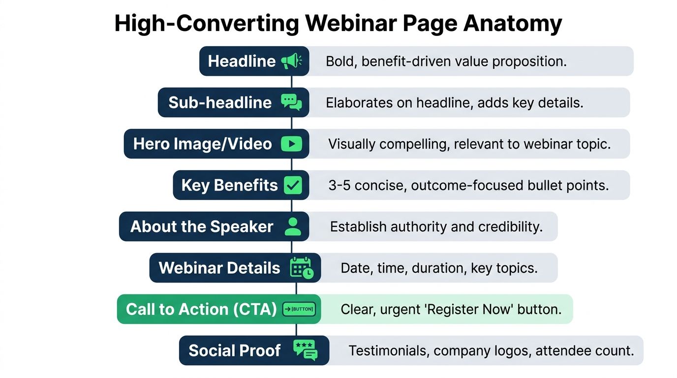
Build the page like a response system. Every block should either confirm intent, reduce friction, or improve signal quality for later optimisation. If a section does none of those three jobs, cut it.
Above the fold decides whether paid traffic stays
The first screen carries the load. It needs to confirm the query, show the outcome, and make the next click easy.
A strong hero section for webinar campaigns usually includes four parts:
- Intent-matched headline: Use the problem the visitor searched for, in plain language.
- Specific subheadline: State who the session is for and what they will leave with.
- Immediate form or primary CTA: Put registration in view without forcing a scroll.
- Fast proof: Add the date, speaker relevance, customer logos, or a sharp credibility line. AI can help in this area if used properly. Generate headline and subheadline variants based on keyword clusters, ad group themes, and pain point language. Then route paid search traffic to the closest-fit version instead of dumping every click onto one generic page. That is how you improve relevance without rebuilding the page from scratch every week.
If you want extra UI inspiration without copying generic templates blindly, these landing page design best practices are a decent starting point.
The form should collect the lead, not satisfy internal politics
Marketers ruin webinar pages at the form. Sales asks for company size, phone number, job title, country, and budget. Conversion rate drops. Everyone acts surprised.
Ask for the minimum you need to get the registration. Then qualify later through enrichment, follow-up, or lead scoring tied back to Google Ads conversion tracking setup for webinar registrations. Paid search performs better when the first conversion is easy and the downstream quality signal is fed back into the platform.
Keep the form simple:
- Best default: email only, or email plus first name
- Reasonable for B2B: email, first name, company
- Usually too much for cold paid traffic: phone, team size, revenue, timeline
Button copy matters too. "Submit" says nothing. "Save my seat" and "Get the replay" tell people what happens next.
Trust needs to be fast and relevant
Trust on a webinar page is not about decorating the page with badges. It is about removing doubt in seconds.
Start with speaker credibility that matches the promise. "VP of Marketing" is weak on its own. "Scaled Google Ads spend across 40 SaaS accounts and fixed offline conversion tracking" is stronger because it connects to the problem the visitor wants solved.
Then add proof that fits the audience. Known customer logos help. A short testimonial helps if it mentions a concrete result. A clear agenda helps because it shows the session has substance and is not going to waste 45 minutes on fluff.
Video can help too, but only if it tightens the pitch. Wistia found that video can improve conversion rates on landing pages when it explains the offer clearly and appears in the right context, not as autoplay clutter. Keep it short. Give people a reason to press play.
The middle of the page should answer buying questions
Visitors from paid search are not browsing. They are checking for reasons to leave.
Use the body of the page to answer the objections that block registration:
- What will I learn? Give 3 to 5 concrete takeaways.
- Is this for me? Name the role, company type, or use case.
- Why should I trust you? Show proof tied to the topic.
- What happens after I sign up? Confirm whether they get a live seat, replay, reminders, or follow-up resources.
This is also where intent-based A/B testing gets useful. Do not run vague tests on button colours and call it optimisation. Test sections against traffic intent. Compare a technical agenda versus a strategic agenda for high-intent search terms. Test "join live" versus "get the replay" for people searching outside business hours. Test speaker-led proof against customer-result proof. Those are meaningful page anatomy tests because they reflect why the click happened in the first place.
What to remove without sentiment
High-performing webinar pages are usually missing half the things internal teams want to add.
Cut these first:
- Top navigation
- Competing CTA buttons
- Long company story
- Feature lists about your platform
- Stock-photo filler
- Anything that sends the visitor off-page before registration
A good webinar landing page feels narrow by design. That is the point. It should guide one action, produce clean conversion data, and give you enough structure to test message-to-intent fit at scale.
The unsexy tech setup that makes you money
This is the bit many marketers avoid because it is less fun than writing headlines. It is also the bit that separates teams who scale from teams who guess.
If your tracking is sloppy, your optimisation is fantasy.

Track the registration event properly
Do not rely only on a thank-you page view. That is fragile.
Track the successful form submission through Google Tag Manager and pass that into Google Ads and GA4. If the form is embedded, AJAX-based, or handled by a third-party tool, make sure the event still fires reliably. Otherwise, you end up undercounting or double-counting conversions and making budget decisions on bad data.
If your setup is shaky, this walkthrough on Google Ads conversion tracking setup is worth reviewing before you touch bids or audiences.
Upload conversions back into Google Ads
A lot of teams stop at basic pixel tracking. That is not enough if you care about revenue quality.
When you upload conversions with values, you give Google Ads better signals for optimisation. Even if your webinar registration is only the first step, you should still think in terms of value, not vanity. A lead that becomes pipeline matters more than a cheap form fill from someone who never attends. Effective integration of your CRM, webinar platform, and ad platform is vital here.
Cross-device attribution is not optional
Here is the blind spot that wrecks reporting. People often click on mobile and convert later on desktop. Most webinar landing page advice barely touches this.
A documented gap in common guidance is cross-device conversion tracking. More than 51% of global traffic comes from mobile, and when teams fail to attribute registrations that start on mobile and finish on desktop, they miscount conversions and inflate CPC perception, as noted by Jon Schumacher’s analysis of webinar landing page guidance.
That matters because marketers then make dumb decisions. They cut mobile traffic, lower bids, or rewrite perfectly fine ads because the reporting makes mobile look weak. In reality, mobile may be starting the journey.
Key takeaway: If you optimise only for same-device conversions, you are not optimising. You are trimming your visibility into the funnel.
A sensible setup includes consistent identifiers where possible, clean GA4 implementation, and a habit of checking how users move between devices before you kill a channel.
This video is a useful refresher if your current setup feels messy:
The technology is not glamorous. Fine. Neither is wasting money because your attribution model is blind.
A real plan for testing and optimization
Most A/B testing advice for webinar landing pages is cosmetic nonsense. Marketers argue about button colour because it is easy, not because it matters.
Meaningful testing starts with bigger bets.
Test the message before the styling
Your first tests should challenge the core promise.
Try one variant that leads with a practical outcome. Try another that leads with the pain or risk of doing nothing. Those are different angles, and they often reveal what your market cares about.
Then test the framing of the offer itself. Sometimes the webinar topic is right but the packaging is wrong. A page about compliance automation may perform better when framed around reducing manual work than when framed around avoiding risk. Same session. Different value perception.

Segment by intent or accept mediocre results
This is the part too many teams skip. Not all traffic wants the same page.
A major gap in current advice is the lack of traffic-intent-specific optimisation. PPC managers need playbooks for changing form complexity and messaging based on high-intent search users versus lower-intent display viewers, as discussed in eWebinar’s guide to high-converting webinar landing pages.
That gap matters because intent changes friction tolerance.
A user who searched your brand plus webinar topic is already half sold. You can often ask for a bit more context. A broad YouTube or display click is colder. That user usually needs a simpler promise and lower-friction signup.
A practical framework:
- High-intent search traffic: Mirror the keyword closely, use direct outcome language, and test whether a slightly richer form improves lead quality without choking volume.
- Mid-intent non-brand traffic: Focus on problem clarity and credibility. Give enough context to justify the signup.
- Low-intent paid discovery traffic: Strip the page down. Short promise, low friction, and no unnecessary asks.
Build variants by campaign, not one universal page
A single winner is often a comforting myth.
The right move is usually a family of webinar landing pages matched to campaign type, keyword cluster, and funnel stage. That sounds like more work, but it is cleaner than forcing one generic page to serve search, display, remarketing, and branded traffic at the same time.
Here is a simple testing queue that deserves your traffic:
| Test area | Bad test | Good test |
|---|---|---|
| Headline | Slight wording tweak | Outcome-led vs pain-led proposition |
| Form | Label wording only | Email-only vs richer qualification |
| Page structure | Button colour | Short page vs proof-heavy page |
| Traffic match | One page for all | Separate variants by campaign intent |
Tip: If a test does not change user psychology or friction meaningfully, it probably does not deserve your traffic.
Good optimisation is not about finding one pretty page. It is about building a system that adapts to the intent behind the click.
Your page is a system not a brochure
A webinar landing page should behave like infrastructure. You put paid traffic in, you measure what happens, and you improve the weak points without drama.
That means clear strategy, sharp relevance, minimal friction, and tracking that does not fall apart the moment someone switches devices. It also means accepting that the best-performing page is often the least self-indulgent one.
Corporate teams love adding things. Real performance usually comes from removing them.
If you want a few copy starters, steal these and make them specific to the query and audience.
- Headline idea: The 5-step framework to fix [pain point] and get [desired outcome]
- Pain-led headline: How to fix [problem] that is wasting your team’s time or budget
- Audience-led headline: [Industry] webinar for teams trying to improve [specific result]
- Forward-looking headline: A common mistake teams still make with [topic] and how to avoid it
For CTAs, stop sounding like a form plugin.
- Direct CTA: Save my seat
- Replay CTA: Get the replay and slides
- Commitment CTA: Reserve my spot now
- Low-friction CTA: Send me the training
The point is not to sound clever. The point is to sound useful.
Build the webinar landing page like a marketer who has to live with the CAC, not like a committee trying to win approval from five departments. That is how you get something that works. 🚀
If you want to build webinar landing pages as part of a serious paid search system, not as one-off design projects, have a look at dynares. It is built for teams that need intent-matched pages, conversion tracking, and scalable testing without turning every campaign launch into a production mess.


