Let's get straight to the point. Your Google Ads campaigns probably aren't the problem—it's where you're sending the traffic. Too many founders are setting cash on fire by pointing expensive clicks at pages that leak conversions like a sieve.
I see it constantly, from SaaS startups in Europe to established e-commerce brands. We treat the landing page as an afterthought, a quick design task to check off a list. We grab a generic template, slap some copy on it, and hope for the best.
Frankly, this is a dumb and expensive habit. Your landing page is the single most critical asset in your paid acquisition funnel. This isn't about making things pretty; it's about building a machine engineered for one purpose—turning clicks into customers. It's time to ditch the lazy, one-size-fits-all approach that's killing your Return on Ad Spend (ROAS).
Shifting your mindset
The most important change you need to make is mental. Stop thinking of your landing page as just another webpage on your site.
Think of it as your best salesperson, working 24/7. This salesperson has one job: to close the exact deal your ad just promised. That means they need to be persuasive, focused, and perfectly aligned with what the customer just saw.
This mindset shift leads to three non-negotiable rules:
- Ruthless focus: Your page must have one goal. Just one. If you're trying to generate a demo request, don't distract visitors with links to your blog, your company story, or your social media profiles. Every single element must serve that primary conversion action. Anything else is a leak.
- Perfect message match: The headline and core promise on your page must perfectly mirror the ad that brought the visitor there. Any disconnect, even a small one, creates instant friction and sends people reaching for the back button. You can learn more about how crucial this is for lowering your ad costs in our guide on landing page relevance.
- Engineered for action: A great landing page isn't a piece of art; it’s a piece of engineering. Every component, from the headline copy down to the number of form fields, is deliberately chosen to reduce friction and guide the user toward the call-to-action.
The moment you start treating your landing page like a dedicated sales tool instead of a digital brochure, your entire paid acquisition strategy changes. You stop asking ‘Is it pretty?’ and start asking ‘Does it convert?’ That question makes all the difference.
Ultimately, a high-converting landing page is built on a foundation of empathy. It anticipates the visitor’s questions, provides immediate answers, and makes it incredibly easy for them to take the next step. It’s a sign of respect—for their time and for the money you spent to get them there.
Anything less is just a waste of a perfectly good click. 🤷♂️
The unskippable blueprint for a winning page
Alright, let's talk architecture. Before you write a single word of copy or pick a template in your page builder, you need a blueprint. High-converting landing pages are engineered, not stumbled upon by accident. This isn't about artistic flair; it's about a ruthless focus on a single conversion goal.
Forget everything you think you know about building a good webpage. We aren't building a brochure here. We're building a highly specialized tool designed to do one thing: convert paid traffic from Google Ads. That means every single element has to justify its existence. If it doesn't directly contribute to the conversion, it gets cut. No exceptions.
The mindset shift is simple but profound: you need to move from a cluttered, leaky page to a focused, 24/7 digital salesperson. This flowchart shows the journey from burning cash to actually closing deals.
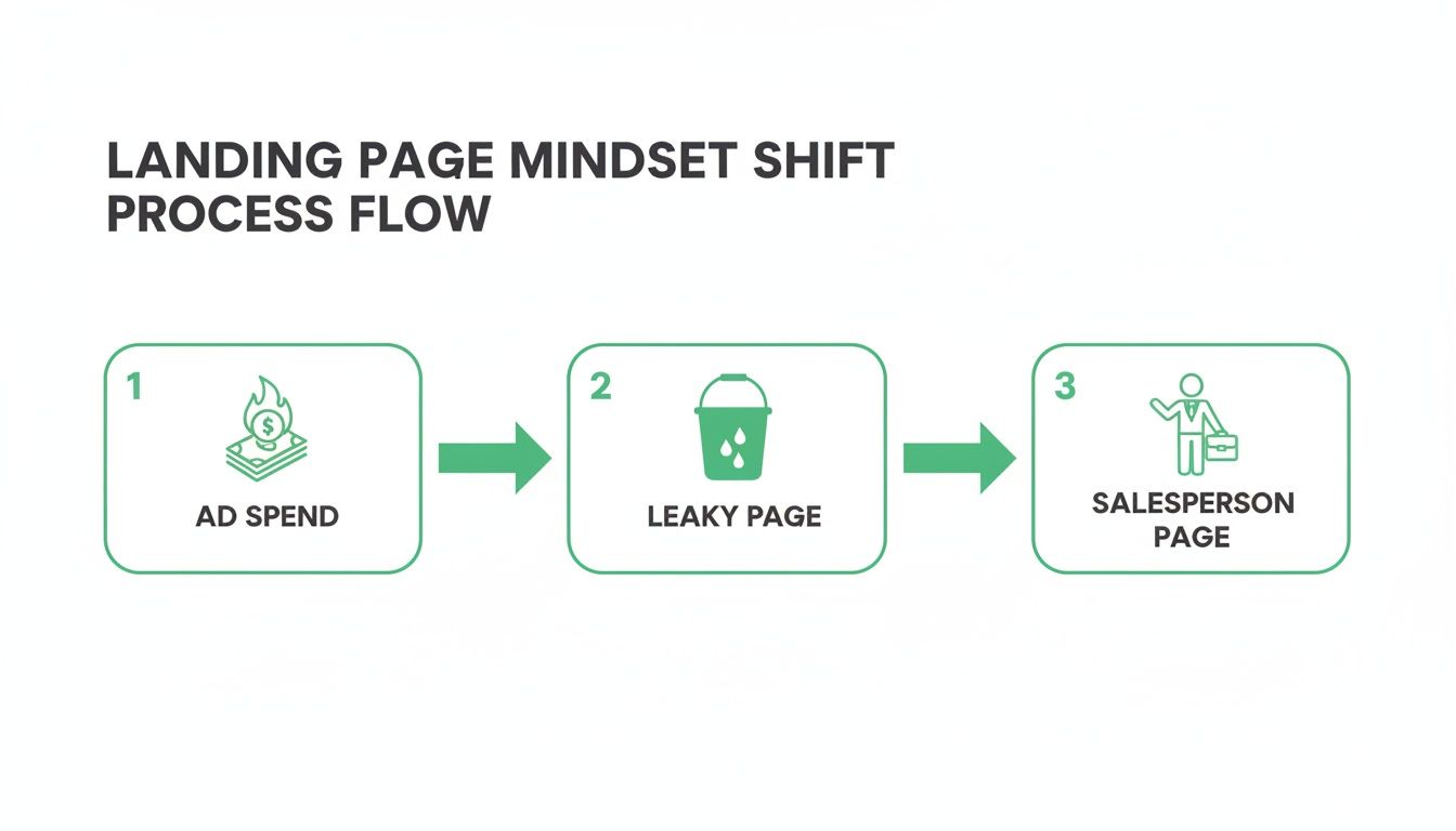
This visualizes the transformation perfectly—from blindly throwing ad spend at a generic page to engineering a focused asset that works as hard as your best sales rep.
The core anatomy of a page that converts
Every winning landing page is built on the same foundational pillars. Get these right, and you're already ahead of 90% of your competition. I've used this exact framework to scale campaigns for B2B SaaS, e-commerce, and everything in between.
For a quick reference, here are the absolute must-haves for any landing page you build for paid search.
Core elements of a high-converting landing page
| Element | Purpose | Quick Tip |
|---|---|---|
| Hero Section | Grab attention in 3 seconds. | Your headline, sub-headline, and CTA must all be visible "above the fold" without any scrolling. |
| Value Prop / Benefits | Answer ‘What's in it for me?’ | Ditch feature lists. Use scannable bullet points that describe outcomes and solve problems. |
| Social Proof | Build trust and credibility. | Raw, authentic customer testimonials outperform polished corporate quotes every single time. |
| The Single CTA | Drive a specific, single action. | Don't create decision paralysis. Use the same CTA button text and link throughout the page. |
Getting these elements in place is non-negotiable. They form the skeleton of a page that guides users, builds confidence, and makes converting feel like the obvious next step.
Your landing page shouldn’t feel like a negotiation. It should feel like the obvious, logical next step in the user's journey. Your blueprint is what makes that path clear and frictionless.
The structure of your page directly controls its performance. Simplicity wins. Studies have shown that shorter landing pages with clear CTAs outperform longer ones by 13.5% on average.
And it’s not just length. Clarity is key. Pages written at a 5th–7th grade reading level convert at 11.1%, nearly double the rate for college-level copy. Given that bounce rates for paid search can be as high as 60–90%, you have no time for complexity.
Mapping your blueprint to ad group intent
This is where the magic really happens. Your blueprint isn't static; it has to be adapted to the intent of the ad group driving the traffic. A user searching for "SaaS pricing comparison" needs a completely different message than someone searching for "best CRM for small business."
Your headline is the most critical link in this chain. It must create an unbreakable bond between the user's search query, your ad copy, and the landing page itself. If your ad promises a "Free Lead Generation Template," your landing page headline better be damn close to "Get Your Free Lead Generation Template."
This isn't just good practice; it's how you signal to Google that your page is highly relevant. That relevance boosts your Quality Score, which in turn lowers your cost-per-click. For a comprehensive look into the elements that make pages truly effective, refer to this detailed guide on creating landing pages that actually convert.
Think of it like this: your blueprint is the master plan for the house, but the paint colors and furniture change depending on who's going to live there. The core structure stays the same, but the message is tailored for maximum impact.
Writing copy and designing forms that convert
If the page structure is the skeleton, the copy is its soul. Let's be blunt: most landing page copy is corporate, bland, and completely misses the mark. It reads like a committee wrote it, and it converts just as badly as you’d expect.
Your job isn't to sound professional. It's to connect with a real person on the other side of the screen who has a problem. You need direct, punchy copy that speaks to their actual pain point and frames your offer as the only logical solution. This is where you actually earn the conversion.
Nail the headline and sub-headline
Your headline is everything. It’s the first—and often the only—thing people read. If it doesn’t instantly tell them they’re in the right place, you’ve lost them. It's that simple.
A powerful headline achieves message match with your ad and clearly states the main outcome the user will get. Don’t get clever; get clear.
The sub-headline should then expand on that promise, adding a layer of detail or knocking down a key objection. Think of it as the one-two punch that keeps them scrolling down the page.
- Bad headline: Innovative Business Solutions
- Good headline: Get 50% More Sales Leads in 90 Days
- Good sub-headline: Our AI-powered system finds qualified prospects your team is missing, guaranteed.
See the difference? The first is meaningless corporate fluff. The second is a specific, desirable outcome with a timeframe. It’s a promise, not a slogan.
Sell benefits, not features
This is marketing 101, yet founders and tech people get it wrong constantly. We fall in love with our product's features—the intricate details of what it does. But guess what? Your customer doesn't care about your features. They care about what your features do for them.
They’re buying an outcome. A solution to a frustrating problem. A better version of their business. Your copy has to reflect that reality, full stop.
Stop listing technical specs and start describing the transformation. Nobody buys a drill because they want a drill; they buy a drill because they want a hole. Sell the hole, not the drill.
Try this simple exercise: translate every single feature into a tangible benefit. It can completely reframe your copy and make it 10x more persuasive.
- Feature: Our platform uses a proprietary AI algorithm.
- Benefit: Stop guessing. Get a prioritized list of your hottest leads delivered to your inbox every morning.
- Feature: Real-time analytics dashboard.
- Benefit: Know exactly which campaigns are making you money—and which are wasting it—at a glance.
This approach shifts the entire focus from your product to your customer's success, which is exactly where it needs to be.
Designing the form: The final hurdle
Now, let's talk about the form. This is where so many otherwise great landing pages completely fall apart. You've done all the hard work to get the click and persuade the visitor with killer copy, only to hit them with a monstrous form that feels like an interrogation.
Every field you add introduces friction and kills your conversion rate. It's a psychological tax you're forcing the user to pay. Your goal is to ask for the absolute bare minimum you need to qualify and contact the lead. Nothing more.
For most lead-gen campaigns, that means:
- Work email: Essential for B2B qualification.
- First name: Personalization is always a good touch.
- Maybe one more field: If absolutely necessary, like "Company Size" or "Biggest Challenge," but test this rigorously.
Asking for a phone number is a huge commitment. It often tanks conversion rates unless the user has extremely high intent, like someone booking an emergency plumber. Start lean. You can always gather more info later in the sales process.
Ultimately, a great form feels effortless. It’s short, the labels are clear, and the button text reaffirms the value they're about to receive (e.g., "Get My Free Audit" instead of a lazy "Submit"). Don't let a poorly designed form be the reason a valuable lead walks away.
Implementing conversion tracking you can trust
If you aren't measuring conversions properly, you're just flying blind and burning money. It really is that simple.
All the effort you just sank into building a killer landing page is completely wasted if you have no idea whether it's actually working.
Too many founders I talk to are still optimizing their Google Ads for clicks or, even worse, for vanity metrics like impressions. That’s an expensive habit. The only metric that keeps the lights on is revenue, and you can't trace a path to revenue without rock-solid conversion tracking.
This isn’t some dark art for technical wizards. It’s a non-negotiable part of building a business driven by data, not guesswork. So let’s get it right.
The right way to track with GTM
First, stop placing code snippets directly on your site. The only sane way to manage tracking in 2026 is with Google Tag Manager (GTM). Think of it as a central hub for all your marketing tags—it keeps your site code clean and lets you make changes without having to bother your developers every single time.
The goal here is to fire a Google Ads conversion tag only when a real lead is generated, not just when someone lands on the thank-you page. That means tracking the form submission event itself.
If your data is wrong, every single decision you make based on that data will also be wrong. Garbage in, garbage out. Setting up clean, event-based tracking is the single most important technical step in your entire paid acquisition funnel.
For a more detailed walkthrough, this comprehensive guide on Google Ads conversion tracking setup covers the technical specifics you'll need to get this done correctly.
Why conversion values are non-negotiable
Okay, so you’re tracking leads. That's a huge step. But we can—and should—go one level deeper. This is the part that really separates the amateurs from the pros. You need to pass a conversion value back to Google Ads with every single lead.
Why? Because not all leads are created equal. A lead from a Fortune 500 company is infinitely more valuable than a lead from a student doing research. Without a value attached, Google's algorithm treats them exactly the same.
By assigning a monetary value, you give the algorithm the data it needs to start optimizing for what truly matters: revenue. This is how you shift from simply buying clicks to making strategic investments in acquiring high-value customers.
Here’s a simple way to get started:
- Estimate your lead value: Calculate your average deal size and your lead-to-close rate. If your average customer is worth €10,000 and you close 1 in 20 leads, then each lead is worth €500.
- Pass the value dynamically: In GTM, you can configure your conversion tag to include this value. To start, you can just hardcode the average value.
- Get more advanced later: As you scale, you can work with developers to pass dynamic values based on what a user selects in your form (like company size or service requested).
Passing this data unlocks Google's smart bidding strategies like Target ROAS (Return on Ad Spend). The algorithm stops looking for just anyone who will fill out a form and starts hunting for users who look like your most profitable customers. This simple step is the key to true scalability and profitability in your paid search efforts. 🚀
The real growth engine is testing and scaling
So, you’ve built your page and your tracking is solid. Congratulations, you’ve completed the first 10% of the work.
Now for the other 90% that actually makes you money.
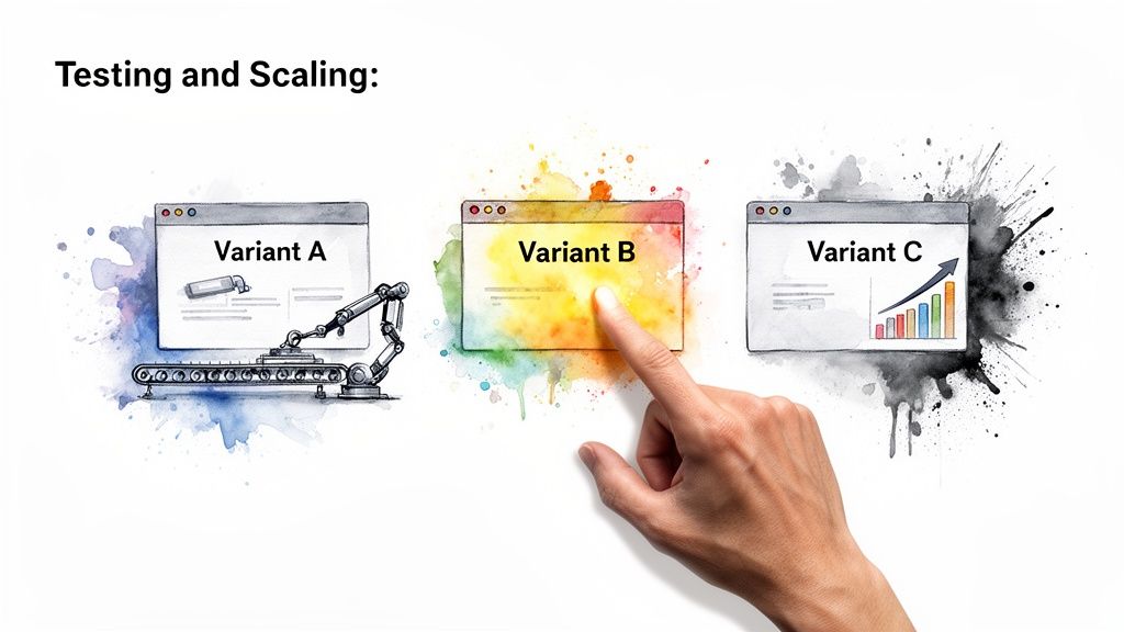
Launching a single landing page is just the start. The real growth comes from relentless testing and intelligent scaling. Most people get this part completely wrong. They spend weeks A/B testing trivial things like button colors—swapping red for green—and then wonder why the needle isn't moving.
Frankly, it’s a waste of time. While minor tweaks can sometimes provide small uplifts, they rarely lead to the 2x or 3x improvements that fundamentally change your business. You have to test the big, bold ideas first.
High-impact testing that actually matters
Instead of obsessing over minor design elements, focus your energy on the core components of persuasion. These are the levers that produce significant swings in performance.
- Your core offer: This is the biggest one. Test completely different value propositions. Instead of a "Free Demo," try a "Free ROI Audit" or a "Personalized Growth Plan." The offer itself is often a bigger driver than any copy you write about it.
- The headline: Test radically different angles. One headline might focus on saving money, while another focuses on saving time or reducing risk. You're testing the core psychological trigger, not just a few words.
- Form structure and friction: Test the number of fields. A radical test isn't just removing one field; it's going from five fields to just an email address to see how it impacts lead volume versus lead quality. Or test a multi-step form against a single-step one.
Testing button colors is like rearranging the deck chairs on the Titanic. Testing your core offer is like changing the ship’s destination entirely. Focus on the big moves first.
This isn't just theory; it's a numbers game. When you learn how to create a landing page that’s optimized for conversion, the financial impact is massive. Across major markets, the single biggest lever is its impact on conversion rate and ROAS. Research analyzing millions of visitors set the median conversion rate at 6.6% across industries, but top performers regularly hit 10–15%+ through systematic optimization.
For a campaign spending €50,000/month at €10 CPC, jumping from a 3% to a 9% conversion rate means going from 150 to 450 leads without raising spend—cutting your cost per lead by 66%. You can explore more data about these landing page stats to see the full picture.
Scaling beyond manual grunt work
Once you find a winning formula through testing, the next challenge is scaling it. Manually building a unique, message-matched landing page for every single ad group is an operational nightmare.
It's the kind of soul-crushing work that burns out even the most dedicated marketing teams.
Imagine you have 50 ad groups. Are you really going to build and maintain 50 different pages by hand? Of course not. It's dumb, slow, and impossible to manage.
This is where modern tools and automation become non-negotiable for anyone serious about paid acquisition. The future isn't about being a faster page builder; it's about building a system that scales persuasion.
The key concept here is programmatic landing page generation.
This approach uses technology to automatically create thousands of unique page variants based on a set of rules and data inputs, like the keywords in your Google Ads campaign. This creates perfect message match for every single click, something that's physically impossible to do manually.
This isn’t some far-off futuristic idea. This is what the best performance marketing teams on the planet are doing right now. They're building engines, not just pages.
They're letting technology handle the repetitive, manual work so they can focus on high-level strategy and creative testing. If you’re still copying and pasting in a page builder, you're already falling behind. 🚀
Frequently asked questions
Alright, let's wrap this up. I get asked these same questions all the time by other founders and marketers trying to figure out landing pages. There’s a lot of noise out there, so here are some straight answers. No fluff.
How many landing pages do I need for my Google Ads campaigns?
Honestly? You need as many pages as it takes to get a perfect message match for every high-value ad group you're running. The old-school approach of pointing an entire campaign to one generic page is just lazy, ineffective, and a brilliant way to burn cash.
Think about it. Someone searching for "emergency plumbing services" has a completely different mindset and urgency than someone searching for "bathroom renovation costs." Sending them to the same page is just dumb. A page that precisely mirrors the ad's promise will always win a higher Quality Score and convert better.
Trying to do this by hand is impossible once you have any real scale, which is why platforms that automate page creation are becoming the standard for any team that's serious about performance.
What is a good conversion rate for a landing page?
This question is a trap. Stop obsessing over universal averages—they vary wildly by industry, offer, and traffic source. A "good" conversion rate is simply one that's better than whatever you had last month.
Sure, you might see a median rate of 6-7% quoted in some blog post, but I’ve seen top-tier lead gen pages hit 10-15% or even higher. Instead of chasing a magic number, focus on the delta—your rate of improvement.
Your goal isn't to hit an arbitrary benchmark. It's to build a system of continuous improvement. If you can take your page from 3% to 6%, you've just doubled your leads for the exact same ad spend. That's a massive win.
Pour your energy into testing and beating your own numbers. That’s the only benchmark that actually matters to your bottom line.
Can I use my website homepage as a landing page?
Please, for the love of your ROAS, just don't. It's one of the fastest and most common ways to absolutely torpedo your campaign performance.
Your homepage is built for exploration. It's a digital brochure with navigation menus, dozens of links, and multiple calls to action all competing for attention. It has to serve everyone.
A landing page, on the other hand, is a focused conversion tool. It has one job and one job only: get the visitor to take one specific action.
Sending paid traffic to your homepage is like inviting a high-value prospect to a crucial sales meeting and then leaving them in the lobby to figure things out for themselves. It’s a jarring user experience and a complete waste of your ad budget. Every click you pay for deserves a dedicated, focused destination. Period.
Ready to stop building pages and start building a conversion engine? At dynares, we've built the platform to do just that—automating the creation of high-intent, message-matched landing pages for every ad group. See how you can scale your paid acquisition at https://dynares.ai.


