Here’s a hard truth most marketers won’t admit: landing pages are often the biggest money pit in digital advertising. They're frequently little more than glorified digital brochures, meticulously designed to burn through your ad budget with zero results to show for it.
A landing page that actually converts isn’t about pretty design or clever copy. It’s a finely-tuned machine built for one job and one job only. And most businesses get this spectacularly wrong.
Why your landing pages are quietly killing your campaigns
Let’s be blunt. As a founder who has built and scaled tech products, I've seen millions of euros vaporized by terrible landing pages. It’s the single biggest point of failure in almost every marketing campaign, yet everyone’s quick to blame their ads, the algorithm, or a full moon. It’s nonsense.
The problem isn't your ad platform; it's what happens after the click. You've spent a small fortune to get someone to tap on your ad, only to dump them onto a generic, unfocused page that has almost nothing to do with the specific promise you just made. This disconnect is where your revenue goes to die. 💀
The great ad-to-page disconnect
Think of your ad as a promise. You promise a solution to a very specific problem. When a user clicks, they expect to see that promise fulfilled instantly and without any guesswork.
The moment a visitor has to ask themselves, "Am I in the right place?" you’ve already lost. Any friction, any confusion, any slight misalignment, and they're gone. We're talking seconds. This isn’t just a small mistake; it's a fundamental misunderstanding of user psychology.
A landing page has one job: to convert a visitor for a single, specific offer. Any element that doesn’t directly support that one goal is a distraction that is actively costing you money.
This isn’t about aesthetics. It’s about creating a seamless, logical journey from intent (the search query) to promise (the ad) to fulfillment (the landing page). Break that chain, and you break your entire business model.
Ditching the 'one-size-fits-all' myth
The most common—and laziest—mistake is building one landing page and pointing dozens of different ad groups at it. It’s a recipe for disaster.
Sending traffic from an ad for "small business accounting software" and another for "enterprise financial tools" to the exact same page is just plain dumb. Their needs, pain points, and the language they use are worlds apart.
Here’s where most campaigns bleed money:
- Message Mismatch: The headline on the page doesn't echo the ad copy, causing instant confusion and a bounce rate that makes your analytics weep.
- Ignoring User Intent: The page offers a generic, feature-dump solution when the user was searching for something highly specific.
- Information Overload: Instead of one clear call-to-action, the page is a minefield of navigation links, social media icons, and other escape routes.
It’s time to stop making excuses and start taking radical ownership of the post-click experience. This is where you separate the amateurs from the pros—and finally build landing pages that actually drive revenue.
Understanding the real numbers behind conversion rates
Alright, let's get real about conversion rates. Every founder I talk to is chasing some mythical number they saw in a guru's tweet. Chasing that number without context is a complete waste of energy.
Stop comparing your SaaS landing page to an e-commerce page selling €20 t-shirts. You're not playing the same sport. One is asking for a complex, long-term commitment; the other is an impulse buy. Of course their conversion rates will be wildly different, and that’s okay.
What does 'good' actually look like?
Most founders are flying blind, setting goals based on wishful thinking instead of industry reality. The hard truth is, the median landing page conversion rate across all industries is just 6.6%. But even that number can be dangerously misleading without more context.
For example, pages for events and entertainment might see median rates around 12.3%, while B2B SaaS often scrapes by with a median of 3.8%. The lesson here? Context is everything. Your goal isn't to hit some random global average; it's to consistently outperform the benchmarks in your specific niche.
Chasing a vanity metric without understanding your industry's baseline is like training for a marathon by running sprints. You're in the wrong race, and you're going to burn out.
Understanding these numbers is the first step toward building a data-driven strategy instead of just guessing. It lets you set realistic targets and focus on making meaningful improvements that actually move the needle for your business. Anything less is just marketing theater.
This chart breaks down some of the most common—and frankly, avoidable—reasons why landing pages that should convert just don't.
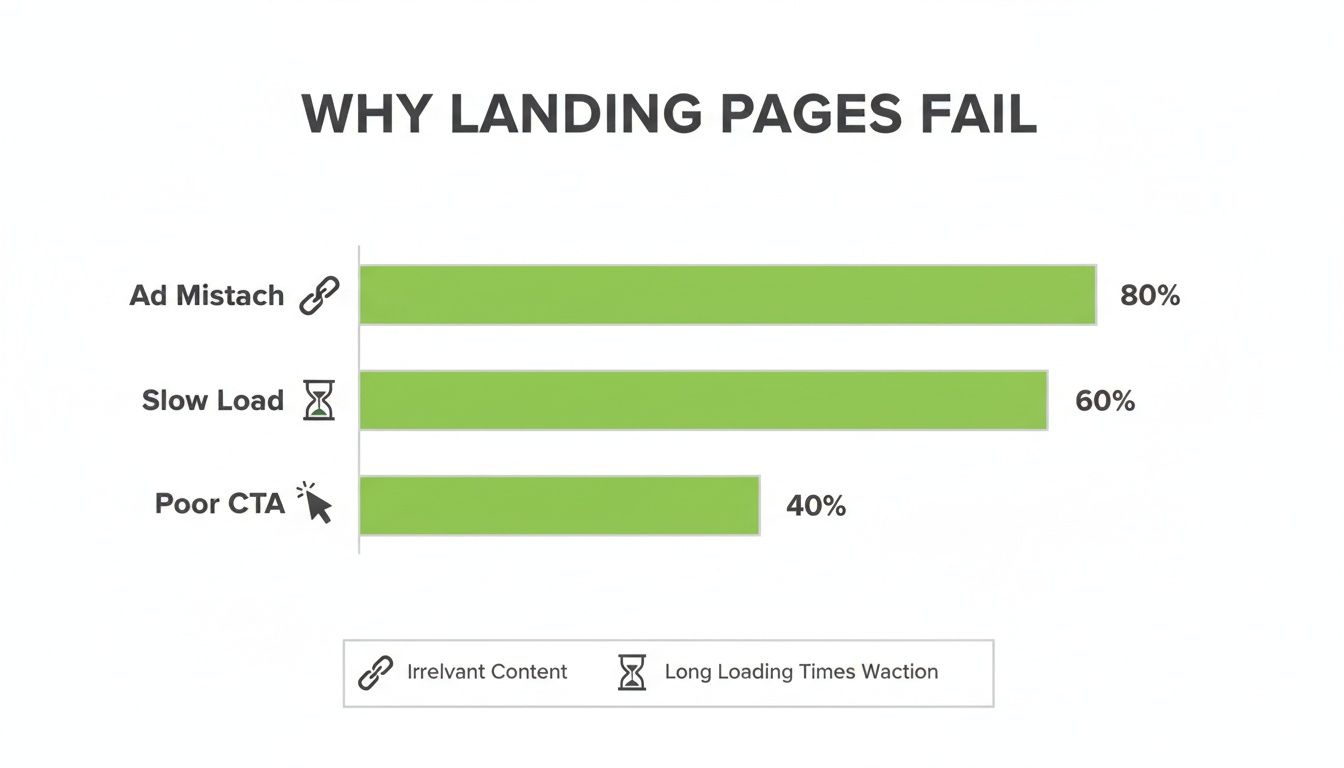
The data is clear: simple mistakes like a slow page or a weak call-to-action are huge conversion killers. But nothing tanks performance faster than a mismatch between your ad and your page.
Benchmarking for a reality check
To build landing pages that actually convert, you need to know where you stand. Stop looking at your overall conversion rate and start segmenting. Your performance will vary drastically based on the traffic source, the offer, and the audience.
Here’s a practical look at how industry benchmarks can give you a much-needed reality check.
| Industry / Category | Median Conversion Rate | Top Performer Rate |
|---|---|---|
| Travel | 8.3% | 24.1% |
| Credit & Lending | 8.0% | 22.5% |
| Legal | 7.9% | 23.9% |
| Events & Entertainment | 7.7% | 27.6% |
| Finance & Insurance | 6.3% | 22.4% |
| B2B Services | 5.2% | 16.1% |
| B2C Services | 4.9% | 14.8% |
| E-commerce & Retail | 4.2% | 14.0% |
| SaaS / Tech | 3.8% | 11.0% |
| Education | 3.5% | 12.4% |
Source: Unbounce Conversion Benchmark Report (2023)
These numbers aren't meant to be gospel, but they give you a starting point. If you're in SaaS and converting at 4%, you're actually doing pretty well. If you're in travel converting at 4%, you have a serious opportunity to improve.
Here’s a simple way to start benchmarking yourself against reality:
- Industry Averages: Find reliable reports for your specific sector (like the one above). This is your baseline.
- Traffic Source: What's the conversion rate from Google Ads versus LinkedIn? Paid traffic should always be sent to a dedicated landing page, never your homepage. If your tracking is a mess, you're just lighting money on fire. Our guide on setting up Google Ads conversion tracking can help you fix that.
- Offer Complexity: A free demo signup will always convert higher than a "Buy Now" for a €5,000/year subscription. Map your conversion goals to the level of commitment you're asking for.
This isn't about feeling bad if your numbers are low. It’s about getting honest with your data so you can make intelligent decisions. Once you know where the real opportunities are, you can stop wasting time on low-impact tweaks and focus on changes that genuinely grow your business.
Matching your headline to user intent
Let's get straight to it: your headline is the single most important thing on your landing page. Seriously. Forget clever taglines or witty marketing slogans for a moment. This is the ultimate five-second test where a visitor decides if they’re in the right place or if they should smash that back button.
If you get the headline wrong, nothing else you've built on the page matters.
The job of a headline is brutally simple: it has to perfectly match the promise you made in your ad. Any disconnect, no matter how small, creates friction. Friction creates doubt, and doubt absolutely murders conversions. It really is that simple.
We’re not aiming for poetry here. We’re aiming for raw, unambiguous communication that makes the visitor instantly nod and think, "Yes, this is exactly what I was looking for."
The psychology of a winning headline
A great headline isn't about being smart; it's about being understood instantly. To stop someone from bouncing, it has to nail three core psychological triggers. Clarity over cleverness is key; your headline must state the outcome or solve the exact problem the user searched for. If they looked for "small business accounting software," your headline should be something like "The Easiest Accounting Software for Small Businesses," not "Reimagining Your Financial Future." Be direct.
Relevance is non-negotiable. The language has to mirror your ad copy and the original search query. This creates a seamless "scent trail" from their initial thought all the way to your page, reassuring them they've made a good click.
Once—and only once—clarity and relevance are locked in, you can add a sub-headline that hints at a unique benefit or surprising outcome. But this is a secondary concern. Nail the basics first.
This isn't just theory. When you create this perfect match, you're tapping directly into the user's confirmation bias. You're showing them what they already want to believe: that they’ve finally found the solution.
Your visitor didn't click your ad to be entertained or impressed by your copywriting. They clicked to solve a problem. Your headline must immediately scream, "Problem solved here."
From ad keyword to headline copy
Let's make this practical. The best way to achieve a perfect message match is to map your Google Ads keywords directly to your headline copy. If you're running multiple ad groups (and you should be), you need multiple landing pages. This is non-negotiable if you’re serious about building landing pages that convert.
Here’s a simple, no-nonsense framework to get it done:
- Identify the Core Keyword: Look at your highest-traffic ad group. What's the primary keyword? Let’s say it’s "CRM for marketing agencies."
- Reflect it in the Headline: Your H1 headline must contain that phrase or a very close variation. For example, "The #1 CRM for Marketing Agencies."
- Use the Sub-headline for the Benefit: Your H2 sub-headline should expand on that promise. Something like, "Stop juggling spreadsheets and start landing more clients in half the time."
By following this structure, you create an unbreakable link between what the user was thinking, the ad they clicked, and the page they landed on. You’ve eliminated all the guesswork and replaced it with an instant feeling of "I'm in the right place".
This isn’t some marketing "trick"—it's the fundamental price of entry for turning expensive clicks into actual revenue. Anything less is just lighting your budget on fire. 🔥
Designing for action, not distraction
Your landing page has exactly one job: get the user to take a specific action. That's it.
Anything that doesn't push them toward that goal is a distraction, and distractions kill conversions. We're not building a website here; we're building a highly focused machine designed to do one thing well. Every button, every image, and every line of text should be a signpost pointing straight to your call-to-action (CTA).
It’s time to stop decorating and start directing.
Embrace ruthless simplicity
Think of your landing page like a high-stakes negotiation. You have a few precious seconds of someone's attention. The more choices you offer, the more likely they are to make the wrong one—which is usually to just leave. This is why you must eliminate every possible escape route.
The prime offenders to cut immediately are navigation menus, footer links, and social media icons. Removing the main navigation is a non-negotiable best practice for landing pages. Don't give them a door to walk out of. Your "About Us" page has no place here. And unless your goal is to get more Twitter followers instead of customers (a terrible goal), get rid of the social links. They are shiny objects that lead users away from the prize.
Your job as a designer isn't to add more elements; it's to take away everything you possibly can until only the essential path to conversion remains. The goal is an attention ratio of 1:1—one goal, one link to click.
This isn't about making your page look sparse or boring. It’s about using visual hierarchy to create a clear, guided path. Use size, color, and whitespace to make your headline and CTA the undeniable stars of the show. For a deeper dive, check out our guide on landing page design best practices.
The hard truth about mobile-first design
Let’s be brutally honest: if your landing page sucks on mobile, your campaign is already dead. The data is overwhelming. While mobile devices generate 83% of all landing page traffic, they convert about 8% lower than desktop. That gap is a massive, costly failure in design philosophy.
Worse yet, every extra second your page takes to load costs you another 7% in conversions. You can't afford to ignore this.
For years, people talked about "responsive design." That's not enough anymore. Responsive often just means your desktop page crams itself awkwardly onto a smaller screen. It's a reactive approach, and it’s costing you a fortune.
You need to adopt a mobile-first mindset. This means you design the mobile experience first, then adapt it for larger screens. It forces you to be ruthless with your content and focus only on what is absolutely essential.
Here's why mobile-first is the only way forward:
- It Forces Focus: With limited screen real estate, you have no choice but to prioritize the headline, a single CTA, and the most critical benefit. All the fluff gets cut.
- It Improves Speed: Mobile-first design naturally leads to lighter pages with optimized images and scripts, directly addressing the speed issue that murders conversion rates.
- It Matches User Behavior: Your users are scrolling with their thumbs while waiting for a coffee. They don’t have time for your clunky, slow-loading desktop replica. Give them a fast, frictionless path to the CTA, or they’re gone.
Stop treating mobile as an afterthought. It’s where the vast majority of your audience lives. Start there, and you’ll build faster, more focused, and higher-converting pages by default. It's the only logical way to operate.
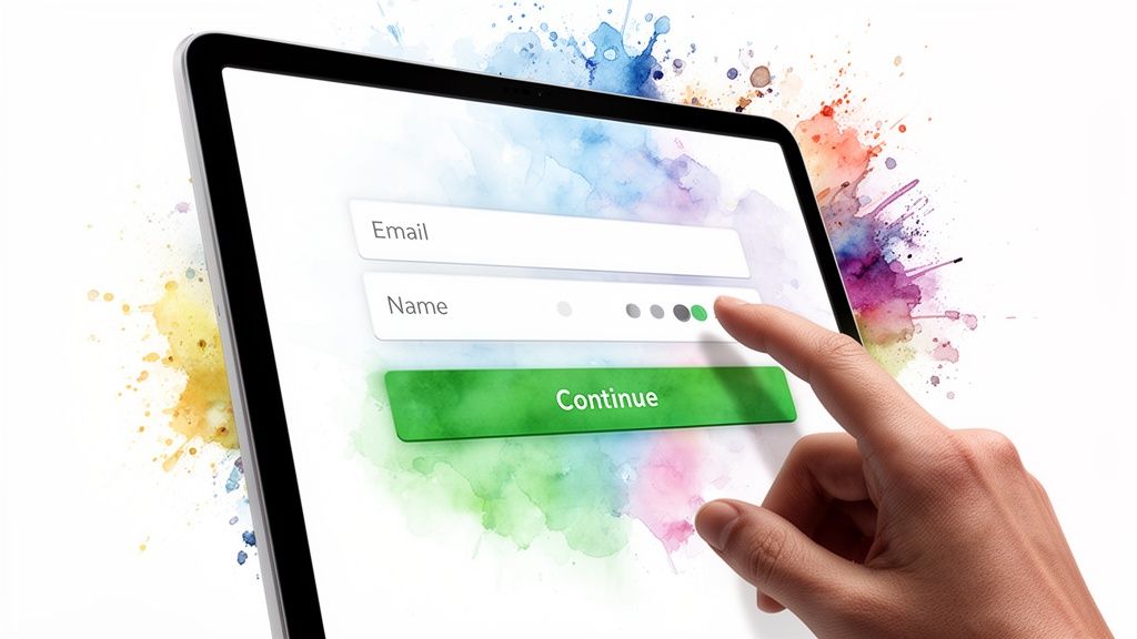
Building frictionless forms that people actually complete
Let’s be direct: nobody enjoys filling out a form. They don't want your form; they want the valuable thing on the other side of it. Your job is to make that transaction as painless as possible. Every single field you add is friction, and friction is the silent killer of landing pages that convert.
This is where so many campaigns bleed money. You do all the hard work to get someone to the page, convince them with a great headline and offer, and then you throw a monstrous form in their way. It’s a dumb, unforced error. Respect your user's time and attention. Making a few smart changes here can deliver a massive uplift in qualified leads.
The 'less is more' philosophy
The golden rule of form design is brutally simple: ask for the absolute minimum amount of information you need to qualify and contact the lead. Every optional field you think is "nice to have" is costing you conversions. Studies have shown that reducing form fields from 11 to 4 can increase conversions by as much as 120%. That’s not a small number.
Here’s a practical way to think about it. For top-of-funnel offers like an eBook download, just ask for an email, maybe a first name if you absolutely must. For a mid-funnel webinar, you can ask for a company name. For bottom-of-funnel requests like a demo, you can ask for more qualifying info like a phone number, but only if you have a concrete plan to call them immediately. It’s one of the highest-friction fields you can possibly include.
Smart design reduces cognitive load
Beyond just the number of fields, how you present the form makes a huge difference. You want the process to feel easy and fast. A few simple tricks can completely change the user's perception of the effort required.
The goal isn't just to have a shorter form; it's to make the form feel shorter. This is about managing psychological friction, not just counting fields.
Break up longer forms into multiple steps. Asking for contact info on step one and company details on step two feels far less intimidating than one long, scary form. This leverages a psychological principle called the "sunk cost fallacy"—once they've started, they're more likely to finish. For more inspiration, check out how modern AI platforms are creating dynamic, user-friendly forms that guide users through the process.
The details that drive conversions
Finally, sweat the small stuff. The details of your form are what separate a good experience from a great one. These aren't minor tweaks; they're essential for building frictionless user journeys.
Ditch "Submit" on your buttons. It’s lazy and uninspiring. Use action-oriented, value-driven copy like "Get Your Free eBook," "Start My Trial," or "Book My Demo." Tell them what they’re getting. Be specific and helpful with error messages. Instead of a generic "Invalid field," say "Please enter a valid email address." Guide them to success instead of just pointing out their mistakes. And if it makes sense for your audience, offer Google or LinkedIn login options. It reduces typing to a single click, dramatically lowering the barrier to entry.
To truly build frictionless experiences, delve into Simplifying User Journeys for More Signups to guide visitors toward conversion. These small optimizations compound, turning a leaky funnel into a powerful lead-generation machine. It’s not magic; it’s just good, empathetic design.
Stop guessing and start testing your way to growth
If you’re not A/B testing your landing pages, you’re not doing performance marketing. You’re gambling with your ad budget and hoping for the best.
Let’s be perfectly clear: intuition is valuable, but data is undeniable. It’s time to stop guessing what might work and start systematically testing your way to higher conversions.
This isn’t about making tiny, insignificant tweaks like changing a button from blue to green. That’s amateur hour. I’m talking about building a rigorous testing framework that delivers real, measurable growth. You need to be testing the big stuff—the headlines, the core offers, the entire page layouts. This is how you build a real competitive advantage.
A/B testing vs. guesswork
The foundation of any good testing program is a strong hypothesis. A random change is just a guess; a test based on a hypothesis is a strategic experiment. And no, a hypothesis isn't just "I think this will be better." It's a structured, falsifiable statement.
A solid hypothesis looks like this: “By changing the headline from a feature-focused statement to a benefit-driven question, we will increase form submissions by 15% because it will resonate more directly with the user’s primary pain point.”
See the difference? It has a specific change, an expected outcome, and a clear rationale. Without this structure, you're just throwing spaghetti at the wall to see what sticks. That’s not a strategy; it’s a waste of traffic and time. Every test, win or lose, should teach you something valuable about your customers.
High-impact testing that actually moves the needle
Forget about button colors for a minute. If you want to see a significant uplift in your conversion rates, you need to focus on the elements that have the biggest psychological impact on your visitors. These are the tests that can fundamentally change the performance of your campaigns.
The real leverage is in testing your core offer, your headline and sub-headline, and your overall page layout. Is "Book a Demo" really the right ask? Maybe a "Free Trial" would perform better. Test radically different headline angles—pit a benefit-driven headline against one that invokes urgency. Does a short-form page outperform a long-form page? These are the tests that reveal profound insights into how your audience prefers to consume information and can lead to 20-30% lifts.
A/B testing is a great starting point for this, but for those with enough traffic, multivariate testing allows you to test multiple changes at once. You can learn more about the differences in our guide comparing multivariate testing vs A/B testing.
The goal of testing isn't just to find a single 'winner.' It's to build a deep, data-backed understanding of what truly motivates your customers. Every test is a lesson.
The future is automated AI-powered testing
Let’s be honest. Manually setting up, monitoring, and analyzing A/B tests is a massive time sink. It’s important, but it’s slow. This is where modern AI platforms are completely changing the game.
Imagine being able to test not just two, but thousands of variations of your headlines, images, and CTAs simultaneously.
This is the new frontier. AI can automatically create countless variations, distribute traffic intelligently, and dynamically route more visitors to the winning combinations in real time. This isn't just about efficiency; it's about achieving a level of optimization that is physically impossible for a human to manage.
This is how you build an unstoppable conversion machine. You let the system do the heavy lifting of continuous experimentation, freeing you up to focus on the high-level strategy. This is no longer science fiction; it’s the new standard for building landing pages that convert at scale. 🚀
Frequently asked questions
Alright, let's wrap this up by tackling some of the questions I get hit with all the time. Building landing pages that actually convert isn't black magic, but there's a lot of noise out there. Here are some straight answers to help you focus on what really moves the needle.
How many landing pages do I need for my campaigns?
Honestly? As many as it takes. That might sound like a non-answer, but it’s the simple truth.
The better question is: how many distinct ad groups are you running? The goal isn't hitting some magic number of pages; it's achieving 100% message match for every single ad group.
A huge, cash-burning mistake I see constantly is sending traffic from five different ad groups—each with a unique user intent—to one generic page. It’s lazy, and it’s a big reason why campaigns underperform. If you're targeting "small business accounting software" in one ad group and "enterprise financial tools" in another, those are two completely different worlds. They demand two completely different landing pages with tailored headlines, copy, and proof points.
Think of each landing page as a specialized tool. You wouldn't use a hammer to drive a screw. Stop trying to make one page do every job. More specific pages mean higher relevance, better Quality Scores, and ultimately, more conversions. It’s more work upfront, but the ROI is undeniable.
What is the most important element on a landing page?
This is a classic. Everyone wants a silver bullet, but the truth is it’s a partnership between two elements: the headline and the Call-to-Action (CTA). They are the essential one-two punch of any page that converts.
The headline has one job: to instantly grab the visitor by the shoulders and say, "Yes, you are in exactly the right place. I understand your problem." It’s the immediate confirmation that their click wasn’t a waste of time. If your headline fails, nothing else on the page gets read. Game over.
Then, the CTA has to close the deal. Its job is to make the next step painfully obvious, compelling, and frictionless. Everything else—the beautiful design, the clever copy, the powerful social proof—exists purely to support these two things. They build the bridge of logic and emotion that gets someone from the headline to the CTA button.
You could have the most persuasive copy in the world, but if the headline doesn't hook them or the CTA is weak, you've got nothing. They are the bookends of the conversion journey on your page.
Should I include navigation links on my landing page?
Let me make this incredibly simple for you: No. Almost never.
A landing page is a conversion machine with a single purpose. A navigation menu is an escape hatch. Why would you build a focused conversion path and then hand your visitors a map with five different ways to leave? It’s completely counterintuitive and financially destructive.
This all comes down to a concept called the attention ratio. It’s the ratio of links on a page to the number of campaign conversion goals. For a landing page, you are aiming for an attention ratio of 1:1. One goal, one primary action to take.
- Remove the main navigation menu. This is non-negotiable.
- Ditch the footer links. Nobody who is ready to convert cares about your "About Us" page right now.
- Kill the social media icons. You are paying for a lead, not a new follower.
By removing all these distractions, you force the user to focus on the value of your offer and the one action you want them to take. You create a closed loop where the only way forward is through your CTA. It might feel aggressive, but it’s how you build landing pages that actually make you money.
Ready to stop gambling with your ad budget and build high-intent landing pages at scale? dynares uses AI to automatically generate thousands of message-matched ads and landing pages for your campaigns, driving higher conversions and better ROAS. See how it works at dynares.ai.


