To lower your bounce rate, you first have to diagnose the root cause by digging into your traffic segments and auditing your site’s technical health. Then, you have to align your ad's promise with your landing page's reality. This isn’t about guesswork; it’s a systematic process of finding and plugging the leaks where you're losing money.
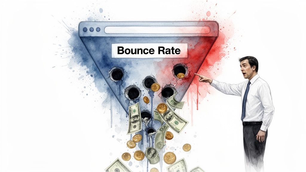
Your high bounce rate is bleeding cash. Let's stop it.
Let’s be direct. A high bounce rate is a silent killer for your paid campaigns. It’s not just some vanity metric floating around in Google Analytics; it’s cash being lit on fire.
Every single visitor who lands on your page and leaves immediately is a click you paid for with zero return. It’s a hole in your bucket, and if you’re serious about scaling, you have to plug it.
I’ve seen founders obsess over tiny product details while completely ignoring a 70% bounce rate on their main lead generation page. It’s madness. You're losing the vast majority of your potential customers before they even get a chance to see what you’ve built.
What is a 'good' bounce rate, anyway?
Forget the generic advice you've read elsewhere. The idea of a universal "good" bounce rate is dumb because context is everything. Obsessing over a single number without understanding the nuances is just a great way to waste your time.
Here’s a more realistic breakdown from my experience, especially for paid campaigns:
- Lead generation pages: For highly targeted traffic (think specific B2B keywords), you should be aiming for under 40%. If your user's intent is high and your message match is sharp, anything higher suggests a serious disconnect.
- E-commerce product pages: These can often be lower, sometimes in the 20-45% range. Users are there to browse and compare, so they naturally click around more if the site is well-designed.
- Blog posts & content: Don't panic if this is 65-90%. A user might land, get the exact answer they needed, and leave completely satisfied. That’s a successful interaction, not a failure.
The only 'good' bounce rate is one that is consistently trending downwards because you are systematically testing and optimizing. Your real benchmark is your own historical data.
The real cost of a bounce
Every bounce isn't just a lost visitor; it’s a cascade of negative effects that hurt your bottom line and kill your campaign's momentum.
It signals to platforms like Google that your landing page experience is poor, which can absolutely tank your Quality Score. A lower Quality Score means you pay more for the same ad position, creating a vicious cycle of wasted spend.
Thinking about how to grab initial interest in a physical retail environment through creative store display ideas offers some valuable parallels. Just like a compelling window display makes someone stop and walk inside, your landing page needs to do the same for a user's attention online.
The goal isn't just to make a number go down. It’s about building a better, more efficient growth engine. Let's get to work.
Okay, let's get into the weeds.
Diagnosing the problem before you change anything
Before you start messing with button colors or rewriting headlines, you need to play detective. A high bounce rate is a symptom, not the disease.
The real problem could be technical, a content mismatch, or a user experience nightmare. Throwing random fixes at it is a fantastic way to waste time and money. Jumping straight into solutions without a proper diagnosis is a rookie mistake—like a doctor prescribing medication before even asking about your symptoms.
You need data, not just gut feelings. The first place to look for clues is inside your analytics.
Find the smoking gun by segmenting your traffic
Your overall bounce rate is an average, and averages can be dangerously misleading. The real insights are hidden in the segments. You have to slice and dice your traffic data to find out who is bouncing and why.
Start by asking the right questions in Google Analytics or whatever platform you use. Don't just look at the top-level number; dig deeper.
The goal here isn’t to find a perfect answer immediately. It's about narrowing the field of suspects. If you discover that 85% of your mobile traffic from paid search bounces, you’ve found your smoking gun. Now you know exactly where to focus your energy.
Properly diagnosing these issues starts with solid data, which means having reliable tracking. If your metrics are a mess, your diagnosis will be too. It’s worth taking the time to ensure your Google Ads conversion tracking setup is configured correctly so you can trust the numbers you're seeing.
Your non-negotiable technical audit
Once you have a hypothesis from your traffic segments, the next step is a technical audit. Let's be brutally honest: if your site is slow, nothing else matters. All the brilliant copy and design in the world is useless if the page doesn’t load.
Page speed is everything, especially for paid search traffic where user patience is practically zero.
Research shows that as page load time goes from 1 to 10 seconds, the probability of a bounce skyrockets by a staggering 123%. For mobile users, it’s even more unforgiving; over half will abandon a site that takes longer than 3 seconds to load. You can read more about these sobering website statistics and see just how critical speed is.
A great free tool for this is Google's PageSpeed Insights. Just plug in your URL and it gives you a performance score.
This report instantly tells you how you're doing on both mobile and desktop and highlights key areas for improvement, like Largest contentful paint (LCP).
Don't get lost in the technical jargon. Focus on the main score and the big, red warnings. If your mobile performance score is in the red, that is your top priority. It's the technical equivalent of a fire alarm going off.
This isn't a "nice-to-have"; it's a foundational fix required before you can effectively lower your bounce rate and get the conversions you're paying for.
Align your ad promise with your page reality
So, your site is technically sound and loads in a flash. Great. Now comes the part that tech specs can't solve: Does your landing page actually deliver on what your ad promised?
This is the absolute heart of message match. It's that critical moment a user clicks your ad, and the page that loads either confirms they made a smart choice or makes them feel like they've been duped. Get this wrong, and you’re just paying to disappoint people.

If your ad screams "Affordable Legal Software for Startups" but the landing page headline mutters a generic "Welcome to LegalCorp," you’ve created a massive disconnect. The user instantly feels they’re in the wrong place and hits the back button. It’s that simple, and I’ve seen this exact mistake cost companies thousands.
Beyond the headline
Message match isn't just about parroting the ad's headline. Real alignment means creating a seamless, reassuring journey from the first impression all the way to the conversion. You need to align the entire experience.
Think about these critical elements:
- Imagery: Does the visual style of your page vibe with the ad? If your ad uses a sleek, modern design, a landing page that looks like it's from 2005 will feel jarring and untrustworthy.
- Value propositions: Are the key benefits you shouted about in your ad copy (like saving 10 hours a week) immediately visible on the page? Don't make people hunt for the reasons they clicked.
- Call-to-action (CTA): The language here has to be consistent. If your ad says "Get Your Free Demo," the button on your page needs to say the exact same thing—not "Contact Sales." Tiny differences create major friction.
This idea of a cohesive experience is non-negotiable. Ensuring strong landing page relevance can dramatically lower your CPC and boost ROAS because platforms like Google actually reward you for giving users what they expect. It’s a win-win.
Make your page effortless to use
Once you’ve nailed the message match, the next hurdle is the user experience (UX) itself. Even the most relevant page will flop if it’s a pain to navigate. This isn't about flashy, award-winning design; it's about ruthlessly cutting out every possible point of friction.
Is your page a dense wall of text? Is the form a 20-field monster? These are classic, unforced errors. You’re asking a potential customer to do hard work just to figure out your offer. Most won't bother.
The best landing pages aren't the ones with the flashiest design. They're the ones that feel completely intuitive. The user should never have to think, 'What do I do next?' The path to conversion should be obvious and inviting.
Let's break down some simple but powerful UX principles that I’ve seen work time and again. This is all about making the journey from ad click to conversion as smooth as possible.
Simple UX principles to cut bounce rate
You don’t need to be a design guru for this. This is about clarity and common sense. A user just landed on your page; their attention is a fragile resource. Don't waste it.
Use clear headings and subheadings to break your content into scannable chunks. A user should be able to grasp your page's entire story just by reading them. Embrace bullet points to list features and benefits, and use plenty of white space to make content feel less intimidating. Finally, make your call-to-action button the most visually dominant thing on the page. A visitor should know exactly what you want them to do within seconds.
These aren't just suggestions; they are fundamental requirements for any landing page that's serious about converting. By aligning your ad's promise with your page's reality—and then making that reality incredibly easy to engage with—you directly attack the root causes of high bounce rates.
Designing forms and CTAs that actually convert
You've done all the hard work. Your page is lightning-fast, the message match is perfect, and the user experience is clean. But then you get to the final frontier—the form and the call-to-action (CTA).
This is where so many qualified leads go to die.
I've seen it happen more times than I can count. A team spends a fortune driving traffic, only to hit visitors with a form that looks like a tax return. It’s an absolute conversion killer. Your form and CTA aren't just elements on a page; they're the final handshake, the last step before a visitor becomes a lead.
Let's tackle this head-on. If your form is the problem, you're losing people who were already interested enough to convert. Fixing it is one of the highest-leverage things you can do to lower your bounce rate and actually see a return on your ad spend.
Stop interrogating your visitors
The golden rule of form design is brutally simple: ask for the absolute minimum information required. Every single field you add increases friction and gives the user another reason to bail.
Your sales team might want 15 data points to qualify a lead, but if that demand kills your conversion rate by 50%, it's a terrible trade-off. You can always gather more information later. The initial goal is just to open the door, not conduct a full background check.
A great way to reduce that initial cognitive load is with multi-step forms. Instead of slamming a user with a wall of 10 fields, you break it down into manageable chunks. By using a progress bar, you gamify the experience and show them how close they are to the finish line. It feels less like an interrogation and more like a guided conversation. This psychological trick works wonders.
Build trust at the point of conversion
Asking for personal information is a big deal. You have to earn that trust, especially right before they click "submit." This is the moment of highest anxiety for a user, and your job is to ease their fears by strategically placing trust signals right next to your form and CTA.
People are rightfully skeptical online. They want to know their data is safe and that they're making a good decision. Your job is to reassure them at the exact moment they feel the most vulnerable—right before they convert.
Don't bury your privacy policy in the footer. Add a clear link right under the email field that says something like, "We respect your privacy and will never share your information." It’s a small detail that makes a huge difference.
Also, add a snippet of social proof nearby. A short testimonial, a customer logo, or a stat like being trusted by 5,000+ businesses can be the final nudge someone needs. It tells them that others have gone before them and had a good experience. Building an effective landing page hinges on these elements; you can find more guidance in our lead generation landing page template, which covers these trust signals in detail.
Your CTA is an offer, not a command
Finally, let's talk about your call-to-action. If your button says "Submit" or "Contact Us," you're missing a massive opportunity. Those phrases are boring, generic, and focus on what you get, not what the user gets.
Your CTA needs to be a compelling offer—an irresistible value proposition packed into a few words. Instead of commanding them to act, entice them with a clear benefit. A weak CTA is "Submit" whereas a strong CTA is "Get My Free Demo". A weak CTA is "Download Now" and a strong one is "Get Your Free Marketing Plan".
The difference is everything. A strong CTA reinforces the value of the exchange and makes the user feel like they are gaining something, not just giving up their information. Offering a powerful lead magnet—like a free guide, a checklist, or a custom report—makes the decision to convert a no-brainer.
When your offer is so irresistible that bouncing feels like a missed opportunity, you’ve truly mastered the art of conversion.
Using automation to lower bounce rate at scale
Alright, let's talk about the real world. Manually creating and optimizing a unique landing page for every single keyword you bid on is a fool's errand. It's slow, it’s mind-numbingly repetitive, and it absolutely does not scale.
You'll burn out long before you see any meaningful results. It's just a dumb way to work.
This is where technology becomes your unfair advantage. If you're still relying on spreadsheets and manual updates to manage dozens, hundreds, or even thousands of keywords, you're bringing a knife to a gunfight. The future of performance marketing is about systems, not manual effort.
The only way to win is systematically
I’m not just talking theory here; I actually built my company, dynares, to solve this exact problem. I was tired of seeing brilliant marketers stuck in the weeds, unable to scale their wins because the manual workload was crushing them. It’s a bottleneck that stifles growth.
Imagine this: you automatically generate a unique, high-intent landing page for every keyword in your campaign. The user searches "cloud accounting software for freelancers," and the page they land on has the headline "Cloud Accounting Software Built for Freelancers." The message match becomes perfect by default.
This isn't about working harder; it's about building an intelligent machine that does the heavy lifting for you. When you automate the tedious parts, you free yourself up to think strategically about the business, which is where the real value is.
This is how you lower bounce rate systematically. It’s not a one-off fix; it's a fundamental shift in how you operate.
How automation works in practice
So, how does this actually look day-to-day? It's not some black-box magic. It's a logical process that combines smart templates with AI-driven content generation and relentless testing.
- Standardize with a template builder: First, you define your brand's look and feel within a template. You set the colors, fonts, and layout once. This ensures every page generated is 100% on-brand, maintaining consistency and trust with your visitors.
- Let AI handle the copy: This is the core of the operation. The platform injects the specific keyword the user searched for directly into the headline, subheadings, and body copy. It creates a hyper-relevant experience that tells the user, "Yes, you are in the right place," within the first second.
- Run automated A/B tests: The system doesn't just create pages; it constantly tries to beat them. You can set it to automatically test different headlines, images, or calls-to-action across your pages. It finds the winning variants and directs traffic to them without you lifting a finger.
The below infographic breaks down some of the core conversion-focused elements, like form design, that can be standardized in templates and then automated.
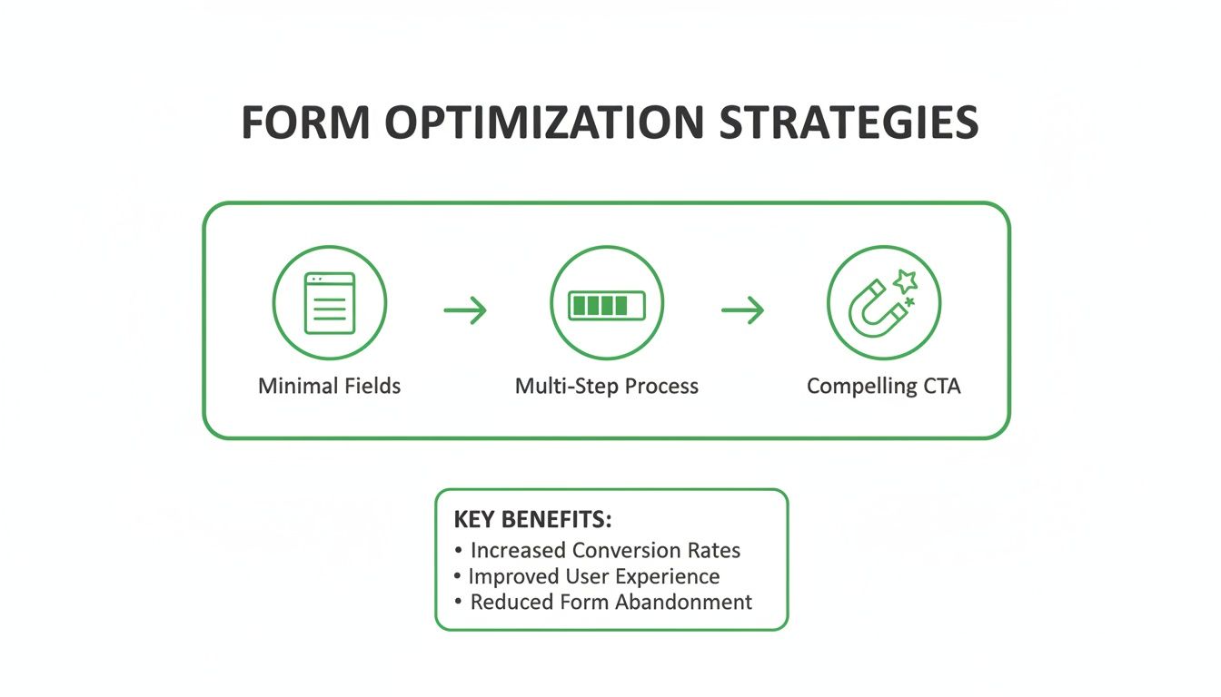
By automating the creation of pages that follow these best practices, you ensure every visitor gets an optimized experience by default.
A practical comparison
The difference between the old manual grind and a modern, automated workflow is night and day. It's not just about speed; it's about what becomes possible when you're not bogged down in repetitive tasks.
Manual vs Automated Landing Page Optimization
| Metric | Manual Approach (The Old Way) | Automated Approach (dynares) |
|---|---|---|
| Speed to Launch | Days or weeks, bottlenecked by dev and design teams for every new page. | Minutes. Marketers can launch new, on-brand pages without writing code. |
| Scalability | Very low. Realistically, you can only maintain a handful of unique pages for top-priority keywords. | High. Generate a unique, relevant landing page for every single keyword or ad group. |
| Relevance | Generic. Most keywords get sent to a "good enough" page, hurting message match and Quality Score. | Hyper-relevant. Page copy is dynamically generated to match the user's specific search query. |
| Testing & Iteration | Slow and painful. Setting up A/B tests requires developer time and manual tracking. | Continuous and automated. The system constantly tests variants and optimizes for the winning combination. |
| PPC Manager Focus | URL mapping, spreadsheet management, and chasing other teams for updates. | Strategy, creative, and analyzing performance to drive business growth. |
| Bounce Rate Impact | Often high due to mismatched expectations between the ad and the landing page. | Systematically lowered as perfect message match becomes the default experience. |
Ultimately, automation frees you from being a project manager and lets you be a marketer again. You spend less time coordinating and more time thinking about strategy, offers, and growth—the work that actually moves the needle.
This isn't a sales pitch; it's a look at the inevitable future of paid acquisition. Manual campaign management is going the way of the dinosaur. To learn more about moving away from these outdated methods, check out our guide on how to move from spreadsheet hell to automated PPC funnels.
The principles behind this apply broadly. To see how automation can boost overall engagement and conversions in other industries, it's worth exploring tools like real estate marketing automation software that solve similar problems.
At the end of the day, your goal is to create a seamless path from ad to conversion. Automation is simply the most efficient and scalable way to build that path for every single potential customer.
Bounce rate FAQs
Alright, we've walked through the whole process, from finding the root cause of your bounce rate to building an automated system to fix it. Still, a few questions always seem to pop up.
Let's clear the air and tackle them head-on. No fluff, just the straight answers I give to clients.
What’s a good bounce rate for a PPC landing page?
Honestly? Anyone who gives you a single number like “40-60%” is giving you lazy advice. You should be skeptical.
The real answer is that it completely depends on context. If you're running a hyper-targeted lead gen campaign for B2B SaaS where the user’s intent is crystal clear, you should absolutely be aiming for under 40%. I’ve seen campaigns hit 25-35% when the message match between the ad and the page is perfect.
But for a broader, top-of-funnel campaign built for brand awareness, a bounce rate of 50-70% might be totally fine. It’s just a different game.
Here’s how to think about it: your only real benchmark is yourself. Aim for progress, not perfection. Chasing some arbitrary industry benchmark that probably doesn't even apply to your business is a waste of time. Focus on making steady, incremental gains.
How long does it take to lower my bounce rate?
I get it. Patience is a virtue, but in performance marketing, you need results yesterday. ⚡️ The timeline really boils down to the kind of fix you’re implementing.
Technical changes, like boosting your page speed, can deliver an almost immediate payoff. Shave two seconds off your mobile load time, and you could see your bounce rate drop within days. These are the quick wins.
Content and UX improvements, on the other hand, require a bit more patience. Testing a new headline, redesigning a form, or improving your ad’s message match means you have to collect enough data to know if you actually made a difference. Depending on your traffic, that could take a few weeks to reach statistical significance.
The single biggest mistake I see people make is changing five things at once. When something works, you have no idea what it was. Test one major hypothesis at a time, gather the data, and then iterate. Be systematic, not chaotic.
Can a high bounce rate actually hurt my quality score?
Yes. One hundred percent, yes. It's not a gentle tap on the wrist; it’s a direct hit to your campaign's wallet.
Google's Quality Score leans heavily on something it calls 'Landing Page Experience.' And a high bounce rate is the loudest possible signal you can send that your page is irrelevant to the user’s search. It screams “bad experience.”
When Google sees a pattern of users clicking your ad and immediately hitting the back button, it concludes your page is a poor match. That tanks your Quality Score, which directly causes higher costs-per-click, lower ad positions, and less impression share.
Fixing your bounce rate isn't just a conversion issue. It's about making every single dollar you spend on ads work harder.
Is a 100% bounce rate always bad?
In a PPC campaign? A 100% bounce rate is almost always a sign that something is fundamentally, catastrophically broken. It’s a five-alarm fire for your ad budget. 🚨
The only exception I can think of would be a simple, single-page site with no other links—maybe a barebones contact page where someone gets an address and leaves. But in 99% of marketing scenarios, it spells disaster.
If you ever see a 100% bounce rate on any meaningful segment of your traffic, drop everything and investigate. It means you are actively burning money.
Ready to stop chasing manual fixes and start lowering your bounce rate systematically? dynares generates hyper-relevant, on-brand landing pages for every keyword, ensuring perfect message match by default.
Book a demo and see how automation can transform your PPC results


