Let's be real for a moment. Most landing pages are digital graveyards where good traffic goes to die.
I've been there as a founder—you pour everything into your product, spend a fortune on ads, and funnel all that traffic to a page that couldn’t convert a free pizza offer. The issue isn't a lack of fancy animations. It's the lack of a repeatable, scalable system.

Your landing page problem isn't what you think it is
I’ve wasted more money on ad clicks that led to dead-end pages than I care to admit. It’s a painful lesson every founder seems to learn the hard way.
The problem isn't your product or your ad copy. It's the chaotic, one-off approach you're taking to build the single most critical asset in your funnel. You build a page, it bombs. You tweak it, it bombs again. You hire a designer and get a prettier failure. Sound familiar?
The root of the problem is the lack of a blueprint—a master lead generation landing page template that acts as your conversion engine. This isn't just about having a nice design. It’s about building a systematic, psychological framework that turns clicks into qualified leads. Forget the marketing jargon; this is about building a machine.
Why a system beats one-off efforts every time
Most people treat landing pages like individual art projects. That’s a fundamentally dumb way to scale. A template-driven system frees you from reinventing the wheel for every campaign and lets you focus on what actually moves the needle. It's about speed, consistency, and focus—the holy trinity of scaling.
A solid landing page template is also a core component of many proven B2B lead generation strategies. It's not an isolated tactic; it's the engine that makes the whole strategy work.
The contrast between the typical, scattered approach and a systematic one is stark. Here’s a quick breakdown of why one fails and the other scales.
Why standard lead gen fails and a template wins
| Common Tactic | Typical Result | Landing Page Template Approach | Expected Outcome |
|---|---|---|---|
| One-off "art project" pages | Inconsistent performance, slow launch cycles. | Standardized, reusable components and layouts. | Predictable baseline CVR, fast campaign launches. |
| Generic messaging for all traffic | Low relevance, high bounce rates, wasted ad spend. | Tailored messaging for specific ad groups/keywords. | High message match, better Quality Scores, higher CVR. |
| Developer/designer dependency | Long backlogs, marketers can't move quickly. | Marketer-led creation from a pre-built system. | Agility to test new offers and angles instantly. |
| Inconsistent tracking & forms | Messy data, unreliable conversion signals. | Standardized form and tracking implementation. | Clean data, reliable attribution, smarter bidding. |
The table makes it pretty clear: one path is built on hope and manual effort, while the other is an engine designed for growth.
The real cost of a bad landing page
A bad landing page doesn't just lose you a lead; it actively damages your business. It tells Google your site isn't relevant, which tanks your Quality Scores and drives up ad costs. It trains ad platform algorithms to find the wrong kind of audience.
Worst of all, it erodes your confidence.
The data is brutally clear. Landing pages are powerhouse tools for lead generation. A 2025 analysis found the average conversion rate sits at a solid 6.6% across all industries—a number that's out of reach without a focused, dedicated page.
This guide is your blueprint to fix what's broken. We're going to build that repeatable system, step-by-step. No fluff, just the practical, in-the-trenches work needed to create a lead generation engine that actually works.
Let’s get to it. 🚀
The anatomy of a high-converting template
Alright, let's build the machine. Forget thinking about a lead generation landing page template as one static design. That’s a rookie mistake.
A truly powerful template is a modular system of components, each engineered for a specific job. You assemble them, test them, and optimize them.
We'll break it down piece by piece, starting with the most critical part.

Nail the hero section and you're 80% there
Honestly, if you get this part wrong, nothing else on the page matters.
The hero section—what a visitor sees without scrolling—is where the conversion is won or lost in seconds. It needs to instantly answer three questions: What is this? Why should I care? What's in it for me?
Most founders overcomplicate this. They try to be clever, mysterious, or worse, they just dump a bunch of product features. Dumb. Your visitor doesn't care about your features; they care about their problems.
Here’s a simple, effective framework for your headline and subhead:
- The headline: Make a clear, benefit-driven promise. Don't be vague. Instead of "Next-Gen Marketing Automation," try "Stop Wasting Ad Spend. Turn More Clicks into Customers." One is jargon; the other is a result.
- The subheading: Use this to add critical context or handle an immediate objection. For example, "Get our free 5-part guide and learn the exact framework our clients use to cut their cost-per-lead by 40%." It clarifies the "what" and adds a specific, desirable outcome.
Don’t get cute with your copy. The goal is clarity, not creativity. A visitor should grasp your entire value proposition in under five seconds. If they have to think, you've already lost.
Social proof that actually builds trust
Tossing a bunch of logos onto your page is lazy. Yes, it can work if they are massive, recognizable brands, but real trust comes from authentic, relevant proof.
Generic testimonials are completely useless. Your social proof needs to be specific and strategic.
- The "Hero" testimonial: Place your single best quote right below the hero section. It should be from a customer who mirrors your ideal client and highlights a specific, quantifiable result.
- Logo bar: Use logos from well-known companies in your target industry. This shows relevance and signals that you understand their world.
- Benefit-driven quotes: Instead of a wall of praise, use a few short quotes that each reinforce a key benefit of your offer. One quote can tackle cost savings, another can highlight ease of use.
This approach transforms social proof from a passive design element into an active part of your sales argument. It’s not just showing off; it’s building a case for why the visitor should trust you. For a deeper look at weaving these elements together, our guide on landing page design best practices covers this visual and psychological flow in detail.
Frame the offer as an irresistible solution
The offer itself—your ebook, webinar, or free guide—is the reason someone is on the page. You need to frame it not as a simple download, but as an indispensable tool for solving their problem.
This is all about benefits over features.
Nobody cares that your ebook is 25 pages long (a feature). They care that it contains a 3-step checklist to triple your email subscribers (a benefit).
Use bullet points; they are your best friend. They break up text and make benefits easy to scan. Start each bullet with an action verb or a direct benefit. For example: "Steal the exact headline formulas that increased our conversions by 78%." Also, include a visual mockup of your lead magnet—a cover for an ebook, a title card for a webinar. It makes the offer feel more tangible and valuable.
Crafting the perfect offer and layout is an art and a science. For an in-depth guide on refining your landing pages, including copy, design, and usability, explore strategies to optimize landing pages for conversions.
This is about making that final push from interest to action. Every component we've discussed works together to guide the user's eye and mind directly to the form and the CTA. This isn't just design; it's psychological architecture. Let’s build it right. 🏗️
Mastering the form and call to action
This is where so many smart founders fumble the ball right at the goal line. Your form and call to action (CTA) are the entire point of the landing page. Everything else—the killer headline, the slick design, the glowing testimonials—is just the setup for this one critical moment.
Let's be brutally honest. Most forms are greedy, and most CTAs are lazy. We’re going to fix both. This isn't about tiny tweaks; it’s about rethinking the entire transaction you're asking a visitor to make.
Your form is asking for way too much
First, the form. How many fields are too many? Almost always fewer than you have right now. Every single field you add creates friction and gives someone another reason to bail. The goal is to ask for the absolute minimum you need to take the next logical step in the relationship.
Think of it like a first date. You don't ask for their mother's maiden name over appetizers. You just need enough to secure a second date.
Here’s a simple framework for deciding what to ask for:
- Email only (the "bare minimum" approach): This is your lowest-friction option. It's perfect for top-of-funnel content like an ebook or webinar. You get the lead and can use marketing automation to fill in the blanks later.
- Name + email (the "personalization" play): Adding a first name field lets you personalize your follow-up. "Hi Alex" will always beat "Hi there." It’s a small price to pay for a much warmer follow-up.
- Name + email + company size/role (the "B2B qualification" step): If you're selling a B2B product, knowing the company size or the person's role is critical. This adds real friction, so your offer has to be incredibly valuable to justify it.
You almost never need a phone number on the first touch. It’s a huge ask that screams "aggressive sales calls are coming!" Unless your immediate next step is an actual phone call, just leave it out.
For a deeper look at how smart forms can adapt to user input and cut down on friction, you can explore the features of advanced form builders that streamline lead capture.
Stop using dead words for your CTA
Now for the CTA button. If your button says ‘Submit,’ you’ve already lost. It’s a dead word. It's lazy, uninspired, and tells the user you're about to put them in a spreadsheet. It offers zero value in return.
Your CTA button should complete the sentence "I want to..." and reinforce the value the user is about to get. It’s the final payoff. The CTA is not a command; it's a confirmation. It should feel like the next logical step in the user's journey, not a demand from your company. The user should feel like they are getting something, not giving something away.
Instead of 'Submit' or 'Download,' try these value-focused alternatives: Get My Free Guide, Start My Free Trial, Book My Demo, Claim My Checklist, or Send Me the Report.
See the difference? The language is active, personal, and focuses entirely on the benefit. This small shift in copy can have a massive impact on your conversion rates.
The power of a personalized CTA
Personalization is where you can see truly dramatic lifts. A personalized CTA speaks directly to the user's context and intent, making it far more compelling than a generic one.
The data on this is staggering. Personalized calls-to-action on lead generation pages can convert 202% better than their generic counterparts. This one change can transform a mediocre template into a powerful lead magnet. You can learn more about these powerful landing page statistics and benchmarks.
Finally, let's talk design. Your CTA button needs to be impossible to miss. Use a contrasting color that pops. Make it big enough to be easily tapped on mobile. And place it prominently—often both above the fold and again at the bottom of the page for longer landers.
Combining a low-friction form with a compelling, value-driven CTA is the secret to turning curious visitors into qualified leads. Get this right, and your entire lead generation engine will start to hum. 🚀
How to track and test what actually matters
Building the page is just the first step. Let's be real—if you're not tracking, you're just guessing. You're flying blind, and in this game, that’s how you burn cash. The real growth, the kind that scales a business, comes from knowing precisely what’s working and what’s not.
This is my no-nonsense guide to getting the essentials right without drowning in useless vanity metrics. Forget the dozens of reports inside Google Analytics. We're going to focus on the handful of data points that actually make you money.
Setting up your tracking foundation
Before you even dream about A/B testing, you need clean data. Without it, any test you run is completely worthless. I mean it.
Your goal is to create a closed loop. You want to trace a click from an ad all the way to a qualified lead, then feed that success signal right back to the ad platforms. This is how you build a self-optimizing engine.
Here’s the bare minimum you have to get right:
- Google Analytics goals: Don't just track page views. Set up a destination goal that fires when someone submits your form and lands on the 'thank you' page. This is your source of truth for conversions.
- UTM parameters: This is non-negotiable for paid traffic. Every single ad link needs clear UTMs (
utm_source,utm_medium,utm_campaign). This tells you exactly which campaigns, ad groups, and keywords are driving real leads. - Meta Pixel & Google Ads tag: Get these pixels on your landing page and set up a conversion event for form submissions. This is critical for retargeting and teaching the ad algorithms who your ideal customers actually are.
Trying to set this all up manually can be a massive headache. We put together a simple guide on how to use Google Tag Manager to manage these scripts from one dashboard without constantly bugging your developers. It’s a game-changer for moving fast.
A practical workflow for A/B testing
A/B testing isn't some dark art reserved for giant corporations. It’s a discipline. But you have to be smart about it, especially when you're working with limited traffic.
Stop wasting time testing dumb stuff like button colors. It’s a distraction. Focus your energy on the big swings that can actually produce meaningful results. You’re not trying to find a local maximum by changing the shade of blue on your button. You’re looking for a completely new hill to climb by testing a radically different value proposition. Think bigger.
This simple process flow shows the impact of changing just one crucial element—the CTA copy. We went from a generic command to a value-driven promise.
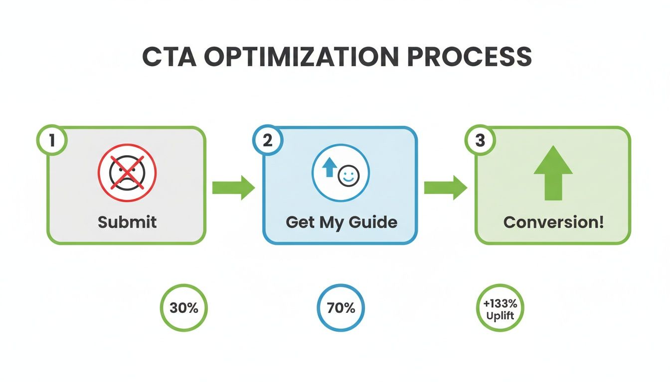
The result is obvious. A small copy change that shifts the focus from the company's action ('Submit') to the user's benefit ('Get My Guide') can dramatically improve results. In this case, it led to a 133% uplift.
Closing the loop with conversion uploads
Alright, here's the final piece of the puzzle that almost everyone misses. Capturing a lead is great, but the ad platforms that sent you that lead are still operating in the dark.
You have to feed your conversion data back into Google Ads and Meta.
This is the step that separates amateurs from pros. When you upload your conversions—especially with values attached—you’re telling the platform’s algorithm, "Hey, this is what a good lead looks like. Go find me more people like this."
Over time, this process makes your ad spend exponentially more effective. The algorithm gets smarter, your targeting gets sharper, and your cost-per-lead starts to drop. It’s the closest thing we have to an automated, self-improving lead generation machine.
This is how you stop buying clicks and start buying customers.
Scaling from one page to a conversion machine
One great landing page is a win. A system for launching dozens of them is how you build a real competitive advantage.
This is where we stop thinking like artists and start thinking like engineers. Manually building a unique page for every single campaign is a colossal waste of time and talent. It’s the kind of busywork that keeps small teams small. Let’s talk about a smarter way to operate.
The power of dynamic content
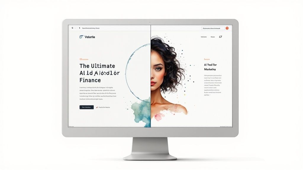
Here’s the core idea: you build one master lead generation landing page template and use technology to personalize it on the fly. This is the magic of dynamic content.
Instead of 20 different pages, you have one page with dynamic fields for the headline, subheading, and maybe even the hero image. These fields swap out automatically based on the ad a user clicked to get there.
Imagine a prospect clicks a Google Ad for 'AI tools for finance'. They land on a page with a big, bold headline that says, 'The Ultimate AI Tool for Finance Teams.' Someone else clicks an ad for 'AI marketing analytics' and sees, 'Next-Level AI for Marketing Analytics.' Same core page, but a hyper-personalized, high-relevance experience.
This isn’t just about being efficient; it’s about message match. You’re confirming to the visitor that they are in exactly the right place, which is a massive factor in keeping them from bouncing.
Why more pages mean more leads
The reason this matters so much is simple: more targeted pages lead to more conversions. It’s not a theory; the data is conclusive.
The number of landing pages a business deploys dramatically amplifies lead generation. Companies sporting 31 to 40 pages generate seven times more leads than those with just 1-5. Even bumping from under 10 pages to 10-15 yields a 55% jump in leads.
This approach lets you create highly relevant micro-experiences for niche audiences, which boosts conversion rates across the board. The numbers don't lie, and you can explore more eye-opening landing page statistics in this 2025 report. This isn't a marginal gain; it's a fundamental shift in performance.
A practical framework for scaling
So, how do you actually do this? It’s not as complicated as it sounds. You need a system that connects your ad campaigns to your landing page content.
Here's the operational workflow we use:
- Build the master template: Create your core page with all the high-converting components we've discussed. Then, identify the elements you want to make dynamic (headline, subhead, image).
- Set up dynamic parameters: Use URL parameters in your ad links. For example,
yourlandingpage.com?industry=finance. This is the signal that tells your page which version of the content to show. - Connect your ad platform: The key is to automate this process. Platforms like Google Ads can dynamically insert the keyword a user searched for directly into your ad's final URL. This signal is what your landing page uses to swap out the content.
This creates a seamless flow from search intent to ad copy to landing page headline. It’s the holy grail of relevance. Tools that integrate directly with your ad accounts are essential for making this work without a ton of manual effort. Our guide on Google Ads optimization tools covers some of the tech that makes this kind of automation possible.
This is how you scale. It’s not about working harder. It’s about building a smarter, more automated marketing operation that can grow without drowning your team in repetitive tasks.
You build the engine once, then let it run. 🚀
Common questions from founders on landing page templates
Alright, let's wrap this up. After building, testing, and scaling these systems with dozens of founders, I get a lot of the same questions. It usually boils down to a few key areas where people get stuck or overthink things.
So, here are some quick, direct answers to the most common questions I hear about building a scalable lead generation landing page template. No fluff, just what you need to get moving.
What’s the ideal length for a lead gen landing page?
For most lead magnets—like an ebook, a guide, or a webinar—shorter is almost always better. Let’s be real, your prospects are busy and their attention spans are shot. Your job is to remove friction, not add an epic novel they have to scroll through.
Get straight to the point. A strong hero section, a few benefit-driven bullet points, some sharp social proof, and a concise form is usually all you need. The data I've seen over and over again shows that for simple lead magnet offers, shorter landing pages crush long-form behemoths.
The only real exception is for high-commitment B2B demos or expensive services where you need more copy to build value and handle objections. For the master template we're focused on building, start short and ruthlessly focused. You can always add more later if testing proves it's necessary.
How much social proof is actually enough?
There's no magic number here. Stop thinking about quantity and start thinking about quality and relevance. Plastering your page with 50 random logos is just noise and can actually look desperate.
Instead, be strategic.
- One "Hero" testimonial: Place your single most powerful quote from a well-known client right below the offer. Make it highlight a specific, desirable result.
- A curated logo bar: Show logos of recognizable companies, but ideally ones in your target industry. This signals relevance, not just popularity.
- A small carousel: 3-5 strong, benefit-focused quotes are far better than a wall of text nobody will read. Each quote should tackle a different benefit or overcome a different objection.
The point of social proof isn't just to show off. It's to build trust and overcome a visitor's natural skepticism. It must feel authentic and directly support the claims you're making on the page. Aim for enough proof to make your offer credible, not so much that it overwhelms the visitor.
Should I gate content with a form or give it away?
This isn't a tactical question; it's a strategic one. They serve two completely different business goals, and confusing them is a classic, costly mistake.
Gating content is for lead generation. Giving it away freely is for brand awareness and SEO. That’s it.
If your primary goal is to capture contact information so you can nurture a lead toward a sale, you gate the content. That’s the entire purpose of the landing pages we've been discussing. The transaction is simple: their email for your valuable resource.
If you're writing a blog post (like this one) designed to rank on Google and attract a wide audience, you leave it ungated to maximize reach.
A hybrid approach can also be effective. You might offer a free, ungated guide on your blog with several CTAs pointing to a gated "content upgrade," like a template or a checklist. For the lead generation landing page template system we’re building, however, the goal is always lead capture. So, you always use a form.
How do I A/B test if I don't have much traffic?
This is a great question because it’s a reality for most startups. Running statistically significant A/B tests requires a ton of data, which is tough when you have low traffic volumes.
So, you have to change your approach.
Instead of traditional A/B testing, focus on bigger, more dramatic swings. Don't waste time testing button colors—that’s a pointless optimization at this stage. Instead, test a completely different headline or a fundamentally different value proposition.
- Sequential testing: Run 'Version A' of your page for two weeks and carefully record the conversion rate. Then, switch entirely to 'Version B' for the next two weeks and compare the results. It’s not a perfect scientific test, but it's a hell of a lot better than just guessing.
- Qualitative feedback: This is often more valuable than inconclusive quantitative data. Use tools like Hotjar or FullStory to watch session recordings. See where people are getting stuck, what they ignore, and where they hesitate. These user behavior insights will often tell you more about what's broken than a low-confidence A/B test ever could.
Focus on finding a new hill to climb, not just optimizing your position on the current one. 🏔️
Ready to stop building pages one by one and start scaling with an automated system? dynares is the engine that connects your ads to hyper-relevant, high-converting landing
pages instantly.


