Let’s be direct. Most landing pages are garbage. They’re slow, confusing, and completely disconnected from the ads sending traffic to them. As a European entrepreneur scaling tech businesses, I see this all the time: companies burning through their ad spend because their post-click experience is a total afterthought. It’s dumb. You’re paying for every single click, so every visitor deserves a page that speaks directly to their needs.
This isn't another fluffy list of generic tips. This is a no-BS guide to the best practices for landing pages that actually work for high-volume Google Ads lead generation. We're talking about the specific actions that move the needle on conversion rates, improve your Quality Score, and ultimately, drive revenue. To truly stop building pages that leak money, you need to master the foundational conversion rate optimization techniques that turn clicks into customers.
We’re in an era of AI-driven marketing; there’s no excuse for manual, one-size-fits-all pages anymore. The future is about precision, relevance, and scale. These are the principles that help you build that future, whether you’re a scrappy startup founder or running a performance marketing agency.
In this roundup, we'll dive deep into ten critical practices. This is a practical playbook, not a theoretical lecture. Let's get to it.
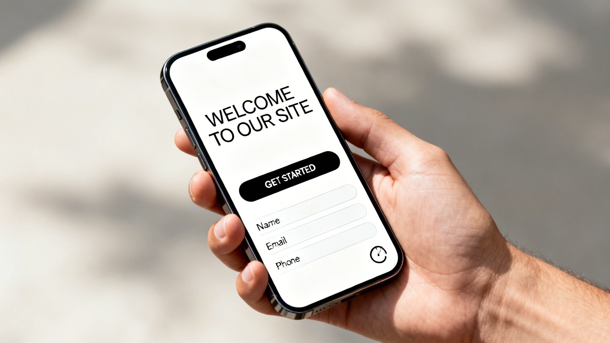
1. Single-minded value proposition above the fold
Your ad got the click. Fantastic. Now you have about two seconds to convince that person they made the right choice before they hit the back button. This is where most landing pages completely fail. They get cute, they get clever, they try to say ten things at once. It’s a dumb approach. The user came from an ad promising a specific solution, and your page must instantly confirm you have it.
This is why a single-minded, benefit-driven value proposition placed squarely above the fold - the part of the page visible without scrolling - is one of the most critical best practices for landing pages. It’s not just a headline; it's a contract. It tells the user, Yes, you are in the right place, and here is the exact value you will get.

Why it works
Clarity beats persuasion every time. A user searching for a free CRM for startups doesn't want to read a poetic ode to customer relationships. They want to see ‘Free CRM for Startups’ in big, bold letters. HubSpot gets this. Their pages immediately confirm the offer, eliminating friction and aligning perfectly with search intent. Similarly, Calendly's classic ‘Easy scheduling ahead’ is a masterclass in simplicity, directly addressing the pain point of back-and-forth emails.
Your headline’s only job is to get the visitor to read the next sentence. If it fails at that, the rest of your page might as well not exist.
How to implement it
Getting this right isn't about being a creative genius. It's about being disciplined.
- Match the message: Your headline must mirror the promise made in your Google Ad copy. This creates a strong scent trail that improves Quality Score and reassures the user.
- Focus on benefits, not features: Instead of ‘Our software has AI-powered analytics,’ try ‘Make 30% smarter budget decisions.’ Frame the value in terms of outcomes.
- Use your keyword: Weave your primary keyword into the headline naturally. This is a powerful signal for both the user and Google.
2. Keyword relevance & ad-to-landing page alignment
A user clicking your ad is on a mission. They typed a specific query, saw your ad promising an answer, and clicked. The worst thing you can do is break that chain of relevance. If your ad says ‘Enterprise CRM Software’ but the landing page talks generally about sales tools, you've created a disconnect. The user feels tricked, their trust evaporates, and they bounce.
This tight alignment between the search query, the ad copy, and the landing page content is non-negotiable. It's the digital equivalent of a good salesperson who actually listens. It tells the user they're not just a click; they're understood. Google rewards this with a higher Quality Score, which means lower CPCs and better ad positions for you. It’s one of the most fundamental best practices for landing pages.
Why it works
This isn't about gaming an algorithm; it's about basic human psychology and reducing friction. When the promise in the ad is immediately fulfilled on the page, cognitive load drops to zero. A search for ‘Free HR Management Trial’ should lead to a page where that phrase is the star of the show, not buried under a mountain of feature descriptions. The user’s brain gets a hit of dopamine: Ah, this is it.
If your landing page doesn't continue the conversation your ad started, you’ve already lost the lead. It's a conversation, not a series of disconnected shouts.
How to implement it
Creating this seamless experience is a systematic process, not a creative one. You have to be disciplined about message matching across the entire user journey. Digging into the details of Google Ads landing page optimization can help fix these issues quickly.
3. Mobile-first responsive design
Ignoring mobile is a death wish for your ad spend. It's that simple. With over 60% of pay-per-click traffic coming from smartphones, treating your mobile landing page as an afterthought is like setting fire to your budget. If a user clicks your ad and lands on a pinched, slow, unreadable mess, they’re gone. You paid for the click, and they bounced before you even had a chance. That’s a dumb way to do business.
A mobile-first approach means you stop designing for a big desktop monitor and then shrinking it down. Instead, you design for the smallest, most-used screen first and then expand the experience for larger devices. This isn't just about aesthetics; it's a fundamental shift in strategy that directly impacts conversions and your Google Ads Quality Score.
Why it works
Functionality dictates success on mobile. A user on a phone is often distracted, in a hurry, and using their thumb to navigate. Speed and simplicity aren't nice-to-haves; they are requirements. This is why Unbounce sees clients achieve 35% higher conversion rates on pages that load in under two seconds. It’s also why one SaaS company boosted its mobile conversion rate from a dismal 1.2% to 3.8% just by switching to a single-column layout for their form. You remove friction, you win the conversion.
A desktop page asks for a user's attention. A mobile page has to earn it in a split second with zero friction.
How to implement it
This isn't about just ticking a responsive box in your page builder. It demands a specific, disciplined workflow.
- Test on real devices: Don’t just rely on your browser's emulator. Pull out your phone. Ask your colleagues to use theirs. See how the page feels and functions in a real-world context. Check button reachability with your thumb.
- Prioritize speed: Use Google's PageSpeed Insights to find and fix mobile-specific performance bottlenecks. Compress images, minify code, and get that load time under three seconds.
- Shorten mobile forms: A ten-field form might work on a desktop. On mobile, it's a conversion killer. Cut it down to the absolute essentials, like 3-5 fields. Use progressive profiling if you need more data later.
4. High-contrast, action-oriented call-to-action (CTA) buttons
Your landing page has one job: get the user to take a specific action. Yet so many pages bury the button that actually does the work. They make it blend in with brand colors, use weak copy like 'Submit', and hide it somewhere at the bottom. This is a massive, unforced error. Your call-to-action (CTA) button isn't a design element; it's the engine of your conversion machine.
Treating the CTA as an afterthought is one of the laziest mistakes in digital marketing. A high-contrast, action-oriented button is one of the core best practices for landing pages because it acts as a visual signpost, screaming ‘Click me to get the thing you came for!’ It removes any confusion about the next step and creates a clear path to conversion.
Why it works
Your CTA is the finish line. If users can't see it or don't understand what it does, they won't cross it. ConvertKit famously improved form submissions by 17% simply by using a contrasting orange CTA that popped against its clean white backgrounds. Similarly, HubSpot's bright orange or green ‘Get HubSpot Free’ button is impossible to miss and communicates the value and action in a single glance. The goal is to make the desired action the easiest and most obvious choice on the entire page.
Your button copy is your final pitch. Don’t waste it on a generic word like ‘Submit.’ Tell the user exactly what they are getting.
How to implement it
Designing a great CTA is less about aesthetics and more about clear communication and psychology. Test 5-10 copy variations (‘Get Started’ vs. ‘Claim Your Free Trial’ vs. ‘Schedule My Demo’) to find what resonates most with your audience.
5. Minimal form fields & progressive profiling
Your landing page has done its job. The value proposition is clear, the copy is compelling, and the visitor is ready to convert. Then they see it: a monstrous form asking for their name, email, phone number, company name, company size, annual revenue, blood type, and the name of their first pet. That’s an instant conversion killer. Every field you add is another reason for someone to abandon the process.
This is why minimizing form fields is one of the most impactful best practices for landing pages you can implement. The goal is to reduce friction to its absolute minimum by asking only for what is essential to start a conversation. You can always gather more data later through progressive profiling, a smarter approach where you ask for more information as the lead shows more interest over time.
Why it works
Psychology 101: humans are lazy. We follow the path of least resistance. A short form feels like a small commitment, while a long one feels like homework. The data backs this up without question. Outreach saw a 43% jump in submissions by cutting their form from eight fields to just four. Similarly, Conversica boosted their lead volume by 30% simply by trimming their landing page form down to three essential fields. It’s a direct trade-off between the data you want and the leads you’ll actually get.
Asking for too much information upfront is like asking for marriage on the first date. It’s too much, too soon. Start with a handshake-level request and build the relationship from there.
How to implement it
Optimizing your form isn't about guesswork; it's about being ruthless with your data requirements and smart with your strategy. For a deeper dive into crafting high-converting forms, you can explore our detailed guide on lead capture form optimization.
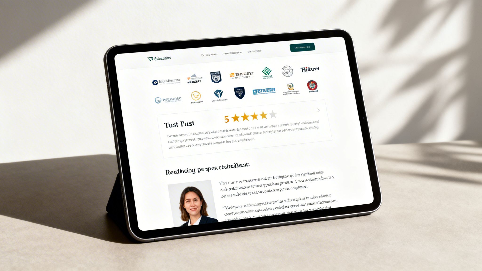
6. Social proof & trust signals (reviews, logos, testimonials)
Your headline and offer grabbed their attention. Now the user is thinking, Can I trust this? This is the moment of truth where a visitor decides if you're a legitimate business or just another slick website making empty promises. Assuming people will automatically trust you is a rookie mistake. You need to prove your credibility, and you need to do it fast.
This is where social proof and trust signals come in. These are third-party validations, like reviews, client logos, testimonials, and industry certifications, that act as a powerful shortcut to building confidence. They show a visitor that other people, just like them, have trusted you and gotten value. It’s one of the most fundamental best practices for landing pages because it tackles a core human bias: we look to others to guide our decisions.
Why it works
People are inherently skeptical of marketing claims, but they trust other customers. Seeing that huge companies like Uber and Airbnb use Slack, or that Calendly has a 4.8/5 star rating on Trustpilot, instantly reduces perceived risk. It’s not you saying you're great; it's the market saying it for you. This validation quiets the internal objections of a potential lead, making them far more likely to click that ‘Get Started’ button.
A landing page without social proof is like a resume without references. It raises more questions than it answers and makes it easy for the prospect to just say no.
How to implement it
Slapping a few logos on your page is a start, but a lazy one. To do this right, you need to be strategic and authentic.
- Quantify your proof: Don't just show logos. Use specific numbers. Instead of ‘Trusted by businesses,’ try ‘Trusted by 750,000+ teams worldwide.’ Quantified proof is more concrete and believable.
- Use targeted testimonials: Select testimonials that directly address common user objections. If your price is a concern, feature a customer talking about the ROI. Include the person's full name, title, and company to maximize credibility.
- Place it strategically: Your strongest social proof, like a row of impressive client logos, should be visible above the fold. Sprinkle other trust signals, like specific testimonials or star ratings, near your primary CTA to give users a final nudge of confidence before they convert.
7. Strategic A/B testing & multivariate testing (MVT)
Guessing what works on your landing page is for amateurs. Pros don't guess, they test. Most marketers throw a page up, hope for the best, and then wonder why their CPL is through the roof. This isn't a game of luck; it's a game of numbers, and strategic testing is how you learn to play it.
This is where A/B testing and its more complex sibling, Multivariate Testing (MVT), come in. A/B testing isolates and tests one change at a time (e.g., Headline A vs. Headline B). MVT tests multiple combinations simultaneously (e.g., two headlines and two images) to see which combination performs best. It's the only real way to know if your changes are improving performance or just making you feel busy.
Why it works
Data beats opinion. You might love a headline, but if the data shows it performs 20% worse than a ‘boring’ alternative, your opinion is irrelevant. The CRO industry is built on this principle. CXL reports that winning tests can produce a 15-25% lift, and Optimizely has case studies where companies achieved cumulative 150% gains over six months. Even small wins add up. This is one of the most vital best practices for landing pages because it moves you from assumption to certainty.
Stop debating what works in a conference room. Let your users tell you what works with their clicks.
How to implement it
Effective testing requires discipline, not just a tool. It's about a systematic process. You can learn more about how to structure these experiments by exploring advanced guides on split testing landing pages.
8. Conversion tracking & UTM parameter implementation
Running ads without proper tracking is like driving with your eyes closed. You're spending money, but you have zero idea if you’re moving toward your goal, stuck in a ditch, or about to drive off a cliff. It's a completely blind approach and a massive waste of budget. You have to know what happens after the click.
This is why solid conversion tracking and a disciplined UTM parameter strategy are non-negotiable best practices for landing pages. They connect the ad click to the final business outcome, whether that's a form fill, a demo request, or a sale. This data is the source of all truth in your campaigns; without it, you're just guessing.
Why it works
Data replaces opinions. By tagging your ad URLs with UTMs, you can see in Google Analytics exactly which campaigns, ad groups, and even specific ad copy variations are driving results. A B2B SaaS client of ours discovered through UTM segmentation that traffic from a niche ‘account-based marketing’ keyword had a 3x higher MQL rate than their general traffic. That insight allowed them to reallocate 50% of their budget to that high-performing segment, doubling their pipeline in a single quarter.
If you can’t measure it, you can’t improve it. Attribution isn't a nice-to-have; it's the central nervous system of performance marketing.
How to implement it
Setting this up requires discipline, not genius. It's about building a system and sticking to it.
- Create a UTM naming convention: Before you launch a single ad, decide on a strict naming structure. Use lowercase, use hyphens instead of spaces, and be consistent. This prevents your analytics from becoming a complete mess.
- Track what matters: Don't just track form submissions. Integrate with your CRM to measure 'Sales Qualified Leads' (SQLs). This tells you which sources bring in actual potential revenue, not just clicks and leads.
- Use both GA and Google Ads tracking: Install the Google Ads tag directly for conversion data that feeds its bidding algorithms. Use Google Analytics 4 for deeper path and funnel analysis. They serve different but complementary purposes.
9. Audience segmentation & intent-based landing page variations
Treating every visitor the same is one of the fastest ways to burn through your ad budget. A user clicking a branded ad for ‘[Your Company] Pricing’ has fundamentally different needs than someone clicking a broad-match ad for ‘how to solve [problem]’. Sending them to the same generic page is a lazy and costly mistake. The smart approach is to build different landing page variations for different audience segments.
This is a core best practice for landing pages that serious advertisers live by. High-intent visitors who already know you want to get straight to the point. Give them a form-forward page that makes it easy to convert. Lower-intent visitors need more context, social proof, and education before they'll trust you. You must cater to both, but separately.
Why it works
Matching the page to the visitor's intent level is just common sense. A SaaS company that created three page versions based on intent saw this firsthand: a ‘Pricing’ page for high-intent traffic converted at 8%, a ‘How It Works’ page for medium intent hit 4%, and a ‘Use Cases’ page for low-intent traffic converted at 2%. By not forcing the low-intent traffic onto a hard-sell page, they still captured leads that would have otherwise bounced. To truly cater to diverse visitor needs, it's essential to understand how to segment your audience effectively and create landing page variations tailored to their specific intent.
Don't average out your conversion rates. A 5% overall conversion rate is meaningless if it’s hiding an 8% rate from one segment and a 2% rate from another. Segment performance is the only metric that matters.
How to implement it
You don’t need to build a dozen pages from day one. Start smart and scale. Create different conversion actions or use custom reporting in Google Analytics to track the performance of each segment. If your high-intent page isn't outperforming your low-intent page by at least 50-100%, something is wrong with your messaging or offer.
10. Page speed optimization & core web vitals
You can have the most persuasive copy and a killer offer, but if your landing page takes five seconds to load, you've already lost. Most users, especially on mobile, simply won’t wait. A slow page is the digital equivalent of a locked door; the prospect just turns around and leaves. This is why page speed isn't a nice-to-have technical chore, it's a foundational conversion and user experience factor.
Google made this explicit with its Core Web Vitals initiative. These metrics directly measure the user's experience of page speed and responsiveness, and they have a real impact on your Google Ads Quality Score. Slow pages get penalized with higher costs and lower ad positions, while fast pages are rewarded. It's a simple, brutal equation: speed equals money.
Why it works
A fast-loading page does more than just reduce bounce rates; it builds immediate trust. It signals that your operation is professional and that you respect the user's time. Unbounce's data shows that even a one-second improvement in load time can boost conversions by several percentage points. A B2B SaaS company that got its pages under a 2-second load time saw a 16% jump in lead generation. This isn't about marginal gains; it's about fundamentally improving the user's first impression.
Your visitor’s patience is not infinite. Every millisecond you shave off your load time is a direct investment in your conversion rate.
How to implement it
Fixing page speed feels technical, but it’s mostly about disciplined housekeeping and focusing on the right things. If you want to dive deeper, you can learn more about improving your page load speed and its direct link to conversions.
Top 10 landing page best practices comparison
| Technique | Implementation Complexity 🔄 |
Resource Requirements & Speed ⚡ |
Expected Outcomes 📊 |
Ideal Use Cases 💡 |
Key Advantages ⭐ |
|---|---|---|---|---|---|
| Single-Minded Value Proposition Above the Fold | Low–Medium; simple design + copy testing | Low dev effort; quick to deploy and fast to load | Reduces bounce, improves Quality Score and time-on-page | PPC landing pages, high-intent keyword pages | Clear immediate relevance; faster user decisions |
| Keyword Relevance & Ad-to-Landing Page Alignment | Medium; requires coordination between ads and landing copy | Moderate resources for keyword research and templating | Higher CTR, lower CPC, 20–40% conv. lifts common | Paid search, keyword-segmented campaigns | Strong relevance → better ad rank and lower cost |
| Mobile-First Responsive Design | Medium–High; design and QA across devices | Higher dev/testing effort; performance optimizations needed | Mobile conv. +20–50%, improved Core Web Vitals | Mobile-heavy traffic, e-commerce, B2C campaigns | Improved UX and mobile conversions; required for indexing |
| High-Contrast, Action-Oriented CTA Buttons | Low; design and copy changes plus A/B tests | Low design effort; fast to iterate and measure | 5–20% conversion uplifts typical with clear CTAs | All landing pages, form-driven funnels | Removes ambiguity, boosts click-through to conversion |
| Minimal Form Fields & Progressive Profiling | Medium; needs form logic and CRM integration | Moderate (automation/CRM) and ongoing nurture workflows | Increases form completions 25–40%, reduces abandonment | B2B lead gen, high-intent offers | Higher completion rates and faster lead capture |
| Social Proof & Trust Signals (Reviews, Logos, Testimonials) | Low–Medium; content collection and placement | Low production; may need legal/permissions and video assets | +15–35% conv. lift, stronger trust for new users | New brands, high-value purchases, B2B trust-building | Reduces perceived risk; validates claims with third-party proof |
| Strategic A/B Testing & Multivariate Testing (MVT) | High; statistical design and disciplined process | High: testing platform, traffic volume, analyst time | Identifies measurable winners; compound gains over time | Continuous optimization programs, medium–high traffic | Data-driven improvements; reveals interaction effects |
| Conversion Tracking & UTM Parameter Implementation | Medium; tagging, pixels, and CRM mapping | Moderate dev and analytics resources; ongoing governance | Accurate ROI, better bid/ budget decisions, proper attribution | Multi-channel campaigns, ROI-driven advertisers | Enables informed optimizations and revenue-based bidding |
| Audience Segmentation & Intent-Based Landing Page Variations | High; many variants and content management | High content and maintenance load; automation reduces cost | +20–40% conversion via personalization; better Quality Score | Large keyword portfolios, account-based or industry campaigns | Tailored messages for intent → higher relevance and ROI |
| Page Speed Optimization & Core Web Vitals | Medium–High; technical performance work | Higher engineering/hosting costs (CDN, image optimization) | Lower bounce, +10–25% conv. per second improved load time | Media-rich pages, mobile-first sites, paid traffic destinations | Measurable UX and conversion gains; positively impacts ad rank |
It’s time to stop guessing and start building
So, there you have it. A deep dive into the 10 core principles that separate high-performing landing pages from the ones that just burn cash. We’ve covered everything from nailing your value proposition above the fold to obsessing over page speed and Core Web Vitals. These aren't just vague suggestions; they are a practical, no-nonsense plan for turning your Google Ads budget into a predictable source of qualified leads.
The gap between a landing page that converts at a measly 2% and one that consistently hits double digits isn't magic. It's a commitment to these fundamentals. It's about respecting the user's intent, ensuring your ad promise matches the page reality, and using data to guide every single decision you make. You don’t need to be a design genius or a copywriting wizard to get results. You just need to be systematic.
The real takeaway: from manual labor to a conversion engine
Let's be candid. The old way of building one-off landing pages for every campaign, or worse, for every ad group, is broken. It’s slow, it’s expensive, and it’s impossible to scale, especially if you’re managing multiple clients or a massive keyword portfolio. Frankly, trying to manually implement these best practices for landing pages across hundreds of keywords is a special kind of nightmare. You end up with a mess of disconnected pages that are a headache to maintain and optimize.
The real shift in thinking is moving from creating static pages to building a dynamic system. Think of it as a conversion engine, not a collection of individual parts. An engine that learns, adapts, and consistently turns clicks into customers.
This is where technology becomes your most valuable team member. Instead of guessing which headline works, you test them automatically. Instead of building ten nearly identical pages for ten intent variations, you use dynamic content to serve the right message to the right person, every time. The technology to achieve this is no longer some futuristic concept; it’s here, and it's accessible. The opportunity for marketers who adopt this mindset is massive. You can finally move beyond chasing incremental gains and start building a truly scalable, efficient lead generation machine. Now go build something great. 🚀
Ready to stop building individual pages and start running a conversion engine? At dynares, we built the platform to automate the very best practices for landing pages discussed in this article. From dynamic keyword insertion to intent-based layouts and automated A/B testing, dynares helps you scale high-performance landing pages without the manual effort.


