Let's get straight to the point: your lead capture form is probably costing you a fortune.
Most forms are an afterthought—a lazy collection of fields slapped onto a landing page. This isn't just bad design; it's actively burning your ad budget, especially on high-intent channels like Google Ads. We’re talking about real money, wasted click by painful click.
A lead capture form shouldn't be a data-entry chore. It should be a strategic tool that turns expensive traffic into real business opportunities. It’s the final, critical handshake between your ad and a potential customer, and most businesses are getting it completely wrong.
We're going to break down why the standard approach is fundamentally broken and show you how to fix it.

Why your form is a conversion killer
Here's a hard truth about user patience: there is none.
People have zero tolerance for friction when they’re ready to act. A poorly optimized form can single-handedly tank an otherwise brilliant PPC campaign, sending your bounce rate through the roof. If you're wondering why your landing pages aren't converting, your form is the prime suspect.
Think of it this way: you just paid Google €50 for a click. The user lands on your page, is convinced by your offer, and then sees a monster form asking for their life story. They're gone. You just lit that €50 on fire. 🔥
This isn't just about aesthetics; it's about pure performance. We're talking about the difference between a campaign that breaks even and one that prints money. Your form is the gatekeeper to your entire sales pipeline. It's time to stop leaving money on the table.
If your landing page feels like a high-friction interrogation, you’re not just getting fewer leads—you’re actively training Google’s algorithm that your page is a bad experience, which can drive up your costs. For a deeper dive on this, check out our guide on how to lower bounce rate.
The goal is to shift your mindset from collecting info to starting a conversation. That conversation should lead directly to revenue.
Common mistakes vs quick wins for your form
Most forms suffer from the same handful of costly mistakes. The good news? The fixes are often simple and incredibly effective. Here’s a quick-glance table to help you spot problems and implement high-impact changes right away.
Common MistakeThe Strategic FixWhy It Drives ResultsAsking for too much, too soon.Only ask for what's essential. Start with just an email. You can gather more info later.Reduces friction and cognitive load, making the initial yes much easier for the user.Using a generic 'Submit' button.Use value-driven CTAs. Try 'Get Your Free Quote' or 'Download the Guide Now'.Tells the user exactly what they get in return for their information, creating clear value.Ignoring the mobile experience.Design for thumbs first. Use large input fields, single-column layouts, and easy-to-tap buttons.Caters to the majority of web traffic, preventing drop-offs from frustrated mobile users.No clear privacy assurance.Add a simple privacy note. A short line like 'We respect your privacy' builds trust at a critical moment.Alleviates common user fears about spam and data misuse, increasing their confidence to convert.Forgetting about page speed.Optimize everything. Compress images and strip out unnecessary scripts to ensure your page loads instantly.A faster page feels more professional and prevents users from bouncing before the form even appears.
By swapping out these common blunders for strategic fixes, you're not just making small tweaks. You're fundamentally changing the user experience from a frustrating chore into a smooth, logical next step.
We need to treat the lead capture form with the respect it deserves—as a high-performance engine for growth, not a dusty old filing cabinet.
The anatomy of a lead capture form that actually converts
Let's dissect what separates a high-performance lead capture form from the junk collecting digital dust on most websites. It's not about flashy animations or fancy design; it’s about psychology and ruthless efficiency. Building a form that converts is an exercise in minimalism and clarity.
We have to start with the basics, because it’s where most people get it wrong. Every single component of your form must serve one purpose: to get the user from point A (curiosity) to point B (conversion) with the least amount of friction possible. It's that simple, yet so many businesses overcomplicate it.

Nail the headline and fields
Your form’s headline is its first handshake. If your ad promises a 'Free SEO Audit', your form's headline better echo that exact promise. A generic title like 'Contact Us' is a lazy, conversion-killing mistake. It creates a disconnect and makes the user second-guess their click.
Now, let's talk about the fields. Every single field you add must justify its existence. Does asking for a phone number right now increase lead quality enough to offset the inevitable drop in conversions? Probably not. Start with the absolute minimum. For most top-of-funnel offers, an email address is all you really need.
Here’s a simple, grounded approach to fields:
- Use a single-column layout. It’s easier to scan and complete, especially on mobile. Don't force users' eyes to zig-zag across the page; guide them straight down to the CTA.
- Enable smart defaults and autofill. Make the browser do the heavy lifting. Little things like this create a smoother, faster experience that users appreciate.
- Implement inline validation. Tell people immediately if there’s an error with their input, not after they’ve hit the submit button. It prevents frustration and rework.
The ultimate goal is to improve conversion rate not just on the form, but across your entire funnel.
The call-to-action is everything
If your call-to-action (CTA) button says 'Submit', you're already losing. The word is passive, boring, and gives the user absolutely nothing in return. It implies they are giving you something and getting nothing. That’s a terrible deal.
Your CTA copy needs to be value-driven. It should complete the sentence, 'I want to...'. For example: 'I want to Get My Free Quote' or 'I want to Download the Ebook'. This small change reframes the entire interaction from a chore into a benefit. It creates a sense of ownership and excitement.
A great CTA is the final nudge that turns a hesitant visitor into a confident lead. It reinforces the value of the offer and makes clicking the button feel like a logical, satisfying conclusion to their journey.
Despite a temporary dip in usage, optimized forms are making a massive comeback. Data shows that 84% of marketers now rely on form submissions as their primary method for turning visitors into qualified leads. Better yet, personalized CTAs can convert over 200% better. This proves that a well-crafted lead capture form is more powerful than ever.
For an even deeper understanding of how these elements fit into the bigger picture, explore our detailed guide on landing page design best practices. Building a form is just one piece of the conversion puzzle.
Advanced tactics to stop leaving money on the table
Alright, you've built a solid, clean lead capture form. The basics are covered. Now it’s time to get sophisticated, because the basics are just table stakes. This is where you build a real, defensible advantage over the competition who are still just slapping 'Submit' buttons on everything.
Let’s be direct: most businesses stop at 'good enough'. But 'good enough' in PPC is a fast track to mediocrity and wasted ad spend. The real growth comes from implementing advanced tactics that feel like small tweaks but deliver massive lifts in conversion rates.
We’re moving beyond simple aesthetics and into the realm of pure performance psychology. This is about building a form that doesn't just collect information but actively persuades users to complete it. It’s a subtle but powerful shift in thinking.
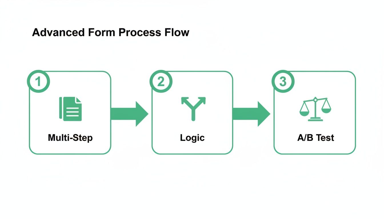
Embrace the multi-step form
The idea of making a form longer to get more conversions sounds completely backward, I know. On the surface, it feels like a terrible idea. But it’s one of the most powerful tools in your arsenal, all thanks to a simple psychological principle: commitment and consistency.
When you present a user with a massive form, their first reaction is, "Ugh, work". But when you ask for just their email on the first step, the barrier to entry is incredibly low. Once they've given you that, they’ve made a micro-commitment. They've started the process, and now they are psychologically primed to finish it.
Here’s a great example of how a simple multi-step form breaks down a complex request into manageable bites.
Notice how it starts with the easiest, least-threatening questions first, building momentum toward the finish line. This isn't just theory. In B2B, while average PPC conversion rates hover around a dismal 1.5-2%, optimized multi-step forms have been shown to boost landing page conversions by up to 300%.
Get smarter with progressive profiling
In the B2B world, asking for company size, job title, and budget on the first interaction is just a bad strategy. It’s like asking someone to marry you on the first date—you haven't earned that level of trust yet. This is where progressive profiling comes in, and it's a game-changer.
The concept is simple: build a customer profile over time, across multiple interactions.
- First Touch (e.g., Ebook Download): Ask only for their work email. That’s it.
- Second Touch (e.g., Webinar Signup): Since you already have their email, your form can now ask for their company name and job title.
- Third Touch (e.g., Demo Request): Now that they're highly engaged, you can ask for qualifying information like company size or specific challenges.
This approach respects the user's time and builds the relationship gradually. Each step feels logical and less intrusive, dramatically increasing the odds they'll provide more detailed information when they’re actually ready to talk business. It’s a smarter, more empathetic way to handle lead capture.
A/B test like a pro
Most people think A/B testing is about changing button colors. That’s amateur hour. Real, impactful testing goes much deeper and is about adopting a mindset of continuous, data-driven improvement. You should be systematically testing every critical element of your lead capture form to squeeze out every last possible conversion.
Stop guessing what your users want and start letting the data tell you. A/B testing isn't a one-time project; it's a core business process for any company serious about growth.
Your goal is to build a testing roadmap. Test your form placement, field labels, or even the number of steps in a multi-step form. You might be surprised at which one performs better for your specific offer.
This iterative process of testing and refining is how you build a true conversion machine. If you want to go deeper on this topic, check out our guide on split testing landing pages for more practical strategies.
Connecting your form to your business for real ROI
A lead capture form is completely useless if the data it collects goes into a black hole. Honestly, it’s just digital paperwork at that point. The real magic—and the ROI—happens when you connect that form to your entire marketing and sales ecosystem, turning a simple submission into a revenue-generating event.
Let's be blunt: if you aren't tracking what happens after the click and the submission, you're flying blind. You might be celebrating a low cost-per-lead, but those leads could be worthless. It's time to connect the dots from the form all the way to the bank. This is how you move from just counting leads to measuring actual business impact.
Tracking and integrations that matter
The first step is setting up proper tracking. This isn't just about sticking a Google Analytics tag on your thank you page and calling it a day. We need to measure the quality of each submission, and that starts with tools like Google Tag Manager (GTM).
GTM is the central nervous system for your marketing data. It lets you fire off specific tracking events when a form is submitted, sending that data to your analytics platforms, your CRM, and your ad networks. It ensures every piece of information goes exactly where it needs to.
This is the technical foundation for everything that follows. Without clean tracking, you can't optimize for what truly matters: revenue.
Speed to lead and CRM integration
Here's a brutal fact: a lead gets cold in minutes. Responding to a form submission within 60 seconds can boost conversions by a staggering 391%. Yet, so many businesses let leads sit in an inbox for hours, or even days. It's an astonishingly common and costly mistake.
This is why a direct CRM integration is non-negotiable. When a user completes your lead form, the data should be instantly pushed into your CRM (like HubSpot or Salesforce), creating a new contact and notifying your sales team immediately.
Without this tight integration, 79% of marketing leads will never convert to sales. It's a massive leak in your funnel that you have to plug.
The holy grail: uploading conversion values
This is the final, most crucial step for any serious PPC marketer. It’s the difference between telling your boss you got 100 leads and telling them you generated €50,000 in qualified pipeline. You must upload conversion data—with assigned values—back into Google Ads.
This process, often called offline conversion tracking, closes the loop. It tells Google’s algorithm not just which keywords and ads are generating leads, but which ones are generating valuable leads that turn into actual customers.
This is where advanced tactics flow together to drive better outcomes.
This entire process flow—from smart forms to A/B testing—is what feeds the data you need to upload valuable conversions.
Once you start feeding this revenue data back to Google, its Smart Bidding algorithms can stop optimizing for cheap form fills and start optimizing for your actual business goals, like ROAS (Return On Ad Spend). This is how you turn your lead capture form from a simple data collection tool into a predictable revenue engine.
To get started on the technical side, check out our guide on setting up Google Ads conversion tracking.
The future of lead capture is automated and scalable
Alright, we’ve covered a lot of ground. We've gone from the basic anatomy of a high-converting form to advanced testing tactics and crucial integrations.
But if you're doing all of this manually, one landing page at a time, you're stuck in the old way of thinking. It's the craftsman approach. It simply falls apart when you’re managing hundreds or even thousands of keywords in a serious PPC campaign.
Let's be direct: if you're still building each lead capture form by hand, you're competing with a slingshot in an era of drone warfare. The future isn't about building one perfect form; it's about deploying thousands of good enough forms that learn, adapt, and improve in real-time. This is where the conversation shifts from manual tweaks to true, automated scale.
Moving from craftsman to industrial scale
Imagine tailoring every single element on your landing page to the exact search query a user typed into Google. The headline, the body copy, the fields on your lead form, and even the CTA button could all dynamically adjust to create a hyper-relevant, one-to-one experience.
This isn't science fiction; it's what you need to do to win in competitive markets today.
Manually, this is impossible. You can't build 5,000 unique landing pages. But with the right technology, this is precisely where the game is headed. New platforms are emerging that automate this entire process, turning a fundamentally unscalable task into a core competitive advantage.
Here’s an example of how this automated approach is presented, focusing on creating relevance at a massive scale.
The screenshot above gets right to the point: shifting from single-page creation to generating thousands of variants in an instant. This is the industrial mindset that separates high-growth teams from everyone else.
This is how lean teams can compete with massive enterprise budgets. You don't outspend them; you out-smart them by using technology to deliver relevance at a scale they can't replicate by hand. It’s about achieving a level of personalization that was previously unimaginable.
What automation truly unlocks
This shift to automation isn't just about building pages faster. It's about automating the entire feedback loop that drives performance. When you operate at this scale, you unlock capabilities that are simply out of reach for manual operators.
This is the ultimate goal: a self-optimizing system where your forms and pages continuously improve based on real-time performance data, without constant manual intervention. It's about building an engine for growth, not just a collection of static pages.
This is the future. It’s less about being a pixel-perfect designer and more about being an architect of a system that learns and scales. For entrepreneurs and lean marketing teams, this is our biggest lever for growth. Let's use it.
Frequently asked questions about lead capture forms
Alright, let's cut through the noise. I get asked a lot of the same questions about lead capture forms, so let's tackle the big ones head-on. No fluff, just straight answers so you can get back to building something that actually makes money.
What is the ideal number of fields for a form?
There's no magic number. Anyone who gives you one is selling something. The real answer is brutally simple: as few as possible, but as many as necessary.
Think about the user’s intent and the value exchange. For a top-of-funnel ebook download, an email address is probably enough. Don’t get greedy. But for a bottom-of-funnel demo request for a high-value B2B product, you need more context to qualify the lead and not waste your sales team’s time.
The best approach is to start minimal. Only add a field if you can prove it significantly improves lead quality without cratering your conversion volume. When in doubt, leave it out.
Should I use a single-step or multi-step form?
For almost any PPC landing page requiring more than three fields, a multi-step lead capture form will crush a single-step one. It might sound counterintuitive—making it longer to get better results—but the psychology is solid.
A small first step, like just entering an email, feels easy. It creates a micro-commitment. Once a user has started the process, they're far more likely to see it through to the end. It's the classic foot-in-the-door technique, and it works.
Don't present a wall of questions upfront. A long, single form is intimidating and screams 'work'. Break it into small, manageable chunks to guide the user smoothly toward completion. Test it for yourself, but I'd bet a multi-step approach gives you a significant lift.
How do I actually measure the success of my form?
Stop tracking submissions. It's a vanity metric that tells you nothing about the health of your business. True success is measured in revenue, period. You need to focus on metrics that connect directly to your bottom line.
This isn’t possible without integrating your form with your CRM and—critically—uploading conversion value data back into Google Ads. Only then can you see which forms are actually driving profitable growth.
At dynares, we automate the entire process—from generating thousands of hyper-relevant landing pages with optimized forms to setting up the tracking that feeds real revenue data back to Google Ads. Stop building pages and start building a scalable growth engine. See how it works at dynares.ai.


