Let’s be blunt. You’re pouring cash into Google Ads and getting clicks, but the revenue isn’t following. A conversion-optimized website isn’t just a prettier version of your main site; it’s a purpose-built asset engineered to guide a user toward a single, specific action—turning your ad spend into actual business.
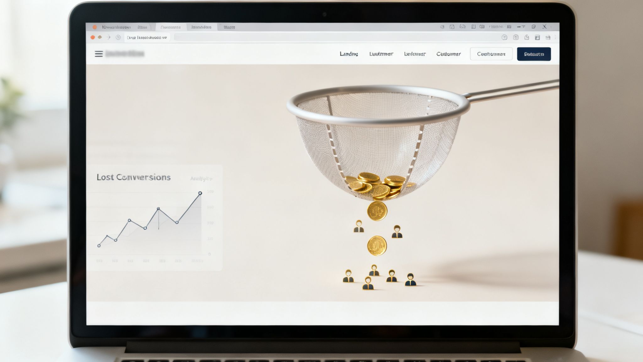
Your website is probably leaking money
Look, most company websites are digital sieves. They’re built to do a bit of everything—showcase the brand, list job openings, host a blog, and satisfy a dozen internal stakeholders. That’s fine for organic traffic, but for paid ads? It’s a dumb way to burn money. 🔥
Sending expensive PPC traffic to a generic homepage is one of the biggest mistakes I see founders and marketers make. Your standard website is a jack-of-all-trades and, consequently, a master of none. It’s cluttered with distractions, mixed messages, and a dozen different paths a user can take. None of those paths are optimized for the one thing you paid for: a conversion.
This isn’t about making tiny tweaks; it’s about fundamentally shifting your campaign’s profitability. The disconnect between ad clicks and business results is almost always found on the page a user lands on after the click. We need to stop treating websites as brochures and start engineering them as efficient conversion machines.
The hard truth about conversion rates
Let’s talk numbers for a second. The average landing page conversion rate across all industries hovers at a pathetic 2.9%. Think about that—for every 100 visitors you pay good money for, 97 of them leave without doing what you wanted them to.
But here’s the kicker: the top-performing landing pages aren't just a little better; they're in a completely different league. The top 25% of pages convert at 11.9% or higher. This isn't a small difference; it's a massive opportunity to stop wasting traffic.
Even beyond the page's design, things like clunky or outdated checkout flows can kill your numbers. For e-commerce or SaaS, making sure you have the right payment processing solutions is crucial to sealing up those financial leaks and boosting your checkout conversion rate.
A truly conversion-optimized website is built with a singular focus. It understands the user’s intent from the moment they click the ad and guides them seamlessly to the desired action. It has no distractions, the headline and content directly reflect the promise made in your ad copy, and there is one clear, unmissable call-to-action, not five different things to click.
This isn't just about aesthetics. It's about respecting the user's time and, just as importantly, your ad budget.
Standard website vs. optimized landing page for PPC
To really drive the point home, let’s look at a quick comparison. This is why your main website is probably failing your paid campaigns.
| Attribute | Standard Website | Optimized Landing Page |
|---|---|---|
| Primary Goal | Inform, explore, brand | Convert a specific visitor |
| Navigation | Full menu, footer, sidebar | Minimal or no navigation |
| Message | Serves many audiences | One message for one audience |
| Call-to-Action | Multiple (e.g., Blog, About Us) | One, clear, focused CTA |
| Focus | Divided attention | Singular, linear path |
| PPC Suitability | Poor, leads to low relevance | Excellent, drives high relevance |
The difference is night and day. One is a library; the other is a direct sales conversation.
When you’re ready to get serious, you need to conduct a thorough analysis of where you're losing people. You can find out more by checking out our guide on how to perform a conversion rate optimisation audit.
The goal is to plug the leaks and build a system that predictably turns clicks into customers. Let’s fix this.
Core principles of websites that actually convert
Alright, we've established that most websites are terrible funnels for paid traffic. So, how do we build one that actually works?
This isn’t some abstract art form; it’s a science grounded in human psychology and user experience. Building a website that actually converts means respecting a few non-negotiable pillars.
Forget fluffy branding exercises. The first and most critical principle is message match. When a user clicks your Google Ad promising AI-Powered Invoicing Software for Freelancers, your landing page headline better say something damn close to that. If it just says Welcome to FinTech Solutions, you’ve created immediate cognitive dissonance. That visitor is gone.
It's a simple, brutal contract: deliver exactly what you promised in the ad.

This alignment is the bedrock of a high-performing page. It reassures the user they’re in the right place within milliseconds—which is all the time you have before they hit the back button.
Designing for a single action
Once the message match is confirmed, the user’s eyes need to go exactly where you want them. This is all about layout and visual hierarchy. Most websites are a chaotic mess of navigation links, competing CTAs, and sidebar promotions. That’s dumb. It’s like a salesperson trying to pitch you three different products at once.
A conversion-optimized website is ruthless in its focus. It guides the visitor down a single, clear path toward one goal. There should be one primary button on the page, not five. Make it big, make it bold, and make the benefit crystal clear. Use whitespace to draw attention to the most important elements, like your headline, your form, and your CTA. And use visual cues like directional arrows or contrasting colors to guide the eye. These subtle nudges are incredibly powerful.
The goal is to eliminate choice paralysis. Give the user one clear decision to make, and you dramatically increase the odds they'll make it. Our own internal data shows pages with a single CTA outperform those with multiple options by over 200%.
Your landing page shouldn't be a choose-your-own-adventure story. It should be a direct flight to a single destination: the conversion. Any element that doesn’t support that journey is just turbulence.
Building trust in seconds
A stranger just landed on your page after clicking an ad. They are inherently skeptical. Why should they trust you with their email, their time, or their money? This is where trust signals come in.
These aren't just decorative elements; they are the evidence that disarms skepticism and builds credibility. To truly build a website that converts, understanding core principles is key. Explore these conversion rate optimization best practices to dive deeper into the tactics that work.
Your page needs to quickly answer the question, is this company legit? Show, don't just tell. Use real testimonials from happy customers, logos of well-known clients, or case study results. If you're asking for sensitive information, display security seals. Mention any awards you've won or impressive statistics like Trusted by 10,000+ businesses.
Getting these foundational elements right isn't optional. It’s the difference between a page that feels like a credible, professional solution and one that feels like a cheap online flyer. For those looking to nail the visuals, you can learn more about crafting effective pages in our article on landing page design best practices. It's the architecture upon which all successful campaigns are built.
Why speed is the foundation, not a feature
Let’s get one thing straight: page speed isn't a nice-to-have or some technical checkbox for your dev team. For conversion-optimized websites, especially in the world of paid search, speed is the product. When you're paying Google for every single click, every millisecond counts.
A user clicks your ad because they have an immediate need. A slow-loading page is the digital equivalent of a locked door—they'll just bounce, go to your competitor, and you've just paid for the privilege of annoying them. Patience is zero.
The brutal math of milliseconds and money
This isn't just a gut feeling; the data is unforgiving. Studies show that websites loading in just 1 second see conversion rates three times higher than those taking 5 seconds. This isn't a small dip; it's a catastrophic drop-off. You can read more about this direct correlation between load times and conversion rates on WordStream.
For a PPC manager, this is a direct lever on profitability. A slow page not only kills your conversion rate but also hurts your Google Ads Quality Score. Google wants to send users to good experiences, and a slow page is a bad experience. This means you end up paying more per click for the few visitors who actually stick around.
Speed isn't just a feature; it's the foundation upon which every other optimization is built. A beautifully designed page with perfect copy is useless if no one waits around long enough to see it.
This is where so many teams get it wrong. They spend weeks debating button colors and headline copy while ignoring the single biggest killer of their conversions: a bloated, slow-loading page. It’s like rearranging furniture in a burning building. 🔥
Common speed killers hiding on your page
So, what’s actually slowing you down? It's almost always a combination of a few common culprits. The good news is that these are fixable problems if you know where to look. Here are the usual suspects:
- Bloated, unoptimized images: That stunning high-res hero image might look great, but if it's a 5MB monster, you've already lost the battle. Every image needs to be compressed and served in a modern format like WebP. It’s a non-negotiable.
- Clunky, unnecessary code: Many websites are built on heavy themes or templates loaded with JavaScript for features you don't even use. Every script is another request the browser has to make, adding precious milliseconds to your load time.
- Too many third-party scripts: Analytics tools, heatmaps, live chat widgets—they all add weight. While useful, each one is a performance tax. Be ruthless about what you actually need.
Fixing these issues is often about subtraction, not addition. It's about building lean, focused pages that deliver the core message and the call-to-action as fast as humanly possible. Our comprehensive guide on how to improve page load speed provides more actionable steps you can take today.
Ultimately, a fast page respects the user's time and your budget. It's the first and most important trust signal you can send. Before you test a single headline, fix your speed.
A simple workflow for optimizing everything
Ideas are cheap. Execution is everything. Having a bunch of theories about what makes a great conversion-optimized website is completely useless without a system to test and implement them. So let’s get practical.
This isn’t about random guesswork or chasing the latest design trend. It’s about a disciplined, repeatable process that turns your website from a static brochure into a dynamic asset that gets smarter with every single visitor. Let's build a workflow you can actually start using tomorrow.
Prioritize your tests like an investor
You can’t test everything at once, and frankly, most of your ideas are probably dumb. The key is to focus your energy where it has the highest chance of making a real impact. I’m a big fan of simple frameworks that force you to think critically, like the PIE model.
It’s dead simple: for every test idea you have, score it from 1 to 10 on three criteria.
- Potential: How much improvement do you realistically think this change could make? Swapping a button color might be a small bump, but redesigning your entire checkout flow could be a game-changer.
- Importance: How valuable is the traffic on this page? An optimization on your highest-traffic landing page is far more important than a tiny tweak on your about us page.
- Ease: How quickly and cheaply can you get this test live? A simple copy change is easy; a full backend integration is not.
Add up the scores (P+I+E). The ideas with the highest total score are where you start. This simple exercise forces you to move beyond gut feelings and invest your resources like a venture capitalist betting on the most promising startups.
A disciplined process beats random inspiration every single time. Stop throwing ideas at the wall and start making calculated bets based on data and potential impact.
You can’t improve what you don’t measure
Before you change a single pixel, your tracking has to be flawless. It’s shocking how many companies run A/B tests with broken analytics, making decisions based on garbage data. It’s like trying to navigate a ship with a broken compass.
You need to know your baseline. What’s your current conversion rate for the specific goal you’re trying to improve? You need event tracking set up for every meaningful interaction—every button click, every form submission, every scroll to a key section.
If you can’t confidently say, our current lead form submission rate on this page is 3.2%, then you have no business running a test on it. Get your data house in order first. This isn’t the sexy part of CRO, but it’s the most critical foundation. Without accurate measurement, you’re just gambling.
This infographic shows a simplified flow of how speed—a foundational metric—directly affects the user journey and your bottom line.
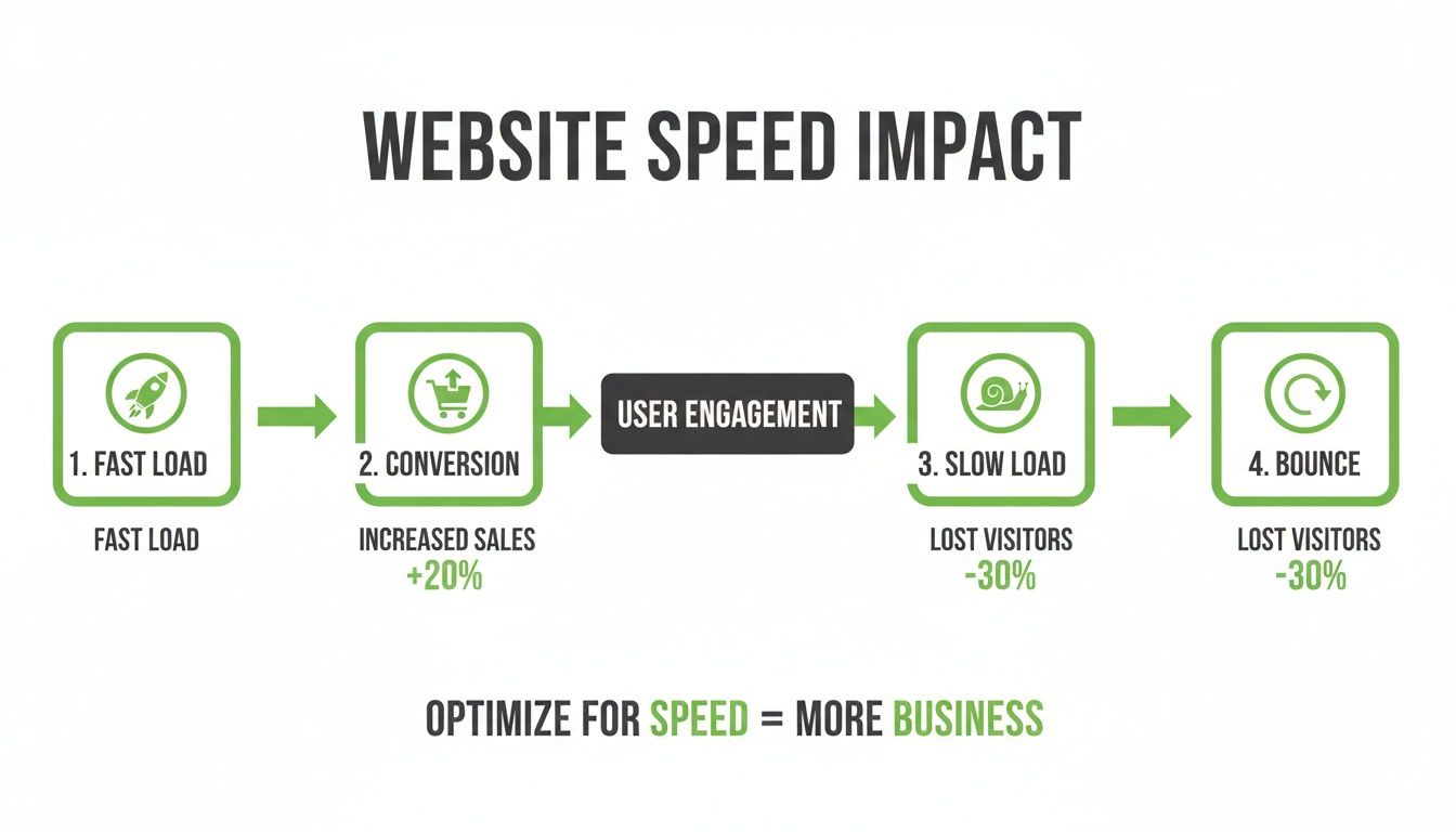
The visualization makes it crystal clear that a fast load time puts users on the path to conversion, while a slow one leads them straight to the exit door.
Run clean tests and trust the data
Now for the main event: A/B testing. This is where you put your hypothesis to the test in a controlled experiment. You have your current page (the control or version A) and your new, improved version (the variant or version B). Traffic gets split randomly between them.
The goal is to see if your change produces a statistically significant improvement. That term is key. It means the result you're seeing isn't just random chance. Here’s how to avoid common traps:
- Test One Thing at a Time: If you change the headline, the button color, and the main image all at once, you’ll have no idea which change actually made the difference. Isolate your variables.
- Let It Run Long Enough: Don’t call a test after one day just because one version is ahead. You need enough data to reach statistical significance (usually 95% confidence). A good testing tool will tell you when you’ve hit that mark.
- Don’t Get Attached to Your Ideas: The data is the only thing that matters. If your brilliant idea loses to the control, then it was a bad idea. Kill it, learn from it, and move on. Ego has no place here.
This entire workflow—prioritize, measure, test—is a continuous loop. The winner of one test becomes the new control for the next. This is how you build a truly conversion-optimized website: not through one big redesign, but through hundreds of small, data-driven improvements over time.
Real-world examples of landing pages that work
Theory is great, but seeing it in action is better. All the principles we’ve talked about—message match, a single CTA, social proof—can sound a bit abstract. So let's look at a few real-world templates for conversion-optimized websites that are absolutely crushing it.
I won't just show you pretty pictures. I’ll break down the strategic thinking behind the layout and copy for three common use cases: a B2B lead generation form, a direct-to-calendar booking page, and a simple email capture page. Think of this as a swipe file for high-converting design patterns you can adapt for your own campaigns.
The B2B lead generation machine
This is the workhorse for most SaaS and service-based businesses. The goal is simple: get a qualified lead to raise their hand and say, I'm interested. Here’s a breakdown of a classic, high-performing B2B landing page.
It starts with a headline that mirrors the ad's promise perfectly—zero ambiguity. Below that, a punchy sub-headline clarifies the core benefit in one sentence. The hero section is clean, usually with a relevant image or short video on one side and a frictionless form on the other.
This form is key. It asks for the bare minimum: work email, maybe first name. That's it. You can enrich the data later. The goal here is to remove every possible point of friction. The button text isn't a lame Submit. It's an action-oriented benefit like Get My Free Demo or Unlock My Quote. Just below the hero section, you’ll almost always see a row of logos from well-known clients. This immediately builds credibility. The body content agitates a specific pain point and then presents the service as the clear solution.
Everything on the page serves a single purpose: getting that form filled out. No navigation menu, no footer links to the blog, no distractions. It’s a closed loop designed for one outcome.
The direct-to-calendar booking page
Why trade five emails to schedule a call when you can get it done in one click? This type of landing page is brilliant for sales teams, consultants, or anyone whose business relies on meetings. It skips the we'll get back to you limbo and goes straight for the commitment.
The psychology here is all about immediacy and efficiency. You’re not just offering information; you’re offering a direct, tangible next step that the user can take right now.
People are busy. Respecting their time by offering instant booking isn't just a convenience; it's a powerful conversion tool. It removes the uncertainty of follow-ups and captures high-intent leads at their peak moment of interest.
The layout is ruthlessly simple. There's a strong headline that frames the call as a high-value consultation. Below that, you'll find a brief intro to the person they'll be speaking with—a photo and a short bio builds a human connection.
The star of the show, of course, is the embedded calendar widget from a tool like Calendly or HubSpot. The user sees available slots and books a time that works for them, right on the page. The CTA simply reinforces the action: Pick a Time. It's incredibly effective because it transforms a lead into a scheduled sales meeting in under 60 seconds.
The minimalist email capture page
Sometimes, the goal isn't a demo or a sale just yet. It's about starting a conversation by getting an email address in exchange for something valuable—a webinar registration, a whitepaper, or access to a beta list.
These are the simplest, yet often most effective, conversion-optimized websites. They are often just a single screen with no scrolling. The entire experience is focused on one field: the email input. The headline is everything here. It has to sell the value of what the user is getting. Something like The AI Marketing Playbook That Drove $1M in Pipeline is far more compelling than Sign Up for Our Newsletter.
There are maybe one or two bullet points reinforcing the key benefits. No long paragraphs. Just enough to overcome any hesitation. The form consists of a single input field for the email address and a clear, compelling CTA button. That's it. This radical simplicity makes the decision to convert almost effortless.
These examples prove that a successful conversion-optimized website isn't about cramming in more features. It’s about a ruthless dedication to a single goal and the strategic removal of everything else.
How to scale your efforts with automation
Building one great landing page is manageable. But what happens when you’re running hundreds of ad groups, each targeting a different keyword with different user intent? Building unique, perfectly optimized pages for every single one is impossible... manually.
This is the point where most campaigns hit a hard ceiling. It’s where technology becomes your unfair advantage. The truth is, manual optimization doesn't scale. If you want to compete at a high level, you have to automate.
Instant message match at scale
Imagine automatically generating a unique, message-matched landing page for every single keyword in your campaign, instantly. This is what platforms like ours, dynares, were built to do. Instead of one generic page for an entire ad group, AI can create thousands of variants, each one perfectly tailored to the user's search query.
This isn’t just about swapping out a headline. It's about tailoring the entire narrative of the page—the subheadings, the benefits, even the CTA—to resonate with a specific intent. The precision this provides is something a human team simply can't replicate across thousands of keywords. It’s the ultimate expression of a conversion-optimized website, delivered at machine speed.
Continuous optimization on autopilot
Running one A/B test is simple enough. But what about running hundreds of them, all the time, across all your landing pages? That’s where automated A/B testing changes the game completely. It moves optimization from a periodic project to a continuous, background process.
The system creates multiple versions of copy, headlines, or layouts based on performance data. It automatically splits traffic between variants to gather data quickly and efficiently. Once a variant proves to be a statistically significant winner, the system automatically directs 100% of traffic to it, ensuring you’re never knowingly sending visitors to an inferior page.
This creates a self-improving system where your campaigns are always getting smarter and more effective, without you having to manually set up and monitor every single test.
The future of PPC management is less about tedious, manual work and more about high-impact strategy. Automation frees you from the weeds so you can focus on the bigger picture—where to expand next.
Closing the loop with conversion value uploads
This is the holy grail for serious performance marketers. Getting a lead is great, but knowing which leads turned into high-value customers is what really matters. Manually tracking this and feeding it back into Google Ads is a nightmare. It’s slow, prone to errors, and often gets abandoned.
Automation solves this by connecting your CRM or sales data directly to your ad platform. When a lead from a specific keyword becomes a €10,000 customer, that value is automatically uploaded back into Google Ads.
This gives Google’s algorithm the fuel it needs to optimize for what truly matters: revenue, not just lead volume. It starts bidding more aggressively for the types of searches that generate real business, transforming your campaigns from lead-generation machines into profit-driving engines. Understanding the wider implications is key, and you can learn more about the benefits of marketing automation in our dedicated post. It’s about making smarter, data-backed decisions at a scale that was previously unthinkable.
Ready to stop building landing pages one by one and start scaling your Google Ads performance? dynares uses AI to automatically create high-converting pages for every keyword, run tests on autopilot, and optimize your campaigns for revenue, not just clicks. See how it works at https://dynares.ai.


