Landing Page CRO: A Practical Guide to Higher Conversions
Let's be blunt: landing page conversion rate optimization is about systematically tweaking your page to get more people to actually do something—fill out a form, buy a product, you name it. It’s not about flashy design. It’s about turning clicks into customers.
Why your paid ads are doomed from the start
Chances are, you're burning a mountain of cash on Google Ads. I know I did. Early in my career, I'd spin up campaigns, obsess over every keyword match type and ad copy variant, and then dump all that expensive traffic onto a generic, one-size-fits-all landing page.
The result? Conversions were basically a rounding error. My cost-per-acquisition was terrifying.
The brutal truth is that most paid search campaigns fail long before anyone even sees the ad. They fail the moment a user clicks through and lands on a page that feels completely disconnected from what the ad promised. That disconnect kills user intent instantly.

The ad scent disconnect
I like to think of it as 'ad scent'—the consistent trail from the search query, to the ad copy, right through to the landing page headline. When that scent is broken, trust evaporates. The user asks, 'Am I in the right place?' and hits the back button before you can say 'wasted spend'.
This isn’t just another marketing task; it's the single most critical lever you have for paid search success. Getting this right means you stop blaming your ads and start fixing the real problem: the destination.
If you aren't meticulously tracking what happens after the click, you're flying blind. For a deeper look, our guide on a proper Google Ads conversion tracking setup shows how this forms the bedrock of any serious optimization effort.
Your landing page has one job: fulfill the promise your ad made. If it doesn’t do that clearly and immediately, you’ve not only lost a conversion, you’ve paid Google for the privilege of disappointing a potential customer.
The data backs this up. The average landing page conversion rate across all industries is a modest 6.6%, based on a massive study of over 41,000 pages. This shows just how many businesses are struggling with this exact disconnect. You can read the full research on landing page statistics to see how you stack up.
The mindset shift required for success
To win at this game, you have to adopt a completely different mindset. It's about shifting from a passive 'build it and hope' approach to an active, scientific one.
This playbook is all about making that shift. We're moving beyond generic advice and into a founder-to-founder guide on systematically improving performance. It's about building a predictable growth engine, not just a prettier website.
The CRO mindset shift
Most people approach landing pages with a set of flawed assumptions. Here’s how we need to think differently.
| Common (and Flawed) Approach | The Revenue-Focused Approach |
|---|---|
| Focus on aesthetics and "best practices." | Focus on fulfilling user intent and the ad's promise. |
| Build one page and send all traffic to it. | Create tailored experiences for different ad groups and intents. |
| Optimize for lead volume (quantity). | Optimize for revenue and lead quality. |
| Treat CRO as a one-time project. | Treat CRO as a continuous, iterative process. |
| Guess what will work based on opinion. | Form hypotheses based on data and test everything. |
Adopting the mindset on the right is the first real step. It changes how you view every element on your page and every dollar of your ad spend.
Building your foundation with research and a aolid hypothesis
Let’s get one thing straight: great landing page CRO isn’t born in a brainstorming session. It’s a terrible idea to gather your team in a room and ask, 'So, what should we change on the landing page?'
That’s how you end up testing button colors for six months with nothing to show for it. It's dumb.
Real, impactful CRO starts with digging into the data. It's about putting on your detective hat and understanding why people aren't converting, not just guessing what they might want. I get it; founders want results now, but skipping this foundational work is the difference between random acts of marketing and building a predictable growth engine.
This is where you stop guessing and start listening to what your users' actions are screaming at you.

Uncovering the "Why" behind user behavior
Before you change a single word on your page, you need to immerse yourself in both quantitative and qualitative data. The numbers tell you what is happening. The human feedback tells you why. You need both.
Quantitative data gives you the hard numbers—your high-level map.
- Google Analytics: Where are people dropping off? Is there a specific page or section with an unusually high exit rate? This is your starting point for spotting problem areas.
- Ad Campaign Data: Which keywords and ad groups have high click-through rates but terrible conversion rates? This signals a massive disconnect between your ad's promise and the landing page experience. Our insights on keyword research can help pinpoint intent mismatches that often start here.
Qualitative data gives you the human context. This is where you find the gold.
- Heatmaps and scroll maps: Tools like Hotjar show you exactly where users are clicking (or not) and how far down the page they actually scroll. If nobody is scrolling past the fold to see your brilliant features list, that’s a huge red flag.
- Session recordings: This is my personal favorite. It’s like watching over your user's shoulder as they move their mouse, hesitate, or rage-click in frustration. It’s often painful to watch but incredibly insightful.
- Customer feedback: Seriously, go talk to your sales and support teams. Ask them, 'What are the top three questions prospects always ask?' or 'What are the biggest hesitations they have?' Their answers are pure CRO fuel.
Before getting too deep into the weeds, it helps to understand the broader principles of How to Improve Conversion Rate for Your Website to connect your page-level efforts to the bigger business picture.
From messy data to a sharp hypothesis
Once you've collected this data, patterns will start to emerge. You might notice users from your 'cheap software' ad group barely scroll, while those from the 'enterprise solution' group watch your demo video twice. Or your sales team might tell you that everyone gets confused about pricing.
This is where you form a hypothesis. A proper hypothesis isn't just a vague idea; it’s a clear, testable statement connecting an observation to a proposed change and a predicted outcome.
A weak hypothesis is, 'Let's change the button color'. A strong hypothesis is, 'Because our session recordings show users hesitating and re-reading the pricing section, we believe that adding a "No credit card required" sub-text below the "Start Free Trial" CTA will reduce friction and increase sign-ups by 10%.'
See the difference? One is a guess. The other is an educated, data-backed strategy. It’s focused, measurable, and directly addresses a real problem you observed.
Here’s a simple framework to build your own:
- Because we saw [data/observation]... (e.g., "Because our heatmaps show that only 20% of users scroll below the hero section...")
- We believe that [change]... (e.g., "...we believe that moving our top three customer logos into the hero section...")
- Will result in [outcome]... (e.g., "...will result in a 15% increase in form submissions by immediately establishing trust and credibility.")
This discipline forces you to justify every single test. It moves you from a 'let's throw spaghetti at the wall' approach to a systematic process of learning and improvement. Every test, win or lose, teaches you something valuable about your customer. That knowledge is the non-negotiable foundation of scalable growth.
Designing pages that convert, not just look pretty
Alright, let's get our hands dirty. The research is done, and you've got a solid, data-backed hypothesis. Now it’s time to translate that into real changes on the page—the kind that actually moves the needle on your landing page conversion rate optimization efforts.
Forget winning design awards. The only trophy we're after here is a higher conversion rate. Your page has one job: create the clearest, most compelling path from the user's click to the desired action. Everything else is just noise.
The anatomy of a high-converting page
Every single element on your landing page has to earn its keep. If it doesn't directly support the conversion goal, it’s a distraction and should probably go. I’ve seen countless pages cluttered with unnecessary navigation links, social media icons, and fluffy marketing copy that do nothing but dilute the user's focus.
Here are the absolute non-negotiables:
- Headline-ad copy mirroring: The headline on your landing page must perfectly echo the promise made in your ad. If your ad says, 'Get a Free Demo of Our AI Sales Tool,' your headline better not be 'The Future of Enterprise Software'. This continuity, or 'ad scent', is critical for building immediate trust.
- A crystal-clear value proposition: Within three seconds, a visitor needs to know what you offer, who it's for, and why they should care. Nail this with a strong headline, a concise sub-headline, and maybe a few bullet points.
- Compelling social proof: People trust other people. Show them they aren't the first person to take this leap. This could be customer logos, star ratings, short testimonials, or even a quick video of a happy client. A simple video testimonial often does more selling than a page of copy ever could.
- A single, unmistakable call-to-action (CTA): One page, one goal. Don't ask them to 'Request a Demo' and 'Download Our eBook' and 'Follow Us on Twitter'. Give them one clear path forward.
For a deeper look into the visual and structural pieces, our guide on landing page design best practices covers these fundamentals in much greater detail.
Frictionless forms and powerful CTAs
Now, let's talk about the two places where most conversions go to die: the form and the call-to-action button. I see founders screw this up constantly. They get greedy, ask for way too much information upfront, and create a massive wall of friction.
Remember, every extra field you add to a form chips away at your conversion rate. Do you really need their company size, annual revenue, and job title right this second? Probably not. Ask for the absolute minimum you need to qualify and contact the lead—usually just a name and an email is enough to start.
Your goal is to make saying 'yes' as easy as humanly possible. Treat the user's attention like a finite resource. Don't waste it on a 10-field form when a 2-field form will do the job.
The CTA itself is another massive lever. Generic buttons like 'Submit' or 'Click Here' are just lazy. Your button copy should reinforce the value the user is about to get. Instead of 'Submit', try 'Get My Free Quote' or 'Start My 14-Day Trial'. This small tweak reframes the action around their benefit, not your process.
Personalized CTAs are even more potent. When the button text reflects the user's specific intent, the results can be explosive. Personalized CTAs have been shown to convert a staggering 202% better than generic versions. The data is clear: relevance drives action and makes users feel understood.
Mobile-first isn't a buzzword—It's a requirement
In 2024, if your landing page isn't lightning-fast and perfectly usable on a mobile device, you might as well not have one. The majority of paid search traffic comes from mobile. A slow-loading or clunky page on a smartphone is an instant conversion killer.
Test your page speed. Pinching and zooming shouldn't be required. Buttons need to be easily tappable with a thumb. Anything less is just throwing money away. To make sure your pages are visually effective across devices, consider these 10 Best Practices for Landing Page Design as a solid reference.
The great news is that you don't need to beg developers for help anymore. Modern page builders and platforms like dynares allow you to create, test, and scale these optimized experiences on your own. This agility is your competitive advantage, letting you turn a new hypothesis into a live page in hours, not weeks.
Running A/B tests that actually produce results
Alright, let's get into A/B testing. This is where most marketers completely drop the ball. They test trivial things like a slightly different shade of blue, call the test way too early, or just flat-out ignore the math. It's dumb, and it leads to a ton of wasted effort.
This isn't about running one-off experiments to feel productive. We're talking about building a disciplined testing culture that produces reliable, actionable insights you can build a business on. If you're not rigorous here, you’re just gambling with extra steps.
This visual flow shows the core elements your test variants should focus on: a compelling headline, undeniable social proof, and a crystal-clear call-to-action.
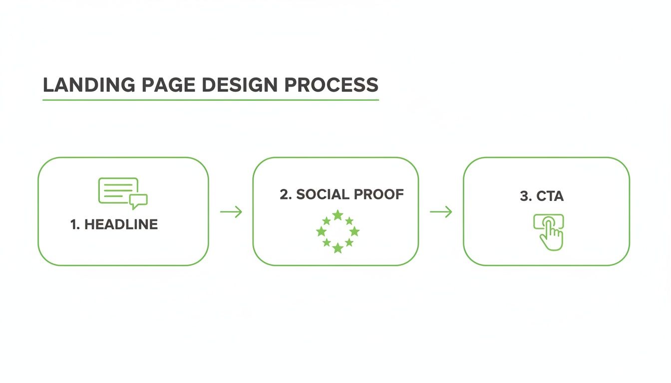
Mastering the interplay between these three components is everything. A weak headline can completely undermine amazing social proof, so you have to think about the page as a single, cohesive argument.
Setting up a test that doesn't lie to you
First things first, you need the right tools. Platforms like VWO, HubSpot, or even the testing features baked into your landing page builder will get the job done. The setup is usually pretty simple: you have your control (Version A, the original) and a variation (Version B, with your change).
The most critical part is defining your primary conversion metric. Are you measuring form submissions? Demo requests? Clicks on a phone number? Pick one. Trying to measure five different things at once will just give you muddy, confusing data that you can’t act on.
Next, figure out your sample size. You can't just run a test on 100 visitors and declare a winner. That’s not data; it’s an anecdote. Use an A/B test sample size calculator to see how much traffic you actually need to reach a statistically significant result. This simple step prevents you from making a huge business decision based on random chance.
Understanding statistical significance (without a PhD)
This is where eyes tend to glaze over, but it’s non-negotiable. You’ll see terms like 'p-value' and 'statistical confidence'. Let me break it down.
Statistical confidence tells you how likely it is that your result is real and not just random luck. A 95% confidence level means there's only a 5% chance that the difference between your pages happened by coincidence.
If your testing tool says a variant is "winning" but the confidence level is only 70%, ignore it. You might as well flip a coin. I don't even look at the results until they cross the 95% threshold. Anything less is a false positive waiting to happen, and it will lead you to make bad decisions that actually hurt your landing page conversion rate optimization.
While A/B testing focuses on one change at a time, it's worth understanding how it differs from testing multiple changes at once. For those looking to go deeper, our comparison of multivariate testing vs A/B testing is a great place to start.
The patience principle: Don't call it early
Another classic rookie mistake is stopping the test the second it hits 95% confidence. You have to let it run long enough to account for natural swings in user behavior.
Think about it: user behavior on a Monday morning is wildly different from a Friday afternoon or a Sunday night. B2B prospects might do their research during the work week, while e-commerce shoppers might pull the trigger on the weekend.
- Run tests for full business cycles: This usually means running an experiment for at least one full week, ideally two. This helps smooth out any daily weirdness.
- Don't peek at the results every hour: I know, it's tempting. But peeking leads to emotional decisions and stopping a test prematurely. Set it up, trust the math, and come back when it has run its course.
- Segment your results: Once the test is done, dig in. Look at how the results differ by device (mobile vs. desktop), traffic source (organic vs. paid), or even ad group. You might find your new design crushes it on desktop but fails miserably on mobile—a crucial insight.
Building a disciplined testing framework is hard. It requires patience and a commitment to data over gut feelings. But it’s the only way to create a repeatable process that generates real, compound growth for your business.
Scaling your wins across every campaign
So, you ran a disciplined A/B test and found a winner. A new headline, a tighter value prop, a smarter CTA—whatever it is, you’ve got a statistically significant lift. Nice work.
But here’s the hard truth: a single win on a single page is just a starting point. The real, game-changing growth comes from scaling that learning across your entire paid search program. This is where most companies fall flat.
They celebrate their 5% lift, file a ticket for a developer to manually update hundreds of other pages, and then… wait. It's a founder's worst nightmare—a total waste of time, momentum, and engineering resources.
Frankly, that manual approach is broken. In 2024, it’s unacceptable.
Moving from manual updates to smart automation
The magic isn’t finding one winning variant. It's building a system that can programmatically apply that winning element across thousands of keyword-specific landing pages, instantly. Automation isn't a luxury here; it's your most powerful growth lever.
Imagine your test proves that a headline formula like '[Benefit] for [Audience] Without [Pain Point]' boosts demo requests by 20%. With the right tech, you don't just update one page. You push that change to a central template, and the new formula is immediately rolled out to every relevant ad group in your account.
That’s not a small gain. That’s how you get exponential growth across your whole funnel.
We have to stop thinking about landing pages as static, one-off projects. They are dynamic assets. A powerful feedback loop should exist where insights from your A/B tests immediately inform your templates, and automation handles the brutal work of execution.
This is the difference between a marketer who tweaks pages and a founder who builds a growth machine.
The power of quantity with quality
Some people think having more landing pages is just more work. They’re missing the point. Having more relevant landing pages is a massive competitive advantage. It’s how you maintain that crucial 'ad scent' from keyword to click to conversion across your entire account.
The data backs this up. Companies with 21 to 40 landing pages see nearly 300% more conversions than those with fewer. This isn't fluff; it’s a direct result of targeted pages multiplying leads. You can dig into more landing page statistics to see how volume tied to relevance drives these kinds of results.
Manually creating and managing 40 pages is a headache. Programmatically generating thousands? That’s where the real opportunity is.
Here’s what that looks like in practice:
- Keyword-level personalization: Systems like our own at dynares can automatically generate a unique, highly relevant landing page for every single keyword or ad group. The headline, copy, and even images dynamically match the user’s search intent.
- Instantaneous rollouts: When a test on your 'enterprise software' template proves a new testimonial format works, that update can be applied across all enterprise-focused pages in minutes, not months.
- Error reduction: Manual updates are riddled with human error—copy-paste mistakes, broken links, outdated offers. Automation gets rid of this, ensuring brand consistency and a flawless user experience at scale.
This isn't some far-off future vision. The technology is here now. It just requires a shift in mindset—from manually managing a handful of pages to architecting a system that manages thousands.
This is how you stop playing small and start leveraging your wins for massive, sustainable growth. It's how you make every single dollar of your ad spend work smarter.
Burning questions about landing page CRO
Let's finish up with a few of the questions that land in my inbox all the time. I’m giving you the straight-up, no-nonsense answers to help you sidestep the common traps that burn through cash and patience. This is the practical advice you need to start building an optimization program you can actually trust.
How long should I run an A/B test?
The short answer? Longer than you think, but not forever. The single biggest mistake I see founders make is calling a test way too early. You can't just run an experiment for two days, get a hundred visitors, and declare a winner. That’s not data; that's just noise.
You're looking for two things: statistical significance (aim for 95% confidence) and a complete business cycle. For most companies, this means running a test for at least one full week, but two is even better. This helps smooth out the natural highs and lows between a dead-quiet Monday morning and a frantic Friday afternoon.
Don't stop a test the second it hits 95% confidence. Let it run for at least a full week to capture a complete cycle of user behavior. Patience here prevents you from making big decisions on flimsy, misleading data.
The whole point is to collect enough solid data to make a reliable decision. Don't let impatience trick you into acting on what amounts to a coin flip.
What should I do when a test fails?
First off, let's redefine what a 'fail' even is. A test that doesn't produce a lift isn't a failure—it's a lesson. If you run a disciplined test and your new version performs the same as or worse than the original, you've just learned something incredibly valuable about what your customers don't want.
Maybe your hypothesis that a shorter form would boost conversions was dead wrong. Perhaps your customers actually prefer providing more detail because it makes them feel like they’ll get a more tailored response. That insight is pure gold.
Here’s exactly what to do next:
- Document everything: Write down your original hypothesis, the changes you made, the final numbers, and your new conclusion. This builds an internal playbook so you don't repeat the same mistakes six months from now.
- Slice up the segments: Did the test lose overall but actually win with mobile users? Or maybe it crushed it for traffic from one specific ad campaign? The top-line result might be hiding a pocket of success you can build on.
- Build a smarter hypothesis: Based on what you just learned, what's your next educated guess? Maybe the issue wasn't form length but the headline's lack of clarity. Use the 'failure' to inform a much sharper hypothesis for your next experiment.
An inconclusive test is only a waste if you refuse to learn from it.
How many tests should I run at once?
Ah, the classic question. The ambitious side of you wants to test everything, all at once. The practical, profitable answer is: it depends entirely on your traffic volume.
If you’re swimming in traffic—we’re talking tens of thousands of visitors per day to a single page—you might be able to run multiple tests on different, unrelated page elements simultaneously. This is called multivariate testing, and it's a more advanced technique for a reason.
For most businesses, though, the answer is simple: run one test, on one page, at a time.
Why? Because running multiple tests on the same page will absolutely muddy your data. If you're testing the headline and the CTA button copy in the same experiment, how will you ever know which change was responsible for the lift (or the drop) in conversions? You won't.
Focus your traffic on a single, high-impact test. Get a clear, actionable result as quickly as you can. Once that test concludes, take what you learned and move on to the next one. This methodical, one-by-one approach is how you build reliable, compounding gains in your landing page conversion rate optimization. It's less chaotic and infinitely more effective.
At dynares, we've built a platform to automate this entire process—from generating thousands of keyword-specific pages to running tests and scaling the winners. It's the system I wish I had when I was burning cash on ads. See how it works at https://dynares.ai.


