Your lead capture form is the digital handshake between you and a potential customer. Get it right, and you're building a pipeline of high-value leads. Get it wrong, and you're just burning ad spend. It's that simple.
Why your lead capture forms are leaking money

Let's be blunt: most lead capture forms are a disaster. They're bloated, confusing, and actively repel the exact people you just paid good money to bring to your landing page. I've seen it countless times—a brilliant ad campaign driving perfect-fit traffic straight to a form that feels like a tax audit. It's a massive own goal.
This isn't just some minor user experience issue; it's a gaping hole in your funnel that's actively draining revenue. As a founder who obsesses over every inch of the customer journey, I've learned the hard way how a lazy or poorly designed form can kill a marketing campaign stone dead.
The real cost of friction
Every unnecessary field, every confusing question, every moment a user has to pause and think—that's friction. It’s the psychological barrier that causes an otherwise interested person to abandon ship and bounce.
You've done all the hard work of getting them to your page, only to lose them at the final, crucial step. It's frustrating, and frankly, it's a waste of capital.
The dependency on forms is huge. Marketers worldwide lean heavily on them for what is lead generation marketing, with 84% relying on form submissions for everything from demo requests to gated content. Yet, a staggering 36% admit they struggle to even track the results. This is where the opportunity lies.
When you get this right, the payoff is enormous. For example, well-designed multi-step forms can boost conversions by up to 300% simply by breaking down the request into smaller, more manageable pieces.
The mindset shift you need is simple but profound: stop seeing just another form and start building a finely tuned, lead-generating machine. Your form is the single most critical conversion point on your landing page. Treat it that way.
Common blunders we've all made
I’ve made these mistakes myself, so I'm not pointing fingers. The key is to recognize them and fix them. Here are the most common culprits I see sabotaging otherwise smart campaigns.
- Asking for too much, too soon. Demanding a phone number and company size right away is like asking for marriage on the first date. It’s a huge commitment before you’ve built an ounce of trust.
- Zero mobile optimization. More than half your traffic is on mobile. If your form requires pinching, zooming, or tapping frustratingly tiny text fields, you’ve already lost. It's dumb.
- Vague, uninspired calls-to-action. "Submit" is the worst CTA in history. It implies work and offers no value in return. What is the user getting by clicking that button?
In the next sections, we'll dive into the practical steps to turn your leaky funnel into a high-performance engine.
Designing forms that people actually want to fill out

Let's get tactical. Great form design isn’t about winning art awards; it’s psychology. The foundational rule is almost painfully simple: ask for the most important thing first. If your entire funnel depends on getting an email address, that should be the very first field they see.
This isn't just a hunch. A deep analysis of over 10,000 forms found that asking for an email address upfront leads to an 18% higher completion rate. It works because it secures a small, low-friction commitment—a micro-yes—that makes people more likely to finish the process. You're building momentum from the first click.
That initial interaction sets the tone. Every design choice from that point on should be about reducing friction and guiding the user effortlessly toward the finish line.
Field strategy and smart defaults
Your form's fields are its currency. Every single one costs the user time and attention, so spend them wisely. A form with 10 fields looks like a mountain to climb, and most people will just walk away.
The solution? Multi-step forms. Breaking a long request into smaller, digestible chunks feels way less intimidating. It turns a marathon into a series of short sprints. Step one might be just the email, step two asks for a name, and a third might have an optional qualifying question.
Think about how you can make the user's life easier at every stage.
- Use smart defaults. If you're targeting a specific country, pre-select it. Little things like this remove needless clicks and make the process feel smoother.
- Clearly label every field. Don't get clever with placeholder text that disappears once you start typing. Use simple, direct labels above each field so users always know what’s required.
- Ditch the non-essential fields. Do you really need their phone number right now? Or their company's annual revenue? If it's not critical for the immediate next step in your sales process, cut it. You can always ask for it later.
The golden rule of form fields is this: if you're not going to use a piece of information to immediately personalize the user's journey or qualify them, don't ask for it. It’s just noise that kills conversions.
Progressive profiling: The B2B game-changer
For B2B founders, this is where things get really interesting. Instead of hitting a new prospect with a massive form, progressive profiling is about gathering intelligence over time. It’s a longer-term strategy that builds a relationship instead of demanding everything in a single, transactional moment.
Here’s a practical scenario: A visitor downloads their first e-book and provides their name and email. The next time they visit to register for a webinar, your form recognizes them (via cookies). Instead of asking for the same info, it now asks for their company name and job title.
This approach feels smarter and more respectful. You’re not just collecting data; you’re building a comprehensive profile of a lead with each interaction, which lets your sales team have much more relevant conversations down the line. To keep potential customers from abandoning your forms, it's worth following these 8 essential lead capture form best practices.
Below are some high-impact changes you can make to your forms today, grounded in proven psychological principles. They're quick wins that can meaningfully move the needle on your completion rates.
Quick wins for higher form completion rates
| Tactic | Why It Works (The Psychology) | Potential Impact |
|---|---|---|
| Put Labels Above Fields | Cognitive Ease: The eye moves naturally from label to field without jumping side to side. It reduces mental friction. | Up to a 10-15% increase in completion speed and reduction in errors. |
| Use a Single-Column Layout | Linear Progression: A single column creates a clear, straight path to completion. Multiple columns create visual chaos. | Can increase form completions by over 15% compared to multi-column layouts. |
| Show/Hide Password Fields | Reduces Anxiety: Users can see what they're typing, reducing typos and the fear of making a mistake. | Significantly lowers password-related errors and associated form abandonment. |
| Inline Validation (Real-Time Feedback) | Instant Gratification: Green checkmarks for correct entries provide positive reinforcement. Red Xs for errors allow for immediate correction. | Reduces user frustration and can decrease the time to complete a form by ~40%. |
| Auto-focus on the First Field | Reduces Friction: The user doesn't have to click or tap to start typing. The form is ready to go the moment the page loads. | Small but measurable improvement in start rate and overall completion time. |
Implementing even a couple of these tactics can have a noticeable effect. They all work toward the same goal: making your form feel less like a chore and more like a simple, logical next step.
Ultimately, designing effective lead capture forms requires a blend of empathy and data. The visual flow of your form is just as important as the fields it contains. For more on how form design fits into the bigger picture, check out our guide on landing page design best practices. It's all about creating a path of least resistance that feels helpful, not demanding.
Crafting a seamless user experience on any device
Let’s get one thing straight: a form that looks brilliant on a 27-inch monitor but is a complete nightmare on a phone is a failed form. It’s just dumb. With over half of all web traffic now coming from mobile, a mobile-first approach isn’t just a nice-to-have; it's the only way to survive.
This is where we get into the practical, non-negotiable mechanics of a smooth user experience. Getting this right separates the pros from the amateurs who are just burning cash on paid ads. It's about building trust from the very first tap.
Smart validation and instant feedback
There is nothing more infuriating for a user than filling out a form, hitting "submit," and then being told with a blast of red error messages that they messed up three fields ago. That's a rookie mistake. It creates friction and makes people want to give up.
The solution is real-time inline validation. It’s a simple concept with a massive impact on your completion rates. As a user types, the form gives them instant feedback.
- Positive reinforcement: When they enter a valid email format, a subtle green checkmark appears. This feels good and encourages them to keep going.
- Immediate correction: If they miss the "@" symbol, a gentle, helpful message like "Please enter a valid email" shows up right away, not after they’ve already moved on.
- Clarity on requirements: For password fields, show the requirements (e.g., 8 characters, one number) upfront, and tick them off as the user meets them.
This turns the form from a guessing game into a guided, supportive conversation. It respects the user's time and drastically cuts down on frustration-fueled abandonment.
Designing for accessibility and inclusion
Building for everyone isn’t just a nice idea; it’s smart business. An accessible form is, by its very nature, a more usable form for every single person who lands on your page. Ignoring this is just leaving money on the table.
Think about the basics. Can someone navigate your entire form using only their keyboard? Tabbing from field to field should be a smooth, logical process. If a user gets stuck in a navigation loop, you’ve failed them.
Here are the critical checkpoints for an accessible lead form:
- Clear, visible labels: Every single field needs a label that is always visible. Don’t rely on placeholder text inside the field—it disappears and forces users to guess what they were supposed to enter.
- Proper color contrast: Light grey text on a white background might look clean to a designer, but it’s unusable for many people. Use tools to ensure your text and background colors meet accessibility standards.
- Large tap targets: On mobile, buttons and fields need to be big enough to be easily tapped without precision. Fumbling fingers lead to frustration and bounces.
This isn’t about ticking boxes for compliance. It's about empathy. It's about ensuring the digital door you've built is open to everyone, not just a select few.
Privacy and trust in a post-GDPR world
In Europe, and increasingly worldwide, privacy is not an afterthought. It's a fundamental user right. How you handle user data on your lead capture forms is a direct reflection of your company's integrity.
Being shady or unclear about what you're doing with someone's personal information is the fastest way to destroy trust. Transparency is your greatest asset.
You're asking a stranger to give you their details. The least you can do is be crystal clear about why you're asking and what you'll do with it. This isn't just a legal requirement; it's basic professional respect.
Make sure your forms include clear, unticked consent checkboxes for marketing communications. Link directly to your privacy policy right where the user is submitting their data—don't hide it in the footer. This simple act shows you have nothing to hide and builds the confidence needed for them to click that final button.
For founders serious about building their funnels, tools like our own landing page creator are designed with these principles built-in, making it easier to be compliant and user-friendly from the start.
Connecting your forms to your business systems
Alright, let's talk about the plumbing. You can have the most beautifully designed, psychologically brilliant lead capture form in the world, but if the data just lands in a spreadsheet that someone checks once a week, you've completely missed the point. It’s a massive waste of potential.
A form submission isn't the end of the journey; it's the start of a new one. The real power is unlocked when that submission instantly triggers a seamless workflow across your entire business. The lead should appear in your CRM, get tagged, and be assigned to the right person before they’ve even closed the browser tab.
This is where we separate the founders who are serious about scaling from those who are just playing around. Manual data entry is a dumb, expensive habit. Automation is non-negotiable.
Automating the flow from form to CRM
The goal here is simple: zero manual work. When a lead fills out your form, the data needs to flow directly into your core systems. For most of us building tech products, this means connecting the form on our landing page to a CRM like HubSpot or Salesforce.
Google Tag Manager (GTM) is your best friend for this. It acts as the central nervous system for all the tracking and data scripts on your site, without needing a developer for every little change.
Here’s the basic, no-fluff workflow we use:
- Create a custom event trigger in GTM: You’ll set up a listener that fires only when your specific form is successfully submitted. This prevents tracking accidental clicks or errors.
- Configure a tag to send data: This tag will capture the form field data (name, email, etc.) using GTM variables.
- Use a Webhook to push to your CRM: The tag sends this data packet to a webhook provided by your CRM. HubSpot, for example, makes this incredibly easy. In a matter of seconds, a new contact is created and populated with the form data.
This setup ensures every single lead is captured, tracked, and ready for your sales team to engage immediately. The speed of follow-up is a massive competitive advantage; a lead is never hotter than in the five minutes after they’ve shown interest.
This diagram breaks down the essential flow for creating a trustworthy mobile experience, which is the foundation for getting the data you need to connect your systems in the first place.
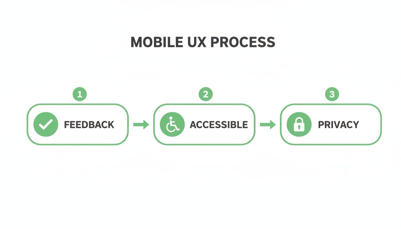
This process highlights that a seamless user experience—built on instant feedback, accessibility, and clear privacy—is what earns you the right to capture a lead's data.
Closing the loop with Google Ads
Now for the most important part. Capturing the lead is great, but if you're running paid ads, you need to know which campaigns, ad groups, and keywords are actually driving those leads. Flying blind here is how you burn through your marketing budget with nothing to show for it.
This is where we connect the dots between a form submission and real business value.
You need to track that GTM event not just as a submission, but as a conversion inside Google Ads. By setting up conversion tracking, you can directly attribute a new lead back to the exact ad they clicked on.
But just tracking conversions isn't enough. The real unlock is assigning a monetary value to each lead. Even a simple estimate—say, based on your average lead-to-customer rate and customer lifetime value—transforms your Google Ads account from a click-and-cost report into a profit-and-loss statement.
This is what enables true optimization. Google's smart bidding algorithms can then work their magic, automatically bidding higher on the keywords and audiences that are proven to drive valuable leads, not just cheap clicks. You stop optimizing for vanity metrics and start optimizing for revenue.
This closed-loop system—from ad click, to form submission, to CRM entry, to conversion value uploaded back to Google Ads—is the engine of a scalable paid acquisition strategy. It’s the difference between guessing what works and knowing.
A founder's framework for A/B testing and optimization
Look, building a great lead capture form is a solid start. But if you launch it and just leave it, you're a fool.
Your first version will never be your best version. The real growth, the kind that creates a massive competitive advantage, comes from relentless, obsessive testing and optimization.
This isn't about guesswork or changing button colors because you feel like it. It’s about applying a growth mindset to a critical conversion point. You need a simple, effective framework for A/B testing your forms to get statistically significant results you can actually trust. Without data, you're just another person with an opinion.
The goal is to turn a static form into a dynamic asset that constantly evolves to drive more value. This is how you build a real lead-generation machine.
What to test and why it matters
Don't overcomplicate this. Start with the big levers that are most likely to move the needle. You're not looking for tiny, incremental gains at first; you're hunting for the big wins that can meaningfully impact your lead flow and cost per acquisition.
Focus your energy on testing elements that directly influence a user's motivation and ability to complete the form. Here are a few obvious starting points:
- The headline: This is your primary value proposition. Test a benefit-driven headline ("Get Your Free Marketing Plan") against a more direct one ("Download the E-book"). The headline sets the entire context for the form.
- The call-to-action (CTA) button: "Submit" is lazy and uninspiring. Test it against something that reinforces the value exchange, like "Get My Free Template" or "Start My Trial." The words you use here matter immensely.
- Number of fields: This is a classic test. Does asking for one less field (like the phone number) dramatically increase your completion rate? The answer is almost always yes, but you need to test it to quantify the impact on lead quality.
This systematic approach is becoming the standard. The market for advanced lead capture tools is exploding, with a 30% year-over-year increase in adoption. Why? Because they work. Among companies using these tools, 30% reported higher conversion rates, and 25% saw their sales cycles shrink, proving the power of a data-driven process. You can find more insights on this trend in a recent Smarte industry report.
Your A/B testing hit list for lead forms
To avoid analysis paralysis, here’s a prioritized list of what to test on your forms. Start at the top with the low-hanging fruit and work your way down to more complex experiments.
| Element to Test | Example Variation | Potential Impact Level |
|---|---|---|
| CTA Button Text | "Submit" vs. "Get My Free Guide" | High |
| Headline Copy | Direct ("Request a Demo") vs. Benefit-focused ("See How We Double Leads") | High |
| Number of Fields | 5 fields vs. 3 fields (e.g., remove "Company Size") | High |
| Field Labels | Standard labels vs. conversational labels ("Your Work Email") | Medium |
| Form Layout | Single-column vs. multi-column layout | Medium |
| Social Proof | Adding a testimonial or client logos near the form | Medium |
| Error Message Copy | Generic ("Invalid email") vs. helpful ("Please enter a valid email address.") | Low |
| Button Color/Size | Standard blue button vs. a high-contrast orange button | Low |
Start with the "High" impact tests first. These are the elements most likely to produce a statistically significant lift in your conversion rates without requiring a complete redesign.
Setting up tests and tracking the right metrics
Setting up an A/B test correctly is crucial. You need to isolate one variable at a time. If you change the headline and the button color in the same test, you'll have no idea which change was responsible for the result. That’s just sloppy.
Use a tool that handles the statistical side for you, but understand what you're tracking.
The most dangerous thing in marketing is a metric you don't understand. Don't just look at the conversion rate. Dig deeper to see the full story of how users are interacting with your lead capture forms.
Obsess over these three key metrics for every test you run:
- Completion rate: The percentage of people who start the form and actually finish it. This is your headline metric for overall form performance.
- Field drop-off rate: This is gold. Which specific field is causing the most people to abandon your form? If 40% of users drop off when you ask for their company name, you have a clear friction point to address.
- Time-to-completion: How long does it take the average user to fill out the form? A shorter time usually correlates with a better, more intuitive user experience.
Tracking these metrics is impossible without the right setup. This is where tools like Google Tag Manager come in. By firing events at each stage of the form submission process, you can get granular data on user behavior.
If you're new to this, we have a complete guide on how to use Google Tag Manager that breaks it down. This isn’t optional; it’s foundational for any serious optimization work.
So, where do we go from here?
Let’s be real. If you’ve made it this far, you get it. Your lead capture forms aren't just some boring technical box to check. They're the handshake. They're the moment a curious click turns into a potential customer.
Every single field you add, every millisecond of load time, every confusing label—it all adds friction. And in the world of paid ads, friction costs you cold, hard cash.
What I've laid out isn't a magic trick. It's a systematic, empathetic, and data-obsessed way to look at one of the most critical points in your entire funnel. It's about respecting your user's time and attention in a world where both are shrinking by the second.
Simplify, connect, and execute
The path forward isn't about adding more bells and whistles. It's about ruthless subtraction and making sure the important bits talk to each other.
- Simplify, brutally. Open your most important landing page form right now. Cut every single field that isn't absolutely mission-critical for the very next step in your sales process. Don't be gentle.
- Obsess over the mobile experience. This is non-negotiable. If your form is clunky, slow, or frustrating on a phone, it might as well not exist. This is where most of your paid traffic is coming from.
- Connect the data dots. If you can't trace a form submission all the way back to the specific ad, campaign, and keyword that brought them there, you are flying blind. You're just guessing with your budget.
The game is won by the builders who obsess over these tiny, critical moments. The milliseconds of page load, the clarity of a single field label, the smoothness of the tap—that’s the whole thing right there.
Of course, forms are just one piece of a much bigger conversion puzzle. For a wider view, it's worth digging into strategies for building websites that convert leads into customers.
Now, go fix your forms. 🚀
Got questions? Let's get them answered.
Alright, let's wrap this up by tackling some of the common questions I get from other founders and marketers when they start getting serious about their lead capture forms. No fluff, just direct answers to help you move faster.
How many fields should my form have?
The million-dollar question. And the honest, slightly annoying answer is: as few as humanly possible.
Every single field you add is another point of friction, another reason for someone to bounce. Think about it—do you really need their phone number, company size, and job title just to send them a PDF? A study by HubSpot actually found that dropping from four fields to three can increase conversions by nearly 50%.
Start with the absolute bare minimum you need for the very next step. For an e-book download, that’s an email. That's it. For a demo request, you might need a name, work email, and company.
Stop thinking about what your CRM wants and start thinking about what the user is willing to give. You can always ask for more information later once you've built some trust. Don't ask for their life story on the first date.
Should I use a single-step or multi-step form?
This depends entirely on the "ask."
For a simple, low-commitment action like a newsletter signup, a single-step form is perfect. It’s quick, easy, and gets the job done without any fuss.
But if you’re asking for more information—like for a detailed quote or a free trial—a multi-step form is almost always better. It’s a psychological trick that works. Seeing a form with 10 fields is intimidating. But seeing a form with three fields, followed by another three, feels way more manageable. You're breaking down the commitment into smaller, less scary chunks, which can seriously boost your conversion rates.
What is the single biggest mistake to avoid?
Easy. Not connecting your form submissions back to your ad spend. It's the most common and expensive mistake I see people make, hands down.
You can have the most beautiful, highest-converting form in the world, but if you can't tell which campaign, ad group, or keyword produced that lead, you're just lighting money on fire. You have zero idea what's actually working.
Your absolute top priority must be closing this data loop. Every lead needs to be tracked as a conversion in Google Ads, ideally with a real dollar value assigned to it. Without this connection, you're just guessing, and guessing is a terrible way to scale a business. It’s the difference between running a professional marketing operation and just messing around with a budget. 🤷♂️
Ready to stop guessing and start building high-performance ad campaigns with lead capture forms that actually work? At dynares, our AI platform automatically generates thousands of optimized landing pages and forms tailored to user intent, connecting every lead back to your ad spend. See how it works at https://dynares.ai.


