Mastering Landing Page Conversions to Stop Wasting Ad Spend
Let's be blunt: improving your landing page conversions isn't about finding some magic trick. It's about fixing the fundamental disconnects that are making your pages leaky buckets for ad spend. You're pouring money into traffic, but the destination is failing you, turning potential customers into expensive bounces.
Why most landing pages are leaky buckets
I see it constantly. Companies pour thousands, sometimes millions, into Google Ads, meticulously crafting campaigns, only to send that high-intent traffic to a generic, unfocused landing page.
It’s like buying a Super Bowl ad to direct people to your company’s Wikipedia page. It’s a massive waste, and it’s costing you a fortune.
The core problem is almost always a failure to respect the user's journey. Someone clicked your ad because it made a specific promise. When they land on a page that doesn’t instantly deliver on that promise, trust evaporates. The click was the handshake; the landing page is the conversation. If that conversation is confusing, slow, or irrelevant, they’re gone.
This is the painful flow of cash when ad spend hits a poorly optimized page. The result? Lost conversions.
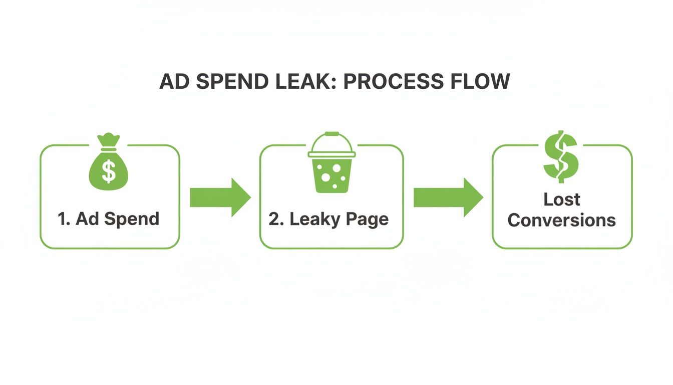
This single weak link—the landing page—can invalidate your entire advertising effort and budget.
The common conversion killers draining your budget
This isn't just a theoretical problem; it has a real financial impact. The median landing page conversion rate sits at a surprisingly solid 6.6%, which tells us that the optimized pages are significantly outperforming the pack. For those of us managing PPC, hitting this benchmark—or beating it—is where the real ROAS growth happens.
The data gets even more compelling on mobile, where dynamically generated pages see 25.2% more conversions. The advantage is clear.
So, where is the money leaking from? It boils down to a few common, yet fatal, mistakes. To help you spot these issues fast, here's a quick rundown of what to avoid and what to do instead.
Spotting the leaks in your own pages
Auditing your pages for these issues doesn't require a data science degree. It just requires a bit of empathy and a critical eye. A high bounce rate is your first major red flag that something is fundamentally wrong. If you see this, you need to dig deeper, and you can learn more about how to lower your bounce rate in our detailed guide.
Ask yourself these brutally honest questions:
- Does the headline perfectly match the ad's message? If there’s even a slight disconnect, you're creating confusion right away.
- Is the call-to-action (CTA) obvious within three seconds? If a user has to search for what to do next, you've already lost them.
- Is your form asking for their life story? Every unnecessary field you add increases friction and absolutely kills your conversion rate.
Answering these questions is the first real step toward plugging the leaks. By moving beyond vanity metrics and focusing on these core experience issues, you can begin to transform your pages from budget drains into powerful conversion machines. It’s not about aesthetics; it’s about engineering for results.
Engineering pages that actually convert
Alright, let’s get practical. Building a landing page that actually drives conversions isn't about artistic flair; it's a discipline. Think of it less like painting and more like engineering. Every single component has a job, and if one part fails, the whole machine sputters.
We're going to assemble a high-performing page, piece by piece. This is the playbook for turning clicks into customers—moving beyond pretty designs to pages that are ruthlessly efficient at doing one thing: converting.

This isn’t about guesswork. It’s about applying proven principles of user psychology and design to guide your visitors toward the one action you want them to take.
Your headline and hero section are everything
The hero section—your headline, sub-headline, and hero image—is the first thing anyone sees. You have about three seconds to convince them they’re in the right place. Fail here, and nothing else on the page matters.
The single biggest mistake I see is a glaring message mismatch between the ad and the headline. If your ad promises a free SEO audit tool, your headline better not say digital marketing solutions. It needs to be a direct echo. The user’s internal monologue should be, 'Okay, this is exactly what I clicked for.' Anything less creates friction and an instant urge to hit the back button.
This is absolutely non-negotiable.
- Mirror the ad copy: Your headline has to reflect the promise made in the ad. Consistency builds instant trust.
- Focus on the outcome: Don't just describe your product; describe the result. Instead of 'Our Advanced CRM Software,' try 'Close More Deals, Faster.'
- Use a compelling visual: The hero image should show the product in action or depict the ideal outcome. A photo of a smiling team is nice, but it's usually useless for conversions. Show the result, not the people who built it.
Craft a call-to-action that demands a click
Let's be honest, your call-to-action (CTA) is probably too weak. Buttons that say 'Submit,' 'Learn More,' or 'Click Here' are lazy, uninspiring, and frankly, a bit dumb. They communicate zero value and create zero urgency.
A strong CTA is specific, value-driven, and action-oriented. It tells the user exactly what they get by clicking. Think about the difference between 'Submit' and 'Get Your Free Marketing Plan.' The second one makes a clear promise and feels like a tangible reward.
To improve website conversion rate effectively, you have to nail every element, especially the CTA. The job of the CTA isn't just to be a button; it's to be the logical, irresistible conclusion to the story your landing page is telling. It should feel like the next natural step, not a massive commitment.
Make your CTA button visually dominant. Use a contrasting color that makes it pop off the page. Don’t make people hunt for it. It should be the most obvious thing in view, period.
Ruthlessly eliminate all distractions
This is where you need to be brutal. A landing page has one job. Anything—and I mean anything—that doesn't directly support that one job must go. Every link to another page is a potential exit ramp, pulling a user away from the conversion goal.
This is the key difference between a landing page and a regular website page. Your homepage is a lobby with many doors. A landing page is a single room with only one door—the CTA.
Your hit list for distractions to cut immediately:
- The main navigation menu: This is offender number one. Get rid of it. There should be nowhere for the user to go but forward (by converting) or backward (by leaving).
- Footer links: Kill the links to your about us, careers, or blog pages. They are conversion killers. The only exception might be a link to your privacy policy, which can build trust.
- Social media icons: Don’t invite people to leave your high-intent page to go scroll through your company’s latest Instagram posts. Keep them focused.
By removing these escape routes, you create a focused environment that channels all the user's attention toward your conversion action. This isn't about trapping them; it’s about providing a clear, simple path.
Remember, a faster page contributes to a better experience, and every millisecond counts when you’ve stripped everything else away. You can find some solid advice in our guide on how to improve page load speed.
The unspoken truth about forms and friction
Alright, let's talk about the most critical—and most frequently botched—part of your landing page: the form.
This is the final gate. It’s where your perfectly crafted ad and beautifully designed page hand off the baton, and it’s where most of your hard-won landing page conversions go to die a quiet, painful death.
Your form isn't just a set of boxes; it's a psychological transaction. Every single field you add is a tiny piece of friction, another reason for someone to think, 'Ugh, maybe later,' and bounce. We're going to fix that.
This isn’t about making your forms look pretty. This is about removing every single obstacle between your prospect and that submit button.
Why your form is costing you money
Here's a hard truth: asking for a phone number on the first touch is almost always a dumb idea for lead generation. Why? Because it feels like a huge commitment. It’s the digital equivalent of asking someone to marry you on a first date. They're not ready.
Your job is to figure out the absolute minimum information you need to move to the next step. For most businesses, that’s just an email. You can always ask for more details later in the sales process once you've actually built some trust.
The data backs this up without question. We know dynamic, mobile-responsive pages convert 25.2% better than static ones, and that advantage gets amplified by smart form design. Forms with fewer than five fields can literally double conversion rates, especially since a staggering 81% of users admit to abandoning longer ones. Given that mobile bounce rates often soar past 60%, a seamless, low-friction form isn't a nice-to-have; it's mission-critical.
Every field in your form is a negotiation. You're asking for something valuable—their personal data. You better be offering something equally valuable in return, and the exchange better be quick and painless.
Building a form that feels effortless
The best forms are the ones people don't even think about filling out. It should feel like a natural conversation, not an interrogation. This is where the psychology of form design really comes into play.
One of the most effective tactics is using multi-step forms. Instead of hitting a user with a wall of seven fields, you show them one or two at a time. This breaks the task into manageable chunks and reduces that initial intimidation. It also leverages a neat psychological principle called the Zeigarnik effect—people are far more likely to complete a process they’ve already started.
Your field labels and microcopy matter, too. Use placeholder text to guide users, not just repeat the label. For example, instead of a blank email field, have '[email protected]' as the placeholder. It's a tiny detail that reduces cognitive load. You can learn more about crafting these high-intent forms by reading our complete guide on optimizing lead capture forms.
The final nudge: social proof
Even with a perfect form, some prospects will still hesitate. They’re standing on the edge, wondering if they should take the leap. This is where you give them that final nudge.
Placing your most powerful social proof directly next to your form is a game-changer. It’s not enough to have testimonials buried somewhere down the page; they need to be visible at the exact moment of decision.
- Client logos: Showcase recognizable brands you've worked with. This is a powerful shortcut for building trust.
- A specific testimonial: Use a quote that directly tackles a common pain point or highlights a key result. 'Their team helped us increase leads by 40% in just two months' is infinitely more powerful than 'They're great to work with.'
- Key statistics: A simple metric like '10,000+ customers served' or a '98% customer satisfaction rate' can be incredibly reassuring.
This combination—a low-friction form and high-trust social proof—creates an environment where converting feels like the easiest, most logical next step. That's how you stop losing leads at the final hurdle.
Building a tracking system you can actually trust
If you aren't tracking conversions properly, you're flying blind. It's that simple. Forget the vanity metrics like clicks and impressions; we need to talk about what actually moves the needle for your business and boosts your landing page conversions.
This is a no-BS guide to setting up a rock-solid tracking system. Because if your data is garbage, your decisions will be too. Let's get this right.

Connecting the dots for a clearer picture
Your first job is to create a seamless flow of data between your tools. This usually means connecting Google Ads, Google Tag Manager (GTM), and Google Analytics (GA4). It sounds technical, but the concept is straightforward: you need a complete picture of the user journey, from the ad click to the final conversion.
GTM is the central nervous system here. It lets you deploy and manage all your tracking tags (like the GA4 tag and the Google Ads conversion tag) without having to mess with your website's code for every little change.
If you aren't using it yet, stop what you're doing and start. You can learn more about how to use Google Tag Manager to get up to speed. This setup gives you visibility—you can see which campaigns are driving traffic, how users behave on your page, and where they’re dropping off. But visibility alone isn't enough to scale profitably.
The secret weapon: value-based bidding
Here’s the part most people get wrong, and it’s the most important. Simply tracking that a lead form was submitted is amateur hour. Not all leads are created equal. A lead from a Fortune 500 company is worth infinitely more than one from a student doing research.
You must assign a monetary value to each conversion and upload that data back into Google Ads.
This is the absolute key. When you feed Google's algorithm conversion values, not just conversion counts, you empower its machine learning to do its job properly. It stops chasing cheap, low-quality leads and starts optimizing for high-value prospects—the ones that actually make you money.
Your goal isn't just to get more conversions; it's to get more profitable conversions. Feeding conversion values back to Google Ads is how you tell the algorithm what a good lead actually looks like in terms of real revenue.
This transforms your campaigns. You move from a cost-per-acquisition (CPA) model to a return-on-ad-spend (ROAS) model. You're no longer just trying to get leads for under €50; you're trying to turn every euro of ad spend into five, ten, or twenty euros of revenue.
Tracking the 'almosts' with micro-conversions
Not every visitor is going to fill out your form on their first visit. But that doesn't mean their visit was worthless. This is where tracking micro-conversions comes in. These are smaller actions that signal interest and engagement, even if they aren't the primary goal.
Think of them as digital body language. They show you who is leaning in and paying attention.
- Video plays: Did someone watch more than 75% of your product demo video? That's a strong signal of interest.
- PDF downloads: If a visitor downloads a whitepaper or a case study, they are moving down the funnel. Track it.
- Scroll depth: Did they scroll all the way to the bottom of your long-form landing page? This indicates they were highly engaged with your message.
- Time on page: Spending more than two minutes on a page shows more than just a passing glance.
Setting up event tracking for these actions in GTM gives you a much richer dataset. You can build remarketing audiences from these engaged users or simply analyze which of your page elements are capturing the most attention. It helps you understand user behavior beyond the binary converted or didn't convert mindset.
This complete tracking foundation—connecting your systems, uploading conversion values, and monitoring micro-conversions—is non-negotiable. It's what separates the amateurs who are guessing from the pros who are building scalable, profitable growth engines.
Scaling your wins with smart automation
Building and testing one landing page at a time is a recipe for burnout. It’s an old-school, painfully slow approach that just can’t keep up. To win today, you have to think in terms of scale, and that’s where the right tech becomes your unfair advantage.
Let's be blunt: if you're still treating each landing page like a one-off project, you're leaving a ton of money on the table. The goal isn't to build a landing page; it's to build a system that can generate the right page for every single user's intent.
This is where automation shifts from being a nice-to-have to a core part of your growth strategy.
Ditch the hamster wheel
The traditional optimization cycle is a hamster wheel. You build a page, run a test, wait weeks for data, make a tiny tweak, and then do it all over again. It’s a slow, resource-draining process that delivers incremental gains at best.
To get exponential results, you have to change the game entirely.
Modern platforms are built for this. Imagine generating thousands of hyper-relevant landing pages in minutes—one for every single keyword group in your Google Ads account. Each page has perfectly matching ad copy, headlines, and forms, creating a seamless user journey from the search result to the conversion. This isn't a fantasy; it's what smart automation enables.
It’s about moving from a one-to-one approach to a one-to-many system. You stop being a page builder and start being an architect of a conversion system that scales effortlessly.
Volume and relevance: the winning combination
The power of this approach is backed by hard data. It’s not about creating more pages for the sake of it; it's about the massive impact that relevance at scale has on your landing page conversions.
The numbers are pretty staggering. Businesses that run between 21 and 40 landing pages see nearly a 300% surge in conversions compared to those with just a handful. That stat blows the single-page strategy out of the water, especially for Google Ads where message match is king. The potential is immense, with top-performing pages in some industries hitting conversion rates of 55% when perfectly tailored to specific ad contexts. You can discover more insights about these landing page statistics to see the full picture.
This isn't just about quantity. It's about combining volume with surgical precision. More pages mean more opportunities to perfectly match a user's specific search query, which dramatically increases relevance, Quality Score, and, ultimately, your conversion rate.
This is how you stop competing on bids alone and start competing on experience. The advertiser who delivers the most relevant post-click experience wins every time. Automation is the only way to do that across hundreds or thousands of keywords.
How automated A/B testing works
One of the biggest bottlenecks in manual optimization is A/B testing. Setting up tests, monitoring them, and implementing the winners takes a ton of time. Smart automation completely changes this dynamic.
Here’s how platforms like dynares tackle this:
- Continuous optimization: The system automatically tests different combinations of headlines, copy, images, and CTAs across your pages. No need to manually configure each test.
- Automatic winner deployment: Once a variation proves to be a winner, the system automatically phases out the losing versions. The best-performing page stays live without any manual intervention from you.
- Multi-level testing: You can test elements at different levels. Test a new hero image across all 'blue widget' pages, or a new CTA just for mobile traffic from a specific campaign. The granularity is powerful.
This is what it means to escape the optimization hamster wheel. Instead of spending your days checking test results, you can focus on high-level strategy—identifying new markets, developing better offers, and thinking about the next big move. The system handles the tedious, never-ending task of optimization for you. It's a force multiplier, turning your strategic decisions into scaled, profitable action.
Landing page questions I hear all the time
Alright, let's wrap this up with a quick-fire round. I get asked these questions constantly by fellow founders and marketers trying to dial in their landing page conversions. No theory, no fluff—just straight, practical answers based on what actually works.
How many A/B tests should I run at once?
Honestly, for most businesses, just one at a time per page. Stop trying to be a data scientist unless you have insane traffic volume.
Falling into the trap of 'multivariate madness' is a dumb move for 99% of companies. Running multiple tests at once just splinters your data, meaning it takes forever to get a clear signal.
You’ll get faster, cleaner, and more actionable results by focusing on one big hypothesis at a time. It’s about making big swings, not tiny tweaks. Test a completely different value proposition in your headline. Pit a short form against a multi-step form. Try a video hero instead of a static image. Find a clear winner, make it the new control, and then move on to the next big idea. Focused, sequential testing beats a scattered approach every single time.
What's a good landing page conversion rate?
This is the million-euro question, and anyone who gives you a single number is selling something. The real answer is: it depends entirely on your business model.
Sure, the median across industries is around 6.6%, but that’s just a benchmark to keep in mind, not a holy grail. I’ve seen successful e-commerce campaigns that are profitable at 3% and niche B2B SaaS pages pulling in over 20% from hyper-targeted traffic.
A 'good' rate for you is one that makes your customer acquisition cost (CAC) work with your customer lifetime value (LTV).
Here’s my advice: stop chasing industry averages and start competing with yourself.
- Establish your baseline: Figure out what your current conversion rate is. That’s your starting point.
- Aim for incremental growth: If you’re at 2%, your goal is 3%, not 15%. Focus on consistent, month-over-month improvement.
- Profitability is the true metric: The only number that really matters is whether you're making more money than you're spending. A page converting at 50% is useless if the leads are all junk.
Can I just use my homepage as a landing page?
Please, for the love of all that is holy, no. I’m not even going to sugarcoat this one. Sending paid traffic to your homepage is one of the laziest, most expensive mistakes you can make in digital marketing.
Your homepage is a lobby. It's designed for exploration, with a navigation menu, multiple CTAs, and links to your blog, careers page, and social media. It has to serve everyone—investors, job seekers, existing customers, and curious prospects. It's a Swiss Army knife.
A landing page is a scalpel. It has one job, and one job only: to convert a visitor from a specific ad into a lead or customer. It's a distraction-free environment built to deliver on a single promise.
Think about it like this: sending ad traffic to your homepage is like inviting a VIP to a specific meeting and just dropping them in the middle of a chaotic train station, hoping they find the right platform. It’s a terrible experience that disrespects their time and intent.
It crushes conversion rates, tanks your Google Ads Quality Score, and wastes your budget. Always, always use a dedicated landing page for your campaigns. End of story. 😉
Ready to stop building landing pages one by one and start scaling your wins? dynares uses AI to automatically generate thousands of high-intent ads and matching landing pages, all optimized for conversion. Book a demo today and see how it works.


