Let's get straight to the point. Pouring money into Google Ads without obsessing over what happens after the click is like trying to fill a bucket full of holes.
Most businesses spend 99% of their time on keywords and bids but completely ignore the landing page—the very place where money is either made or lost. This is where user experience optimization stops being a nice-to-have and becomes your biggest profit lever.
Why your paid ads are probably leaking money

I've built and scaled tech products from the ground up, and I've seen this one mistake cost companies a fortune. They get the click—great. But then they dump that hard-won user onto a generic, clunky, or slow page that has almost nothing to do with the ad they just saw. It’s a massive, and often invisible, gap between the click and the conversion.
This isn't about pretty design; it’s about ruthless efficiency. It all comes down to a simple principle: user intent.
If your landing page doesn't immediately deliver on the intent behind the search query, you’ve already lost. You have seconds, maybe less, to prove to someone they’re in the right place.
The ROI of UX investments
The financial impact of getting this right is staggering. It's no longer a nice-to-have—it's a critical business function that pays for itself many times over. Just look at the numbers.
| Investment area | Potential conversion lift | Average ROI |
|---|---|---|
| Strategic UX design | Up to 400% | 9,900% |
| Page speed optimization (1s) | ~7% | Varies |
| A/B & usability testing | 20-200% | 10x-100x |
Sources: Forrester, Google/Deloitte, VWO
Recent data shows that every €1 invested in UX design can yield a return of €100—that's a 9,900% ROI. A well-designed user journey can boost conversion rates by up to 400%. This is why we need to stop thinking of UX as a cost and start seeing it as the most powerful profit driver we have.
Here’s the simple truth of what’s at stake when you ignore it:
- Wasted ad spend: Every click that bounces due to a bad experience is money straight down the drain.
- Damaged brand perception: A frustrating journey tells users you don’t value their time. They won't be back.
- Lost revenue: The gap between your current conversion rate and what it could be is pure, unrealized profit.
This guide is a practical, no-fluff approach to user experience optimization that ties directly to your bottom line. We're going to fix the leaks.
If you're just getting started and want to find those leaks, a good first step is our guide on conducting a conversion rate optimisation audit.
Auditing your funnel like you actually mean it

Let's be brutally honest for a second. Most user experience audits are a complete waste of time. They’re academic exercises that produce a beautiful, 50-page PDF that collects dust in a forgotten Google Drive folder. Nobody reads it, and nothing changes.
We’re not doing that here.
A real audit isn't about generating a report; it's a gritty, hands-on process. It’s about walking through your entire paid search funnel as if you were a real, impatient customer with a credit card in hand. You have to experience the pain your users feel to truly understand what’s broken. This is about building empathy, not a document trail.
The goal isn't a long list of minor cosmetic tweaks. It’s a short, sharp, actionable list of the most glaring problems that are costing you conversions right now. Think of it as triage for your user experience.
Map intent to reality
Your audit has to start where the user's journey starts: with the ad click. This is where most funnels break down before they even have a chance. The first, and most important, step is mapping your highest-spend keywords to their corresponding landing pages.
Grab your top 10-20 ad groups by spend. Open the landing pages in one browser tab and the ad copy in another. Now, get real with yourself and ask some hard questions. Does the headline match the ad copy? If someone clicked an ad for "emergency plumbing services," does the landing page headline scream that exact phrase? Or does it offer some generic "Local Home Services" message? That kind of mismatch creates instant distrust.
This exercise alone will likely uncover some embarrassingly obvious disconnects. Fixing them is the lowest-hanging fruit in UX optimization, yet so many people skip this step. The friction in your funnel isn't hidden in complex data models; it’s in the painfully obvious experience of a user who expected one thing and got another.
Become the user and feel the pain
Once you’ve confirmed the ad-to-page message match, it’s time to go deeper. This is where you put on your customer hat and use the tools that show you what’s really happening. You need to get out of spreadsheets and into the qualitative mess of human behavior.
This part is less about analytics and more about observation. I've spent countless hours watching session recordings, and I can tell you they are pure gold. Tools like heatmaps and session replays let you watch where people are getting stuck, confused, or just plain frustrated. You’ll see them rage-clicking a non-clickable element or endlessly scrolling past a CTA because it’s not obvious enough.
From there, it's about building your triage list. This is my personal checklist for spotting the biggest conversion killers during an audit:
- Confusing navigation: Are there too many options? Is it unclear where to go next? Simpler is always better.
- Forms that ask for a life story: Every single form field you add crushes your conversion rate. If you don't absolutely need their phone number to deliver the initial value, don't ask for it.
- Weak or hidden calls-to-action (CTAs): The primary CTA should be impossible to miss. If I have to hunt for the "Buy Now" button, you’ve already failed.
Of course, before you can fix the user journey, you have to have accurate data. If your tracking is off, your entire optimization effort is built on sand. For a deeper dive, check out our guide on how to get your Google Ads conversion tracking setup right the first time.
Fixing the biggest conversion killers: page speed and mobile UX
Alright, let’s get real about two of the biggest, most boring, and most profitable things you can fix in your paid search funnel: slow load times and a junk mobile experience. If your site takes more than a couple of seconds to load on a phone, you might as well just light your ad budget on fire. 🔥
This isn't an exaggeration. Every single millisecond matters. We're not talking about a minor inconvenience for the user; we're talking about a direct, catastrophic impact on your revenue. If you ignore everything else and just fix these two problems, you'll be miles ahead of most of your competitors.
Speed isn't a feature anymore—it's the bare minimum
Let’s be blunt: a slow website is a broken website. I don’t care how brilliant your product is or how compelling your copy is—if the page takes an eternity to appear, people will hit the back button before they ever see it. Patience is not a virtue in paid search.
This goes way beyond just compressing a few images, though that’s a decent start. You need to get serious about Core Web Vitals (CWV), which are Google's own metrics for measuring the raw user experience of a page. Obsess over Largest Contentful Paint (LCP) and Interaction to Next Paint (INP). Anything over 2.5 seconds for LCP is actively costing you money, and an INP over 200 milliseconds feels broken.
Google cares about these numbers because users care about them. A fast, responsive site feels professional and trustworthy. A slow one feels amateurish and broken. It’s that simple. And diagnosing this stuff is easier than you think. Tools like Google’s PageSpeed Insights will give you a full report card and a laundry list of specific, actionable fixes.
Your mobile experience is probably terrible
Now, let's talk about mobile. I see this all the time: beautiful, thoughtfully designed desktop sites that become an unusable mess on a smartphone. Pinching and zooming to read text or trying to jab a tiny button with your thumb is a surefire way to lose a lead you just paid for.
That massive gap between desktop and mobile conversion rates is a huge, untapped opportunity. For the majority of your paid traffic, your mobile site is your website. It needs to be designed for thumbs, not a mouse and keyboard.
Thinking mobile-first isn't a buzzword; it’s a mandate. You have to design the experience for the smallest screen and then scale up, not the other way around. This means you have to be ruthless about what really matters on the page. For a deeper dive into the technical side, check out our guide on how to improve page load speed.
Fixing page speed and mobile UX isn’t the sexiest part of marketing, but it’s where the real money is made. It’s the foundation that every other optimization you do will rest on. Get this right, and everything else gets a whole lot easier.
Nailing the final click: forms, CTAs, and the words that sell
You can get everything else right—the ad, the targeting, the landing page—but the final moments before a user converts are where the entire funnel either succeeds or falls apart. We’re talking about the make-or-break details: your forms, your buttons, and the tiny bits of text that carry all the weight.
Let's be blunt: most forms are greedy. They ask for way too much information, way too soon, creating a massive wall of friction right at the finish line. The golden rule here is incredibly simple: ask for less, not more. Every single field you add is another reason for someone to bail.
I’ve personally seen conversion rates literally double just by axing a single, non-essential field like "Phone Number" from a lead gen form. People are protective of their data, and for good reason. Your job is to make the exchange feel as low-risk and high-value as humanly possible.
Rethinking the form experience
Don’t just slap a bunch of empty boxes on a page. A form is part of the conversation, not a bureaucratic chore for your visitor. If you absolutely have to collect more than two or three pieces of information, your best bet is to use a multi-step form.
Breaking a long form into smaller, digestible chunks makes the whole process feel less intimidating. It plays on a psychological principle of commitment and consistency; once someone completes the first easy step, they're far more likely to see it through to the end. For complex sign-ups or detailed quotes, this is a total game-changer.
Writing CTAs that actually get clicked
Now for the most important button on your entire page: the Call to Action (CTA). If your button says "Submit," you’re doing it wrong. It’s the most boring, uninspired, and frankly, selfish word you could possibly use. Nobody wakes up excited to "submit" to anything.
Your CTA button shouldn't just describe what the button does; it should promise the value the user is about to get. It’s the final payoff. Frame it around what they receive, not what they give. This shift in perspective is fundamental to good user experience.
Ditch the generic, lazy copy and try something action-oriented and benefit-driven. Instead of "Submit," try "Get Your Free Quote." Instead of "Download," try "Grab My Free Ebook." See the difference? The better options are personal, active, and focused entirely on the user's gain. For a deeper dive into this, check out our guide on creating high-converting lead capture forms.
The power of microcopy
Finally, let’s talk about the unsung hero of conversion: microcopy. These are the small, often-overlooked bits of text that live around your forms, buttons, and links. Think of microcopy as the helpful, reassuring voice that guides the user and eases their anxiety at critical moments.
It’s the little message under the email field that says, "We hate spam as much as you do." Or the text next to the credit card field that confirms, "Your data is 100% secure." These tiny phrases build a massive amount of trust and can be the deciding factor for a hesitant user. Microcopy is the difference between a user feeling like they're filling out a sterile, bureaucratic form and feeling like they're having a helpful conversation with a brand that gets them.
Good microcopy anticipates a user's questions and fears before they even have them. It’s empathetic. It shows you’ve thought about their experience from their point of view. Don't treat it as an afterthought; it's one of the most powerful tools in your UX arsenal. Getting these small details right is what separates the amateurs from the pros.
Scaling your UX wins with testing and automation
So, you’ve found a few UX wins. That’s great. But if you’re fixing one page at a time, you’re not building a growth engine—you’re just patching holes. To really pull ahead, you need a system to operationalize those wins across thousands of keywords and landing pages.
This is where we graduate from one-off fixes to relentless, systematic improvement. Let's start with a no-nonsense guide to A/B testing.
Test hypotheses that actually matter
Forget the dumb tests you read about online. Endlessly tweaking button colors is a colossal waste of time and traffic. We’re talking about testing big, bold hypotheses that can deliver significant, needle-moving uplifts. Testing isn't an academic exercise; it’s a tool for making more money. Period.
A real test always starts with a strong hypothesis, not a random idea. A weak hypothesis is, "I think a green button will work better." A strong one is, "I believe changing the headline to match the ad's promise of '24/7 Emergency Service' will increase form submissions by 20% because it immediately confirms user intent and builds trust."
See the difference? One is a guess. The other is a strategic assumption rooted in user psychology. You need to be crystal clear on what you’re trying to achieve and why.
The goal is to get a clear signal, win or lose. A flat result is still a win—it tells you your hypothesis was wrong, and you can move on to the next idea without wasting more time. Just be sure to run your test long enough to reach statistical significance, usually at least a 95% confidence level. Don't call a winner after two days because one version is slightly ahead. That’s how you make expensive mistakes.
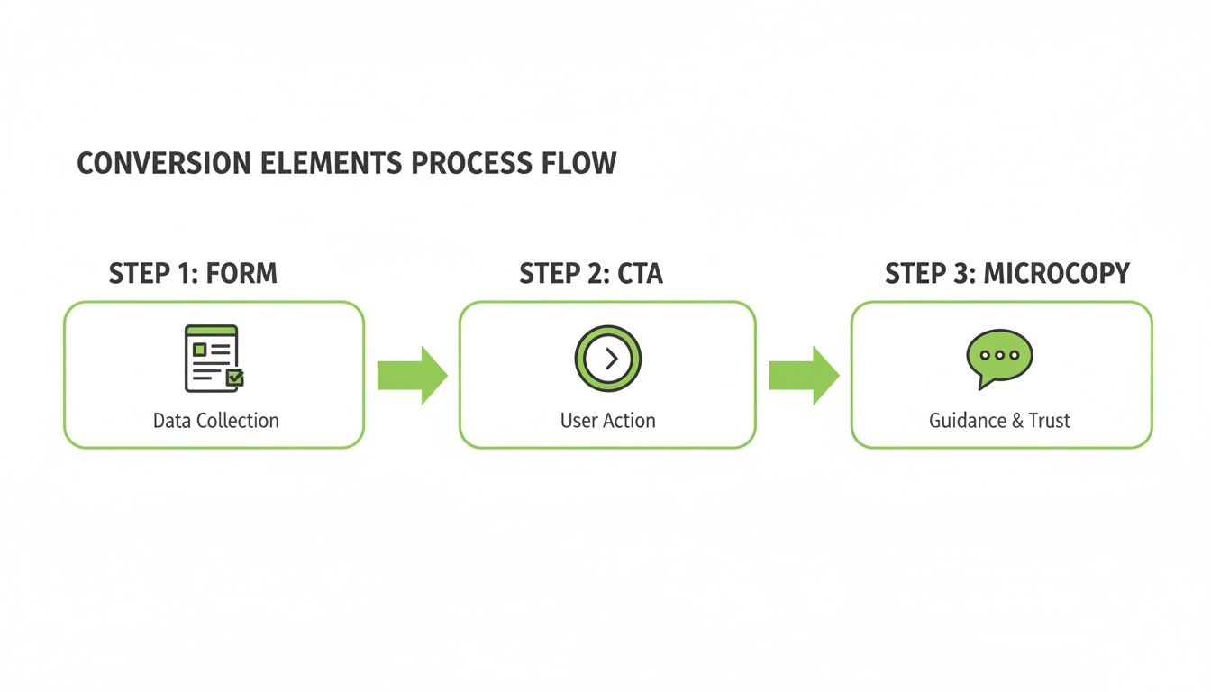
This flow—from form to CTA to microcopy—represents the final, critical steps where a user decides to convert or bounce. These are often the most potent variables you can test.
The automation game-changer
Now for the really exciting part: automation. For anyone running Google Ads at any real scale, manually creating and testing a unique, intent-matched landing page for every single ad group is an operational nightmare. It's just not possible. This is where most campaigns fall flat. They average out their landing page experience, and "average" doesn't win.
The future of user experience optimization at scale is programmatic. We can now build systems that automatically generate thousands of hyper-relevant landing pages, each one perfectly tailored to the keyword that triggered the ad. Manually building landing pages is like writing letters by hand in the age of email. Automation allows you to have a one-to-one conversation with every user, at a scale of millions.
This kind of system turns a manual, time-consuming task into a scalable, automated workflow that continuously refines itself.
The magic happens when you connect this directly to your Google Ads account. You create a dynamic feedback loop: the system generates a page, Google Ads sends traffic, and performance data flows back. This data automatically tells the system which page variants are winning, allowing it to double down on what works and kill what doesn't.
To really operationalize your wins, implementing the right 15 Website Conversion Rate Optimization Techniques is crucial for turning insights into tangible improvements.
This isn't just about efficiency; it's about building a learning machine. You move from making quarterly updates to your top 10 pages to making thousands of micro-optimizations across your entire funnel, every single day. This is how you build a moat around your business that your competitors simply can't cross.
It’s how you win.
Building a culture of user obsession
We’ve covered audits, speed, forms, and testing. These are all critical levers. But the real, lasting advantage isn't a single A/B test or a slightly faster landing page. It’s building a culture that is absolutely, relentlessly obsessed with the end-user.
This isn't a job you hand off to a designer. Something incredible happens when user experience optimization becomes a shared mission. The PPC manager starts thinking about message match, not just keywords. The founder questions every new feature, asking, "Does this actually make our customer's life simpler?"
Everyone owns the experience
In every truly successful company I’ve built or admired, UX is in the DNA. It's not a department; it's the default setting for the entire organization. They don't just optimize landing pages; they optimize the whole company around delivering value and systematically stamping out friction for the customer.
This shift starts with one thing: making user feedback impossible to ignore. Create a dedicated Slack channel—something like #voice-of-the-customer—where every piece of user feedback is piped in. The good, the bad, the brutally honest. This makes the user’s voice a constant presence, not an abstract concept in a quarterly report.
The most powerful question you can ask in any meeting is simply: "What's best for the user?" It cuts through politics, ego, and bad ideas like a hot knife. If you make that the core of your culture, you've already won half the battle.
Tools and tactics will change. AI will bring new opportunities and challenges. But an unwavering commitment to making things simpler, faster, and better for the user is the one strategy that will always stand the test of time.
It’s the ultimate moat. Build that, and you’ll build a business that lasts. 🚀
A few FAQs about user experience optimization
I get asked about UX optimization all the time, especially from founders deep in the trenches of running paid ads. Here are a few of the most common questions I hear, with straight-up, no-fluff answers.
Where do I start on a tight budget?
Don't boil the ocean. Seriously, forget about a full redesign. The goal here is to find the highest-impact, lowest-effort change that gives you a quick win.
First, pull up Google Analytics. Find your highest-traffic landing page that has the absolute worst conversion rate. That’s ground zero. Now, just focus on speed, the form, and the headline. Small, focused changes on high-traffic pages will always give you the biggest bang for your buck.
What are the most important UX metrics to track?
Forget vanity metrics. You need to focus on the numbers that directly tell you if you're making or losing money.
The essentials are Conversion Rate (the ultimate scoreboard), Bounce Rate (a high rate on a landing page often signals a massive disconnect between your ad and your page), and Form Abandonment Rate (this tells you exactly where your form is failing). These metrics give you a clear, honest picture of what's actually happening on the page.
How does user experience impact my Google Ads quality score?
Massively. This is something so many people overlook, and it's costing them a fortune.
Google's Quality Score is heavily influenced by what it calls "Landing Page Experience." A slow, confusing, or irrelevant landing page will absolutely tank your score. A low Quality Score means you have to pay more per click (a higher CPC) just to hold the same ad position. So, good user experience optimization isn't just a conversion strategy; it's a financial one. It literally makes your ad budget go further.
To really get to the core of this, it's worth understanding exactly What Is User Experience Design and why it's so critical to a website's success. Once you grasp that, you'll see why Google values it so highly in its ad auction.
At dynares, we built a platform that automates this entire process—generating thousands of high-intent, fast, and conversion-focused landing pages that match your ads perfectly. Stop leaking money and start building a real growth engine. Check out how it works at dynares.ai.


