How to Stop Burning Money on Google Ads With User Experience Optimization
Let's be blunt. Pouring money into Google Ads while ignoring the user experience on your landing pages is like setting a pile of cash on fire. Seriously. User experience optimization isn't some fluffy, nice-to-have thing for designers; it's a core, non-negotiable pillar of any paid search strategy that's actually supposed to be profitable.
Your bad UX is burning your ad spend
I've seen it happen more times than I can count. A business will meticulously craft its ad campaigns, obsessing over every keyword match type and bidding strategy, only to send that expensive traffic to a clunky, slow, or confusing page. That’s a guaranteed way to lose a customer you just paid good money to acquire.
Think of UX as the bridge between a potential customer's click and your conversion goal. If that bridge is broken—riddled with slow load times, confusing navigation, or impossible forms—your entire funnel collapses. All the money you spent getting them to the bridge is wasted. Before we get into fixing it, we have to agree on one thing: this problem is real, and it’s costing you money every single day.
The staggering cost of neglect
This isn't just about user frustration; it's about pure economics. The financial impact of getting UX right is massive, and the cost of getting it wrong is even bigger. We’re not talking about small percentage gains here.
The ROI from proper user experience optimization is almost unbelievable. Research shows organisations are seeing a return of $100 for every $1 invested in UX design. A well-designed UI can lift website conversion rates by up to 200%, and a fully optimised UX can boost them by as much as 400%. These numbers should make any founder or marketer stop and really think about where their budget is going.
For every dollar you spend on optimising your Google Ads landing pages, you get it back through higher conversion rates, better Quality Scores, and improved ROAS. It's one of the highest-leverage activities you can possibly focus on.
Why this matters more than ever
In the past, you might have gotten away with a decent product and a mediocre website. Not anymore. User expectations are at an all-time high, and their patience is paper-thin. They expect seamless, intuitive, and fast experiences. Anything less and they're gone, likely heading straight to your competitor.
Here’s the hard truth:
- A bad first impression is final: Most users form an opinion about your site in literal seconds. A poor design immediately kills trust.
- Friction kills conversions: Every unnecessary step, every confusing instruction, and every second of loading time is another reason for a user to leave.
- Mobile is non-negotiable: If your mobile experience is an afterthought, you're not just ignoring a huge chunk of your audience—you're actively pushing them away. We've all been on the receiving end of a terrible mobile site; it's infuriating.
The goal isn't just to stop losing money; it's to build a machine that turns ad clicks into loyal customers as efficiently as possible. You can learn more about how to lower your bounce rate in our guide, but it all starts with fixing the user’s journey.
Conducting a ruthless UX audit of your funnel
Before you touch a single button on your site, you need a brutally honest picture of what’s actually broken. A real UX audit isn’t about team opinions or what you think is good design. It's a data-driven investigation to find the cold, hard facts about where your funnel is bleeding cash.
This isn’t about creating a 100-page report to impress your boss. It’s about being a detective, digging into the digital crime scene of your paid search funnel—from the ad click to the thank you page—and finding the culprits killing your conversions. We’re hunting for the biggest leaks in the bucket so you can plug them, fast.
Where to find the bodies
Your first stop is your data. You have to combine quantitative data (the 'what') with qualitative data (the 'why'). Forget vanity metrics. Focus on the numbers that show user frustration and directly torpedo your PPC success.
Here's where I always start:
- Google Analytics: Pull up the top landing pages for your paid campaigns. What are their bounce rates? If you’re paying for a click and 70% of those people leave immediately, something is deeply, fundamentally wrong. Also, compare mobile vs. desktop drop-off rates; you’ll often find your mobile experience is the real problem.
- Heatmaps and Scroll Maps: These tools are brilliant because they show you what people are actually doing—where they click and how far down the page they bother to scroll. If your most important call-to-action is below a scroll depth that only 20% of users reach, it might as well not exist. It's a dumb but shockingly common mistake.
- Session Recordings: This is the game-changer. Watching real user sessions is like looking right over their shoulder. You’ll see people rage-clicking on non-clickable elements, getting stuck in form fields, and circling their mouse in pure confusion. It's often painful to watch, but it’s the most direct evidence you’ll ever get.
This simple flow chart visualises exactly how a poor user experience burns through your ad budget, click by click.
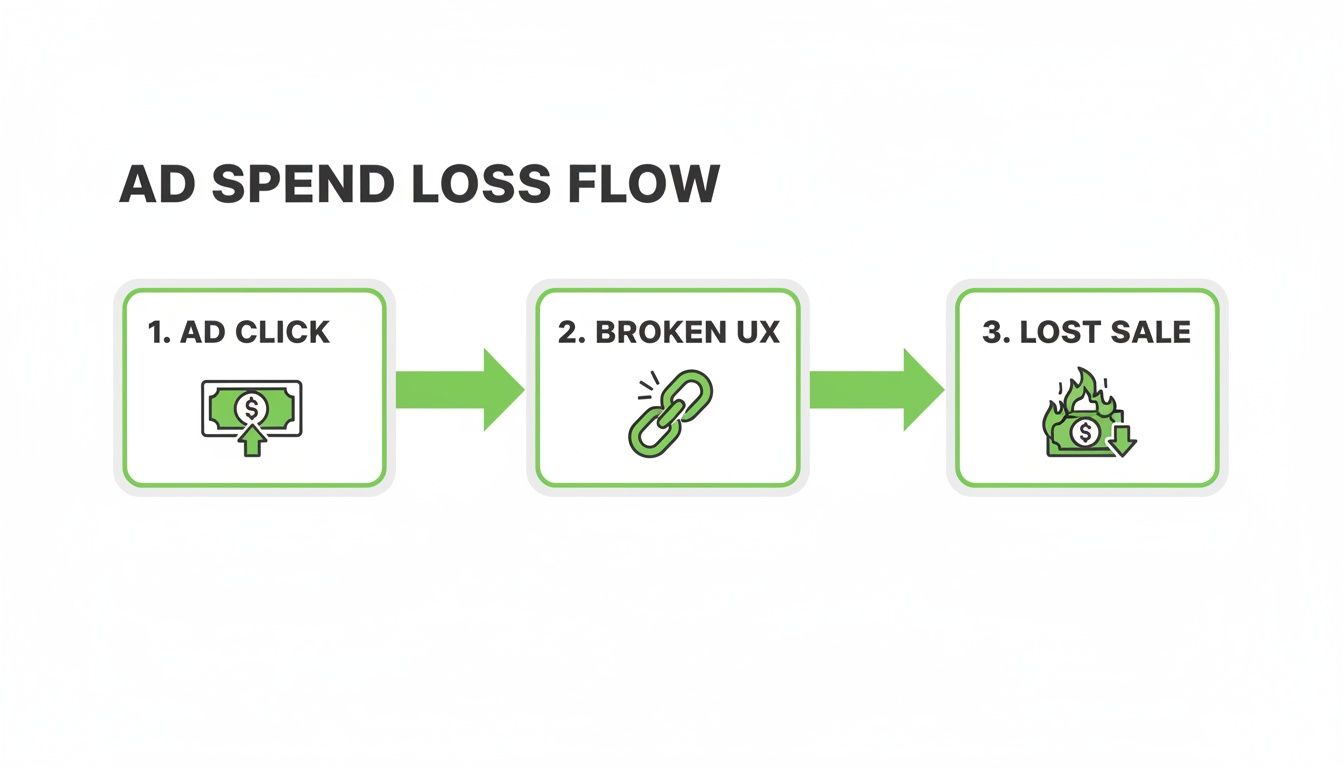
The ad click is just the beginning. A broken user experience is the direct cause of lost sales and wasted spend.
Building your no-BS audit checklist
A systematic approach is key. You're looking for points of friction—anything that slows a user down, confuses them, or makes them doubt their decision to convert. The goal is to identify and eliminate every single obstacle standing between the user and your goal.
A solid audit looks at the entire journey. Here’s a practical, no-fluff checklist to get you started:
- Clarity and message match: Does the headline on the landing page directly reflect the promise in your ad copy? A disconnect here is the fastest way to lose trust and earn a bounce.
- Mobile experience: Don't just resize the browser window on your desktop. Test it on an actual phone. Are the buttons big enough to tap? Can you read the text without pinching to zoom? Is the form a total nightmare to fill out on a small screen?
- Page speed: Use Google's PageSpeed Insights. If your page takes more than three seconds to load, you're already losing people. This isn't a suggestion; it's a hard rule in today's market.
- Forms and CTAs: Is every single form field absolutely necessary? Are your calls-to-action clear, visible, and compelling? 'Submit' is lazy. What value is the user actually getting when they click that button?
The goal of a UX audit isn't to find every tiny imperfection. It's to find the 3-5 biggest friction points that are causing 80% of your drop-offs and fix those first. Prioritisation is everything.
A well-structured audit turns a messy pile of observations into a clear, actionable plan. You need a way to organise your findings so you know what to tackle first for the biggest impact.
For those who want to go even deeper, you can check out our guide on conducting a conversion rate optimisation audit for more advanced techniques. Ultimately, a good audit gives you a clear roadmap for your user experience optimization efforts, turning guesswork into a data-backed strategy.
Nailing landing page intent and page speed
Let's get straight to the most common—and most expensive—failure point in paid search. Sending traffic from a highly specific ad, like one for ‘emergency plumbing services in Berlin,’ to your generic, catch-all homepage is just lazy. It’s a dumb move that instantly tells the user you don’t really care about their problem.
This disconnect is where most campaigns bleed money. The user's intent, captured perfectly in their search query, has to match the promise of your landing page. This is called message match, and it’s non-negotiable for building immediate trust.
When the headline, imagery, and core offer on the page mirror the ad they just clicked, you create a seamless, reassuring journey. Anything less feels disjointed and sends people running for the back button.
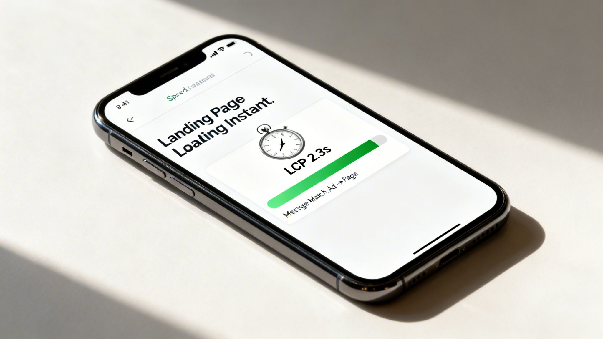
But even with perfect message match, a silent killer will sabotage your efforts every time: page speed. It doesn’t matter how brilliant your landing page is if it takes forever to load. In 2026, fast isn't just a feature; it’s the price of entry.
The brutal reality of page speed
Let's be crystal clear. If your page takes more than three seconds to load on a mobile device, you've likely lost nearly half the audience you just paid to acquire. Performance has become a critical UX metric that’s directly tied to retention and conversions. Mobile sites that load in under 3 seconds retain 47% of visitors, while those that take longer lose a staggering 53%.
A single one-second delay can wipe out conversions. For PPC managers, this gets even more serious: landing page speed directly influences your Quality Score in Google Ads. Faster pages lead to better ad rankings and lower costs-per-click.
Your landing page speed isn't just a technical detail for developers to worry about. It's a core financial metric. A faster site literally makes your ads cheaper and more effective.
Slower pages don't just lose you customers; they actively make your ad spend less efficient by tanking your Google Ads Quality Score. A solid user experience optimization strategy starts here.
Must-hit performance benchmarks for 2026
Forget vague notions of 'making your site faster'. We need to be surgical. Google’s Core Web Vitals are the metrics that matter, and you need to be obsessed with them.
Here are the non-negotiable targets:
- Largest Contentful Paint (LCP): This measures how long it takes for the biggest element on your page (usually an image or text block) to appear. Your goal is to get this under 2.5 seconds. Anything over 4 seconds is considered poor and is actively hurting you.
- Interaction to Next Paint (INP): This metric assesses how quickly your page responds when a user clicks or taps something. A good INP is below 200 milliseconds. A laggy, unresponsive page is a one-way ticket to a lost lead.
- Cumulative Layout Shift (CLS): This measures visual stability. We’ve all been there—you go to tap a button, and suddenly an ad loads and shifts the entire page, causing you to click the wrong thing. It’s infuriating. Your CLS score should be below 0.1.
Practical steps to boost your speed
Achieving these benchmarks isn't black magic. It’s a matter of disciplined execution. And remember, a fast page that still misses the user's intent is a wasted effort. Matching the page's purpose to user expectations is crucial to keep visitors engaged and to help reduce website bounce rate.
Here are some of the most impactful, no-excuses optimisations you should be implementing:
- Aggressively optimise your images: There is absolutely no reason to upload a massive, multi-megabyte image file. Use modern formats like WebP and run everything through compression tools to shrink file sizes without a noticeable drop in quality.
- Leverage browser caching: This tells a visitor's browser to store parts of your site, so it doesn't have to re-download everything on their next visit. It’s a simple fix that makes a huge difference for repeat traffic.
- Minimise your code (CSS, JavaScript, HTML): Every line of code has to be downloaded and processed. Strip out unnecessary characters, comments, and formatting. Plenty of tools can automate this for you.
For those managing campaigns at scale, manually building a high-intent, lightning-fast page for every single keyword is impossible. This is where modern platforms shine. Systems like ours at dynares are built to automate this, generating thousands of lightweight, high-intent page variants that are optimised for speed from the ground up.
This is how you deliver a world-class user experience without an army of developers. If you want a deeper dive into the technicals, you can learn more about how to improve page load speed in our article.
Optimising forms, microcopy, and CTAs
This is it. You've done all the hard work to get someone interested, and now you’re at the moment of truth. The last few yards—a simple form and a button—can still make or break the entire conversion. Let's get granular, because tiny changes here deliver huge results.
We're talking about that final moment of hesitation. The user is on the verge of converting, but a clunky form or a weak call-to-action (CTA) can plant a seed of doubt and send them packing. Your job is to make this last step feel effortless.

This isn't about pretty design; it's about psychology. A clean, simple form feels trustworthy. A clear, compelling CTA feels empowering. Get this wrong, and you're practically telling your expensive traffic to leave.
Your form is a conversation, not an interrogation
Let's be honest: nobody likes filling out forms. Your goal is to make it as painless as possible. Every single field you add increases friction and cognitive load, which is a direct line to higher abandonment rates.
Before adding any field, ask yourself one question: Do I absolutely need this information right now? If the answer is anything but a resounding "yes," kill it.
Ditch the dead weight. Seriously, do you need a fax number? Or their company size just to get a newsletter? Be ruthless. A shorter form almost always converts better.
Use inline validation. Don't wait until someone hits 'Submit' to tell them their email format is wrong. Real-time feedback—a little green checkmark or a helpful red hint—makes the process feel smooth and interactive, not like a test they just failed.
Break up long forms. If you genuinely need a lot of information, don't throw a 15-field monster at them. Break it into a multi-step form and show a progress bar (e.g., "Step 1 of 3"). It makes the task feel far less daunting and keeps people moving forward.
Think of your form as the final handshake. Make it firm, confident, and brief. Don't make it a weird, awkward interrogation that makes the other person want to run away.
Microcopy: the tiny words that make a big difference
Microcopy is the unsung hero of user experience optimization. It’s the small text on your buttons, in your error messages, and used as placeholder text inside form fields. Good microcopy is clear, concise, and, most importantly, reassuring.
It’s the difference between a generic error like 'Invalid input' and a helpful one like, 'Oops! Looks like your email is missing the @ symbol.' One is a dead end; the other is a gentle guide. This is your chance to inject your brand's personality and build trust at a micro-level. For more ideas on crafting copy that converts, you can explore our guide to creating effective lead capture forms.
Stop using 'submit' on your CTAs
Finally, let's talk about that call-to-action button. The word 'Submit' is probably the most boring, uninspiring, and lazy CTA on the planet. What does it even mean? The user is submitting to you. It implies they're giving something up without getting anything in return.
Your CTA should scream value. It needs to be action-oriented and tell the user exactly what they're getting when they click. A great trick is to have the button text complete the sentence, 'I want to...'
Instead of 'Submit,' try 'Get My Free Quote'
Instead of 'Download,' try 'Download the 2026 Guide'
Instead of 'Sign Up,' try 'Start My Free Trial'
These small shifts reframe the entire interaction. It's not about what the user is giving to you; it’s about what you are giving to them. That one change can easily be the difference between a click and a bounce.
Using A/B testing to make data-driven decisions
Let's be brutally honest. Your opinion on which headline, CTA, or hero image works best doesn’t matter. Neither does mine. The only thing that actually matters is what your users do—what the data says drives them to convert.
This is where so many teams go completely off the rails. They sit in a meeting room, debate aesthetics, and make decisions based on whatever the highest-paid person in the room wants. That's a surefire recipe for burning cash. Real UX optimisation isn't art; it's a science, and the core of that science is rigorous A/B testing.
You have to stop guessing and start testing. The goal isn't a one-off project; it's to build a continuous optimisation engine that runs on data, not ego.
Building a hypothesis that actually means something
A good test always kicks off with a strong hypothesis. An idea like 'let's test a new button colour' is completely useless. A real hypothesis is a clear, testable statement that predicts an outcome and explains why you think it will happen.
It should look something like this:
We believe that changing the CTA button text from 'Learn More' to 'Book a Demo' will increase form submissions by 15%. We believe this because 'Book a Demo' is more specific, aligns with a higher-intent user, and clearly states the value they will receive next.
This format is powerful because it forces you to think through the entire chain of logic. You have a clear variable (the CTA text), a measurable goal (a 15% lift in form submissions), and a user-centric reason. Without that, you’re just throwing spaghetti at the wall.
How to prioritise what to test first
You could test hundreds of things on any given page, but you don't have infinite traffic or time. You need a system to focus on the changes that will deliver the biggest impact with the least amount of work. This is where a framework like the PIE model is incredibly useful.
It forces you to score each testing idea on three simple criteria:
- Potential: How much room for improvement is there? A landing page with a 90% bounce rate has massive potential compared to one that’s already converting well.
- Importance: How valuable is the traffic to this page? Your highest-volume paid landing pages are the most important places to start. A 5% lift on a page that gets thousands of paid clicks a day is a huge win.
- Ease: How hard is this test to implement? A simple headline change is easy. A complete redesign of a multi-step form is hard.
Score each idea from 1-10 across these categories, and you'll get a clear, data-informed priority list. This stops you from wasting cycles on low-impact tweaks and points your energy where it will make the most money.
Common pitfalls that will ruin your tests
Running a successful A/B test is about more than just setting up variations in a tool. It’s about discipline. I’ve seen plenty of smart teams get it wrong by making simple, avoidable mistakes.
And the stakes are high. The hard truth is that design and UX have become dominant factors in website success, with 94% of first impressions being determined by design quality. When 88% of consumers won’t return after a bad experience, guessing wrong costs you more than just the immediate conversion.
Getting this right is critical. Testing with just 5 users can uncover 85% of usability issues, proving that rapid, user-centered refinement delivers massive benefits. You can discover more about the impact of user experience on web trends.
Here are the dumbest mistakes I see people make all the time:
- Testing too many things at once. If you change the headline, the hero image, and the CTA in one test, you have zero idea which element actually caused the change. Test one variable at a time.
- Calling the test too early. You need to reach statistical significance, which is just a fancy way of saying you're confident the result isn't a random fluke. Ending a test after two days because one version is 'winning' is a classic rookie move.
- Ignoring external factors. Did you run your test during a major holiday or a big promotional event? Things like that can seriously skew your results. Always consider the context.
Ultimately, the goal is to build a culture of testing. It moves your team away from subjective opinions and toward a shared understanding that in UX, data is the only thing that truly matters.
Got questions about UX and PPC?
Let's wrap up by hitting a few of the most common questions I hear from smart marketers and founders out in the wild. These are the sticking points that often keep teams from connecting their ad spend to a genuinely great user experience.
How does user experience actually affect my Google Ads quality score?
It has a massive impact. Honestly, this is probably the single most overlooked lever for improving PPC performance. Google’s entire business is built on giving users relevant, high-quality results, and that absolutely includes the experience after the click.
'Landing Page Experience' isn't just a suggestion; it's a core, non-negotiable component of your Quality Score. A page that loads fast, is a breeze to navigate, and speaks directly to the promise you made in the ad copy earns a higher score. It’s a clear signal to Google that you’re delivering the goods.
When your score goes up, you get rewarded:
- Lower CPCs: You literally pay less for the same ad position.
- Better ad positions: Your ads show up higher on the page, even if your bid isn't the absolute highest.
- More impressions: Google trusts the experience you provide, so it shows your ads to more people.
On the flip side, a poor user experience—like a painfully slow page or a jarring disconnect between your ad and your landing page—tells Google you're a bad match. This tanks your Quality Score, which directly inflates your costs and kills your campaign's efficiency.
Neglecting UX is like choosing to pay a voluntary tax on every single click you buy. It's just a bad financial move.
What are the most important UX metrics to track for a PPC campaign?
You need to get laser-focused on what happens post-click. Vanity metrics are a complete waste of time here. For paid search, you should be obsessed with the numbers that tell you what a user did after they landed on your page and whether that journey was successful.
Your goal isn't just to get the click; it's to get the conversion. Tracking the right metrics tells you exactly where the bridge between those two points is broken.
Here are the essentials I always have on my dashboard:
- Conversion rate: The most obvious one, but also the most important. What percentage of your paid clicks actually turn into the action you want?
- Landing page bounce rate: If someone clicks your ad and leaves immediately without interacting, it screams that there's a disconnect. A high bounce rate is a five-alarm fire.
- Form abandonment rate: This tells you how many people start filling out your form but give up halfway through. It's a direct signal that your form is too long, confusing, or just plain annoying.
- Mobile vs. desktop performance: Don't just lump them together. You have to segment your data to see how mobile users behave compared to desktop users. More often than not, you'll find the real problems are hiding in your mobile experience.
Tracking these specific metrics gives you a brutally clear picture of where your user experience is failing and where you need to focus your attention first.
How can I implement UX optimisation at scale without a huge team?
This is the big one. It's the challenge that every lean, ambitious team faces. The old model of having a designer and a developer manually build one landing page at a time is completely broken. It just doesn't scale when you're running granular PPC campaigns with hundreds or thousands of ad groups.
Trying to do it the old way is a recipe for burnout and mediocre results. You'll simply never be able to create a unique, high-intent landing page for every specific keyword you're targeting.
The modern solution is to stop thinking in terms of individual pages and start thinking in systems. This means creating a library of pre-approved, high-performing, modular components inside a flexible template builder. You design the building blocks once—things like hero sections, feature grids, testimonial blocks, and forms—and then you can use automation to assemble them into countless page variants.
This is exactly why we built dynares. It’s a system designed to automatically generate thousands of high-intent ads and perfectly matched landing pages for every keyword, at scale. You set the brand guidelines and strategy, and the platform handles the granular work of injecting keywords, tailoring copy, and ensuring a seamless user journey from ad to conversion.
It’s how you achieve hyper-personalisation and a world-class user experience without needing a massive team to do it all by hand.
At dynares, we turn this complex, time-consuming process into an automated, revenue-generating machine. Stop letting bad UX burn through your ad spend and see how you can scale your paid search profitably. Learn more about dynares.


